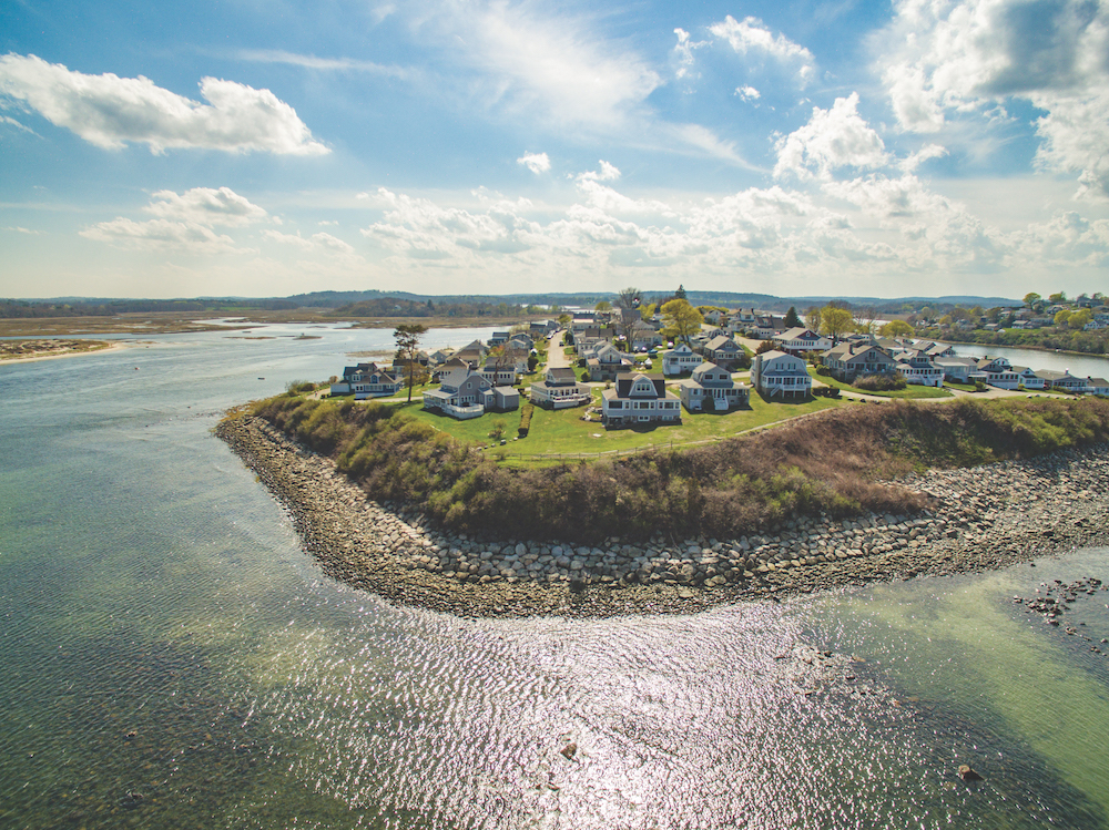
Nestled in among a collection of historic cottages in Ipswich, this cedar-shingled gambrel-roof summer cottage with a wraparound porch fits right in. But it took some imagination to make that happen. Rigorous restrictions and easements are in place to preserve the neighborhood aesthetic and to avoid the obstruction of other residents’ ocean views, which influenced what could be done during this project.
The new build needed to fit into the same footprint and three-dimensional envelope of the original structure. “It was an interestingly constrained project—more so than [those] we usually do—but within that volume we had the license to capture additional living space and to open up other spaces to the views, which are pretty tremendous,” says Tobin Shulman, a principal with Siemasko + Verbridge and architect on the project.
The topography was another element that influenced the design—again, more so than with other projects, as new sites offer more freedom to alter grades. “In this case, we were where we were, and we couldn’t really make significant modifications to [the land],” explains Shulman, noting that the limited land meant restrictions regarding the degree to which they could feather out the grade. “It was more of a nip and tuck to the topography to get enough to maximize the living space.”
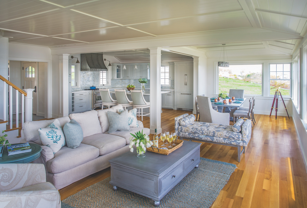
The original house featured something of a looming porch that obstructed the views from the primary living area. The goal was to magnify that living space and the near-180-degree view. “We took out the porch and made a modern, open interior space with big, beautiful windows to capture that view.” The ocean-facing side is now radically different from what had been there, and essentially amounts to a glass wall.
Whereas the original house’s exterior materials were mimicked on the interior, which made it rather dark, the new house is filled with natural light. “[The client] wanted to go as far away from [what had been there] as possible,” notes Siemasko + Verbridge interior designer Shelby Littlefield. “The inside is nice and bright.” This was achieved by using a lot of white, including on the living room’s shiplap walls and for the tongue-and-groove ceilings throughout the living room, dining area, and kitchen. “We wanted some extra detail there because we knew the color was going to be primarily white,” adds Shulman.
The architect makes the point that medium-density fiberboard was used for both the walls and the ceilings to achieve dimensional stability, given that the coastal location subjects the house to moisture. “You want something that isn’t going to move a lot with big swings in humidity,” he explains. “It gave us the opportunity to do some interesting trim work on the ceiling, too.” The v-groove grid pattern they chose also serves to indicate where the individual “rooms” are within what is a large, open space. “It’s more like tracery than anything,” notes Shulman.
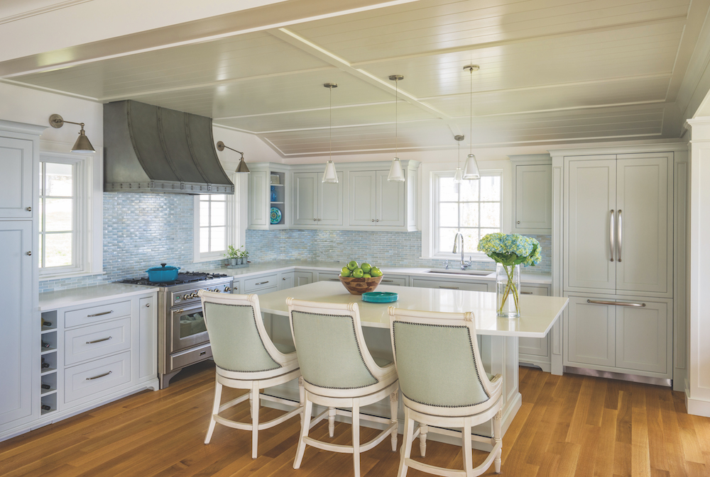
Many of the accents are sea glass blue. It’s seen in the kitchen’s iridescent glass tile backsplash, which has an aquatic, shimmering quality; the fabric-backed island chairs complement the tiles and lend a blue hue to the cabinetry, as well. The beachy color palette continues upstairs, where it was used in the shower tile, for an accent wall, and in some of the bedrooms. “It’s not the same color every time but it’s all within that blue sea glass family,” says Littlefield.
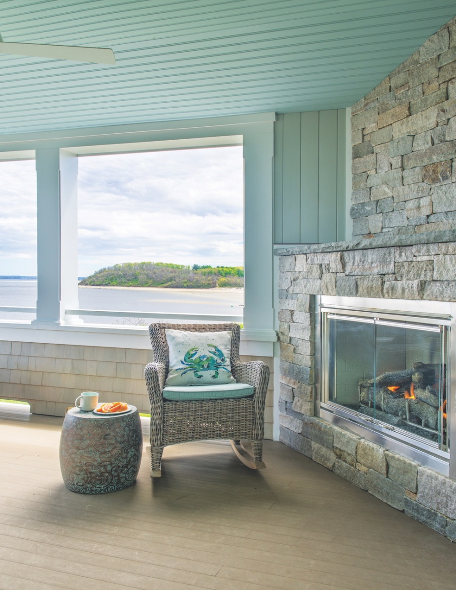
Noteworthy in the living room are the glass fold-away doors, which open to a covered screened patio, creating an indoor-outdoor space that features a gas fireplace with a Cape Ann granite stone surround.
Shulman points to the gambrels as another design determinant. “When you have the gambrel shape, and multiple gambrels colliding together, you get some pretty interesting geometry,” he says, noting that in the bedrooms, the idea was to use the geometry to create some special nooks. “It was fun to work with that to make the bedrooms fit and feel large enough, but also be fun and intimate.” For instance, the guest bath is made playful with porthole windows in the shower.
Given the challenge of the uniquely shaped rooms, Shulman’s team worked with the client to plan accordingly with respect to furnishings, helping to nail down dimensions that would work. “We wanted to make sure they could entertain the way they wanted to,” he says.
Something else the original house didn’t have but that the team was able to include is a full finished basement, the footprint of which is almost identical to that of the first floor. The space features a kitchenette, bedroom with en suite bath, and informal living space that opens to a patio and grilling area and offers direct access to the ocean. “We got in enough windows on the downhill side and the corners that it feels like an extension of the house—not a basement,” notes Shulman.
The essence of this charming Ipswich home lies in its beachy character—beachy being a word Shulman uses often when describing the place. “The spirit of the thing is really that of a summer cottage—that was the driving concept behind all the decisions that we made,” he explains. “If you look up ‘classic summer cottage’ in the dictionary, there should be a picture of this house.”
Siemasko + Verbridge
978-927-3745

