"I like color." Three words every designer longs to hear. When Jayme Kennerknecht and Jessica Rogers of Kennerknecht Design Group met with a client about her family home in Swampscott, they discovered she gravitated toward jewel tones. As a result, the designers knew right away they could use this preference to their advantage in updating its interior aesthetic.
After living in the house for two years, the client embraced its positive traits. She appreciated its origins as part of a 19th-century farm (the land was eventually subdivided). It boasted plenty of square footage for the couple’s teenage kids and 90-pound bernedoodle. Most of all, she loved its location on the end of a quiet street, with a backdrop of beach and ocean views.
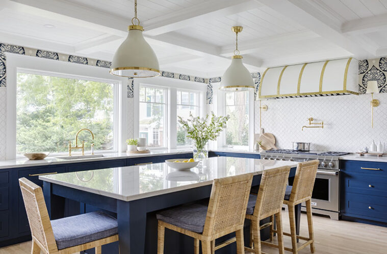
What she didn’t like, however, was the kitchen. It was narrow and felt dark with cherry cabinets, black granite countertops, and a peninsula instead of an island. “We are kitchen people,” she explains, “and we found ourselves lingering in this long galley arrangement. It was not user-friendly at all.”
In addition, she found the home’s large foyer—“almost the size of a whole room,” she notes—challenging to optimize and decorate. Meanwhile, a formal living room, situated to the left of the front entry on the opposite end from the kitchen and family room epicenters, was hardly ever used.
“When the kitchen appliances started to die, we decided it was time to rip off the Band-Aid and start a renovation,” recalls the owner. “The goal was to make the first floor more usable and livable for our family.”
Interior designers Kennerknecht and Rogers embraced the challenge of reawakening this coastal home with a fresh color palette and enhanced functionality. Establishing a more sophisticated, personalized style; creating more family- and entertaining-friendly destinations; and matching the home’s presentation to the beauty of its surroundings were all on their to-do list.
“She was drawn to a coastal aesthetic, and our main goal was to utilize those blues and greens and natural textures in an elevated way,” summarizes Rogers.
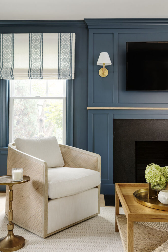
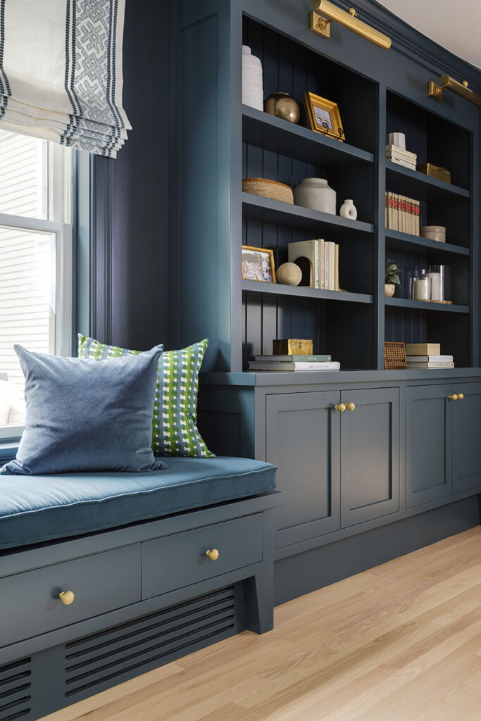
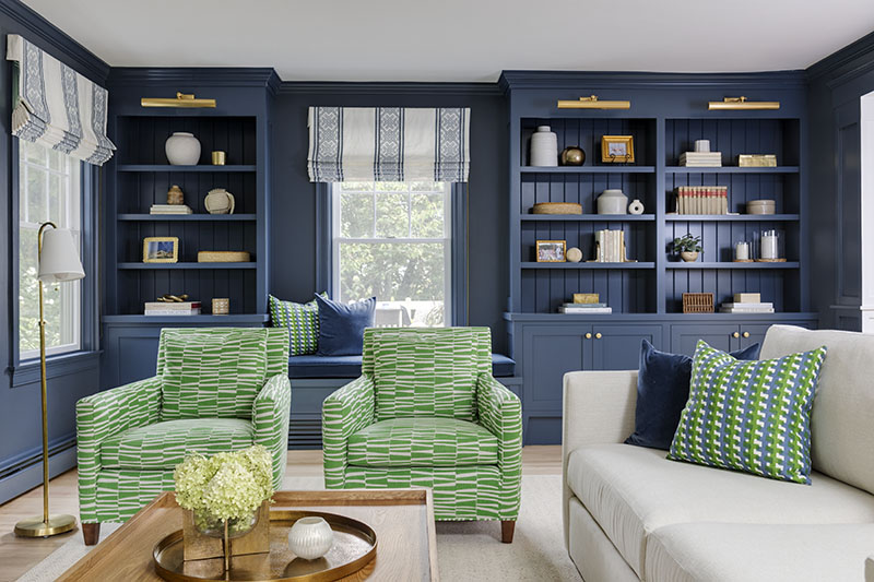
The design team saw great potential in the underutilized living room. “It was beige and filled with furniture from their previous home,” recalls Rogers of their starting canvas. To make it more inviting, they oriented a sitting area around the fireplace, simplified the fussy mantel, and added a TV. They also transformed one end into a library wall with window seat and the other end into a chic workspace anchored by a bleached cerused oak desk by Villa & House.
Adding to its seductive qualities, the designers applied a moody navy—“New Providence Navy” by Benjamin Moore, to be exact—to the walls and built-ins. “We asked ourselves, ‘How do we draw people into this space?’” recalls Kennerknecht. “The answer was with a little shock value in the form of this bold use of blue.”
“We envisioned something more unique than a traditional library with standard wood tones. This navy feels natural to both the client’s tastes and the beachside setting,” adds Rogers. A luxurious Galbraith & Paul fabric on the club chairs breaks up the blue with bursts of malachite green.
“I was a little hesitant about the blue, but I love it,” relates the client. “Everyone is drawn to this room now. It has a cozy, comfortable, inviting feel.” She adds that this bonus destination is where she and her husband relax while the kids and their friends hang out in the family room.
Another frequented spot is the new kitchen. Designed by Karen Swanson of New England Design Works, it features blue base cabinets, brass accents, a Galbraith & Paul wall covering, and water views through expanded glazing. The coffered ceiling lends architectural charm while hiding a structural beam. Builder Mark Driscoll of MHD Building & Remodeling borrowed about five feet from the adjoining dining room to eke out enough room for the island.
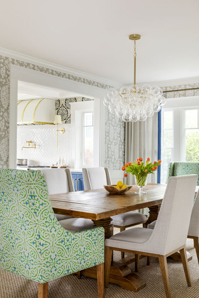
While the kitchen leans more colorful, the dining room feels purposefully quiet. A blue-and-green batik-patterned Betsy Textiles fabric on the armchairs adds a little drama while contrasting the table’s rusticity. Overhead, a new “Bubbles” chandelier by Regina Andrew is a playful touch: “It adds whimsy without introducing more color,” explains Rogers.
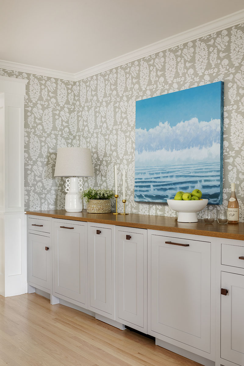
For easy entertaining Kennerknecht and Rogers collaborated with New England Design Works on the dining room’s custom serving station. Designed to emulate a furniture piece, the built-in’s pale gray cabinetry hides a variety of useful programming, including a beverage fridge and ice maker.
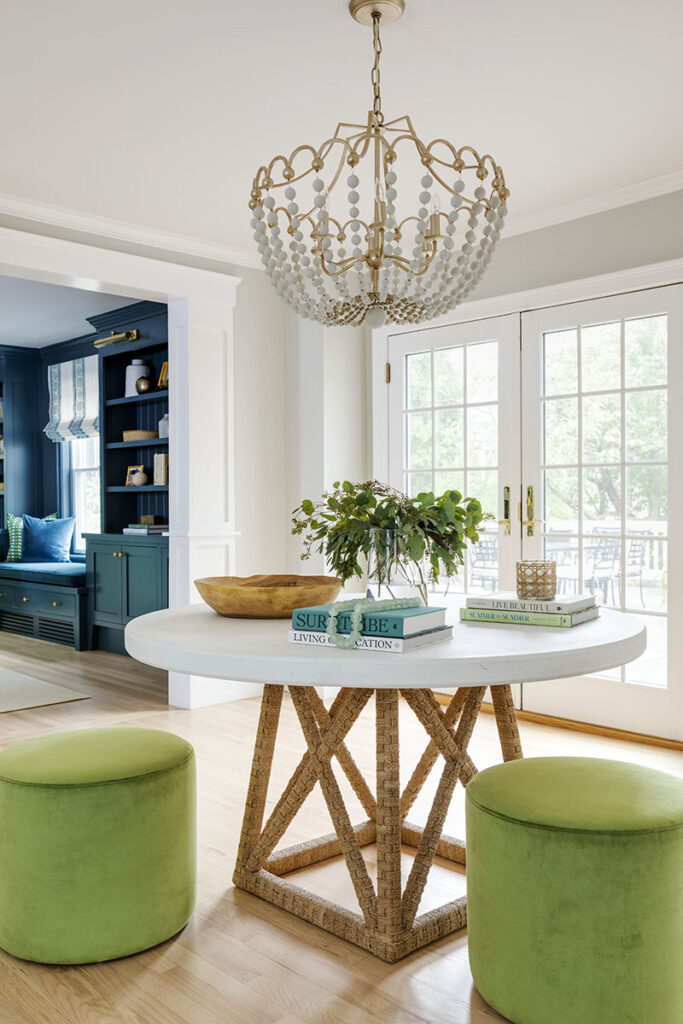
Rounding out the first-floor update, the designers also tackled that problematic foyer. Since the house already has a mudroom, the foyer “is more of a formal entry for entertaining,” explains Kennerknecht. Considering its pass-through nature, the design firm minimalized its furniture allotment, grouping a round console table, green leather stools, and beaded chandelier into a focal point. (The table and chandelier were existing and repurposed.) A set of French doors keeps the space light and bright while framing the rear deck and garden.
With their problem areas turned into valuable features, the family is now maximizing every square inch of their cool, comfortable home by the sea.
Learn more about the project team
Architect: ART ARchitects
Contractor: Hunter Whitmore, Whitmore Brothers Construction Co.
Landscape architect: Nina Brown, Brown, Richardson + Rowe
Interior design: Kennerknecht Design Group
Builder: MHD Building and Remodeling

