The trouble with a great big outdoor deck is that you might use the whole thing only a couple times a year.
“Most decks are designed for the Fourth of July,” says Andrew Sidford, principal of Andrew Sidford Architects in Newburyport. “The rest of the time, it’s just blocking your view.” The challenge, he says, is to create something that you can enjoy whether you are entertaining or sitting alone.
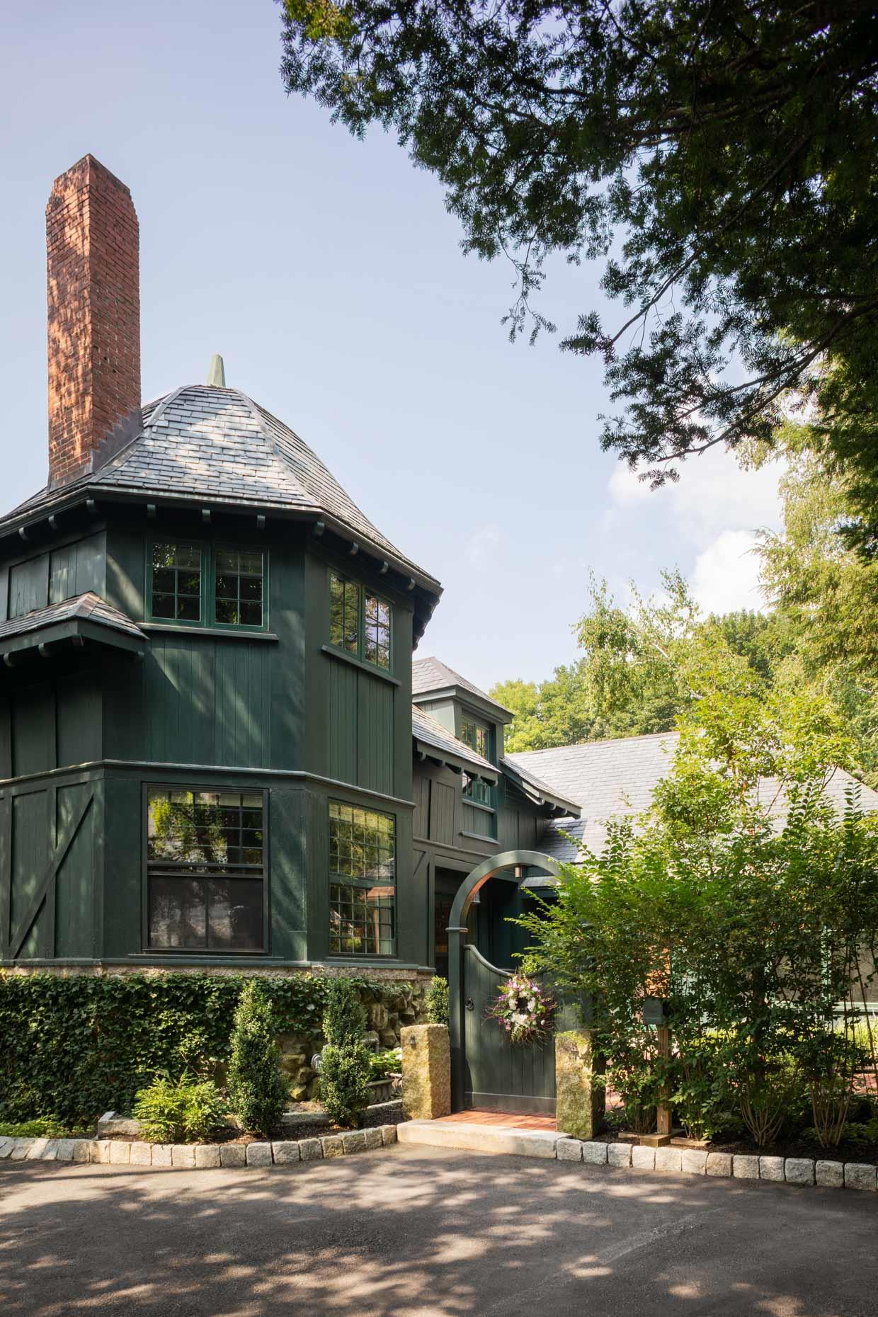
So, when creating the deck for a historic Newburyport carriage house, Sidford suggested a curve. “It packs in so much more than what you think is coming,” he says, explaining that the deck is meant to be a sculptural statement as well as a functional one. “It’s meant to hover in the trees,” he says. “A curve suggests movement much more than a straight line.”
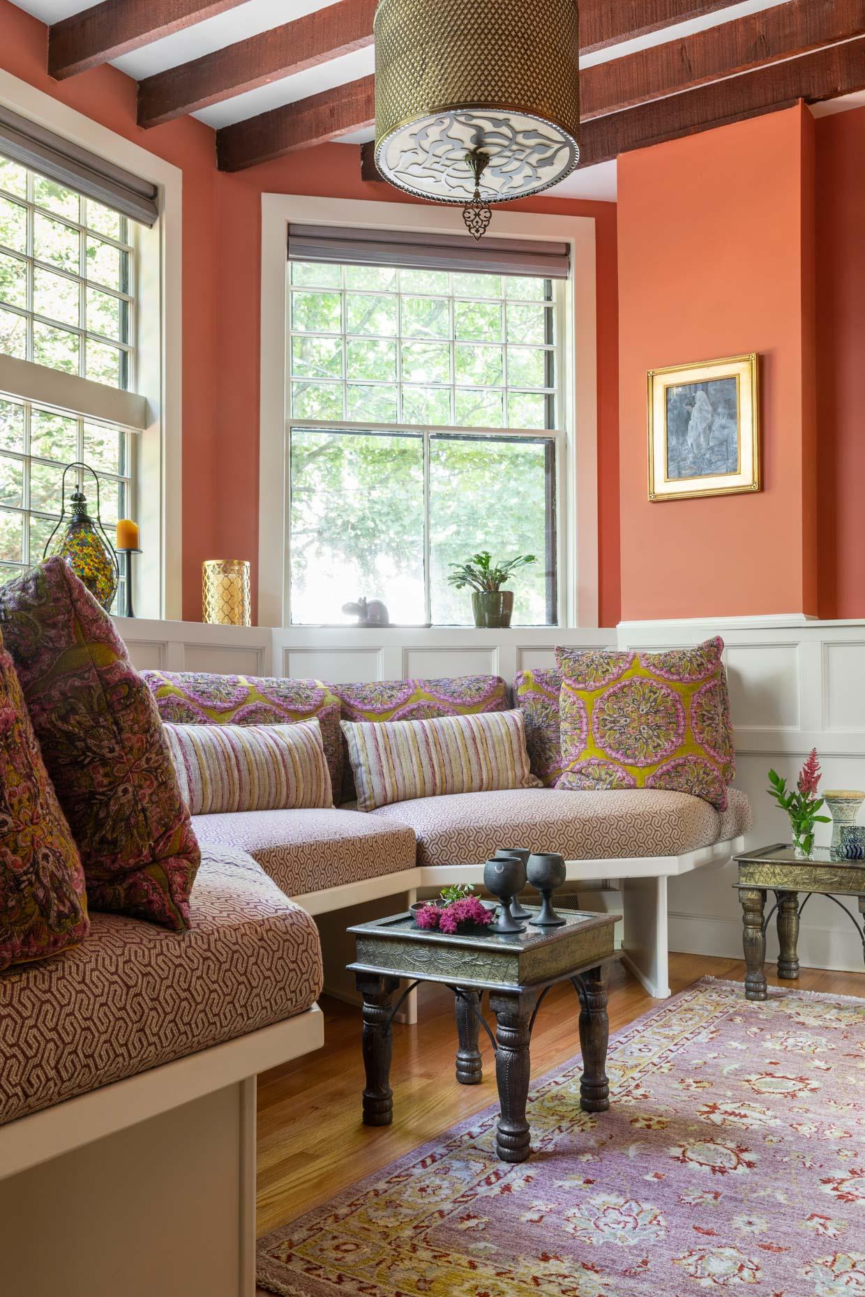
Sidford likes to think outside the box—quite literally—and that sometimes pushes homeowners out of their comfort zones. That was certainly the case with the curved deck, which Sidford says took some convincing.
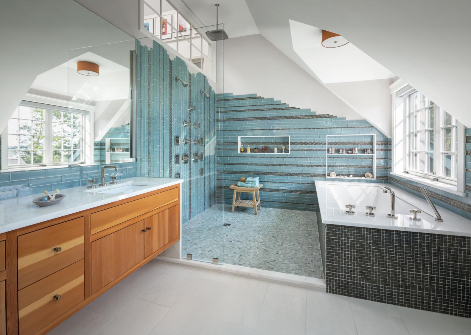
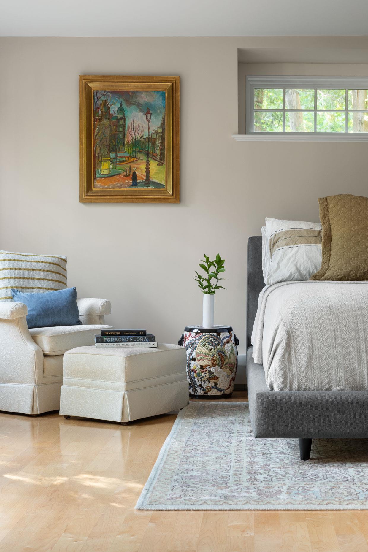
“I always tell clients, ‘My job is to push. Your job is to decide,’” Sidford says. “So I’m trying to push them out of their comfort zones in many places.”
As is the case with most of Sidford’s clients, the project and relationship with the client evolved over time. The curved deck came after a series of creative suggestions that accentuate the house’s unique character but initially gave the homeowners pause.
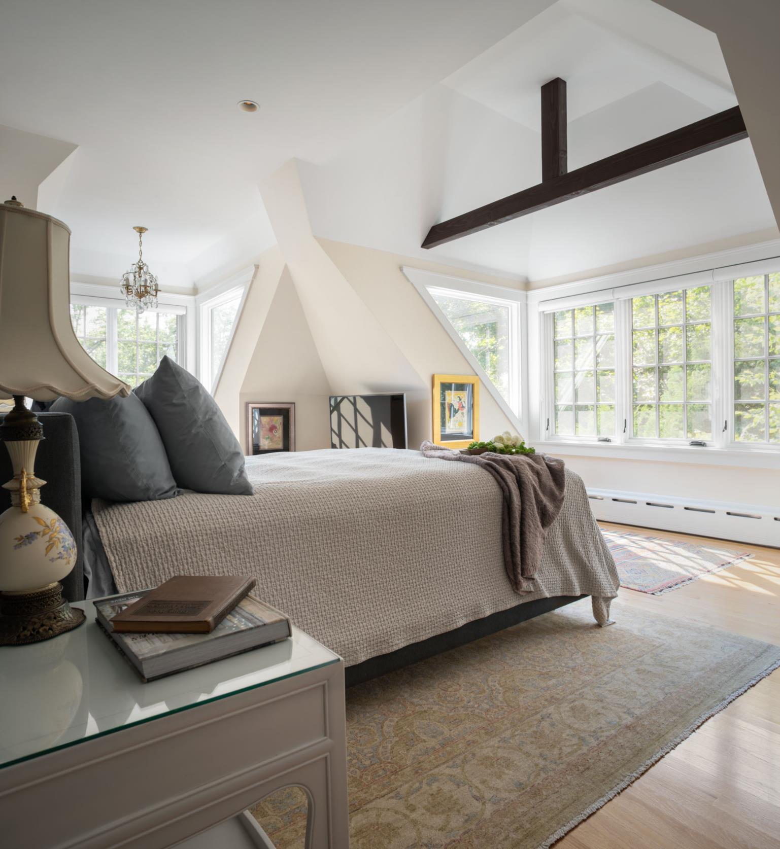
Sidford’s first challenge to convention was triangles of glass built into the sides of a bedroom dormer, bringing the occupants outdoors without leaving the house.
“There’s a connectedness I want them to feel to the wind, the sun, but also to the architecture,” Sidford says. “The triangular glass makes it feel like you’ve popped right out of the roof and you get to see the slate up close. It’s a much more visceral feeling of the architecture than is typical, and that’s quite intentional.”
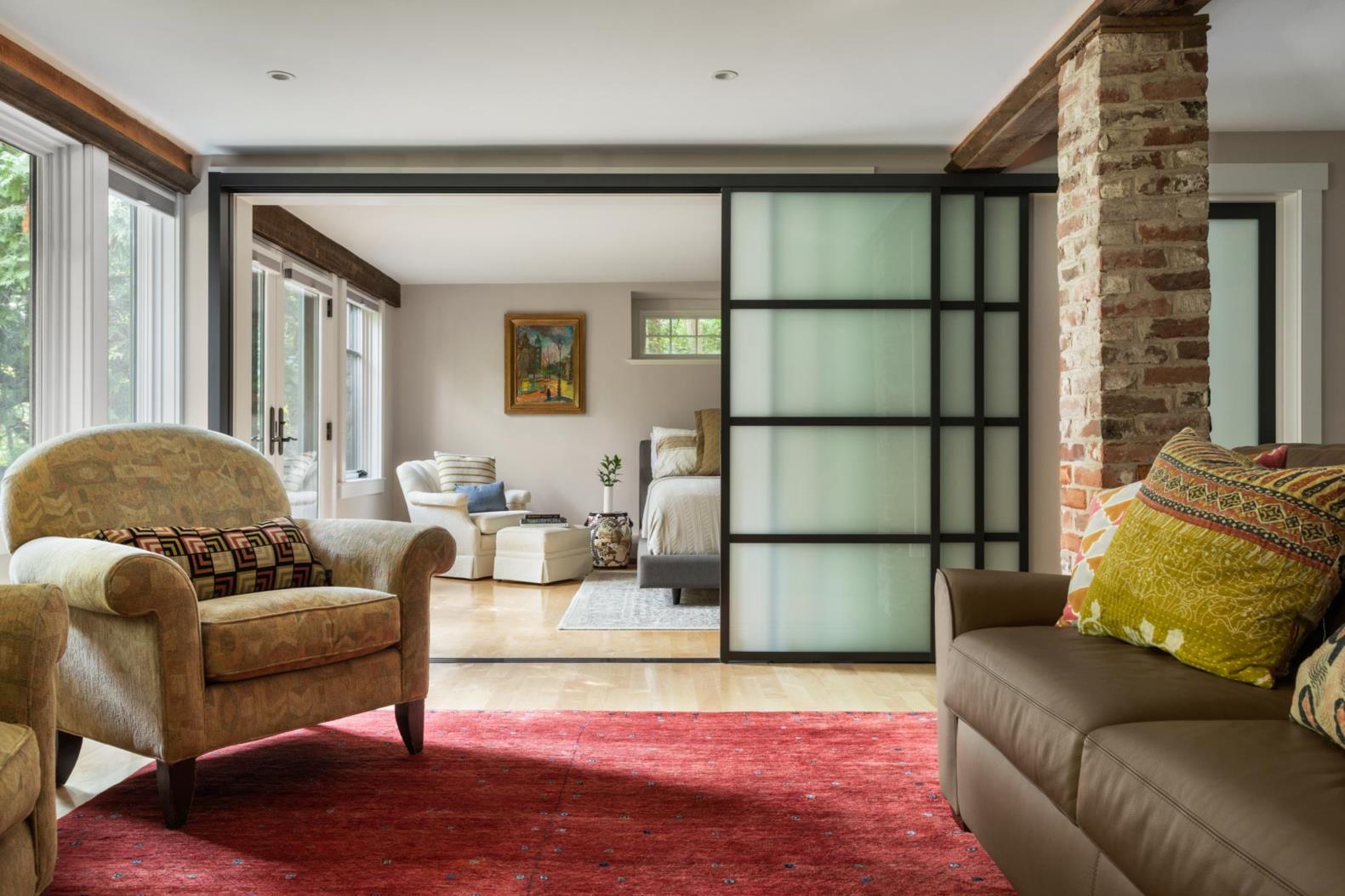
Once the client experienced the reimagined dormer, he developed more trust in the journey, which led to the striking deck. “It was a great artistic dialog,” Sidford says. “If the homeowner hadn’t seen the difference the dormer glass made, the deck never would have happened.”
That dialog crafted a home that is full of surprises while being very livable. “As you move through the house, there is a constant sense of awe and wonderment about what is coming next,” Sidford says. “Each of the rooms is designed to have its own unique experience in terms of light and in terms of view.”
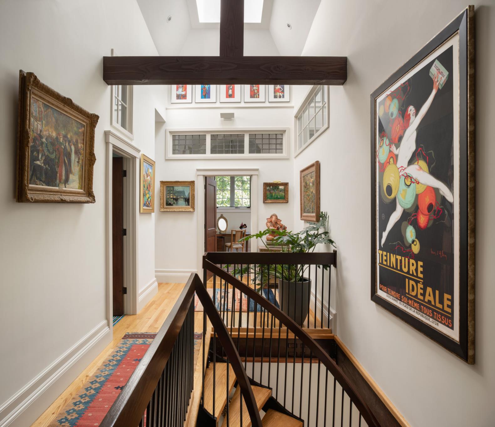
The key to energizing the historic carriage house was to bring in more light and more nature while respecting the original building and maintaining privacy.
“It looks like a solid structure, then develops into a tree house,” Sidford says. “Natural light comes into the house from all sides at all times of day…. From inside, it’s hard to tell where all the light comes from.”
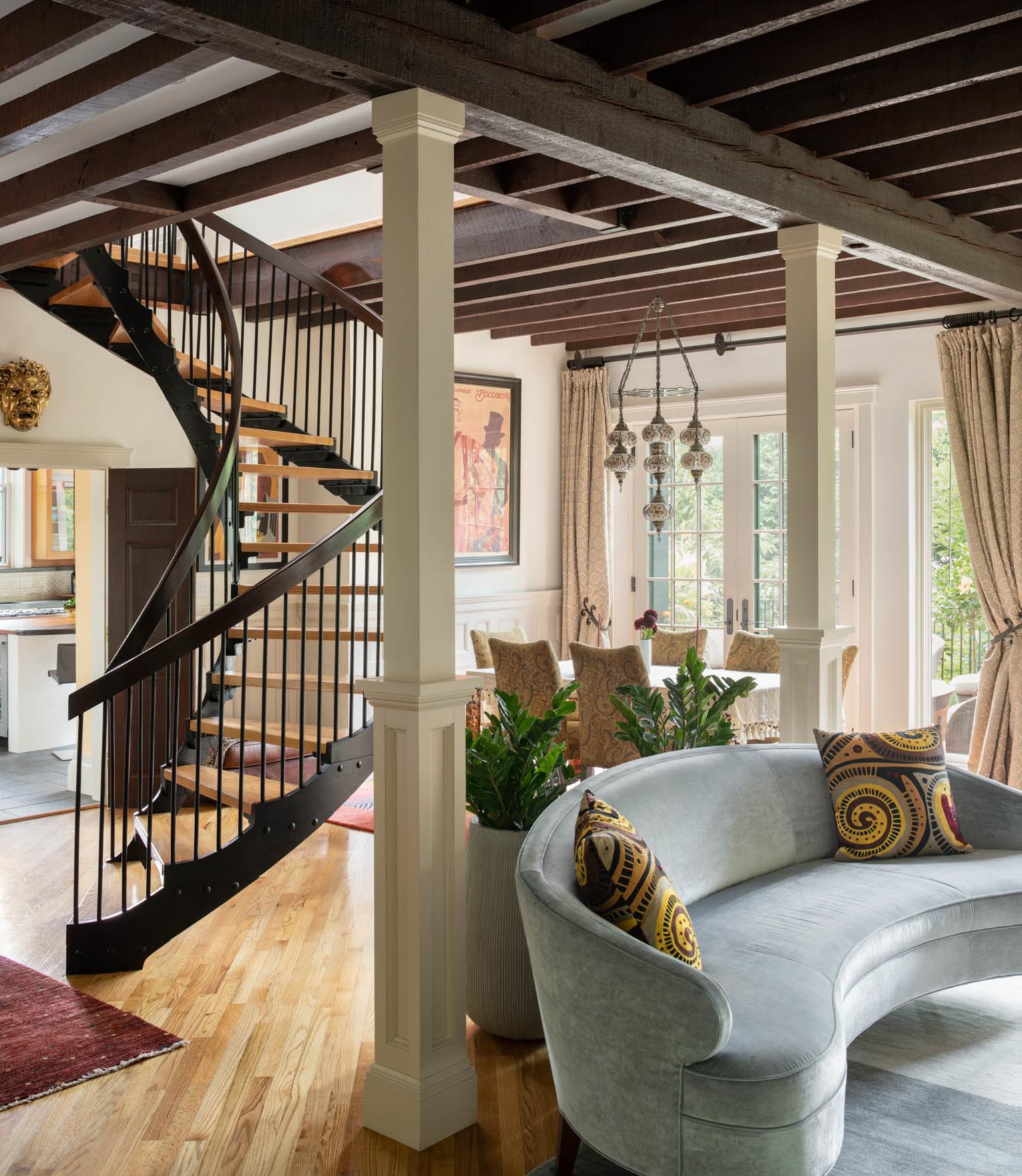
A few of the architect’s tricks? A modern bay window between two original windows over the sink in the kitchen, and transom windows in the halls.
“Everybody says they want more space and they want more light, but that isn’t true,” Sidford says. “Nobody wants to live in a glass house and nobody wants to live in a gym. Our craft is finding that balance.”
Indeed, while the home might be small, square-footage-wise, by modern standards, smart design makes it feel much larger. “Perception of space is much more important than actual space,” Sidford says. “Even though some of these rooms are remarkably small, they are incredibly comfortable and inviting to stay in.”
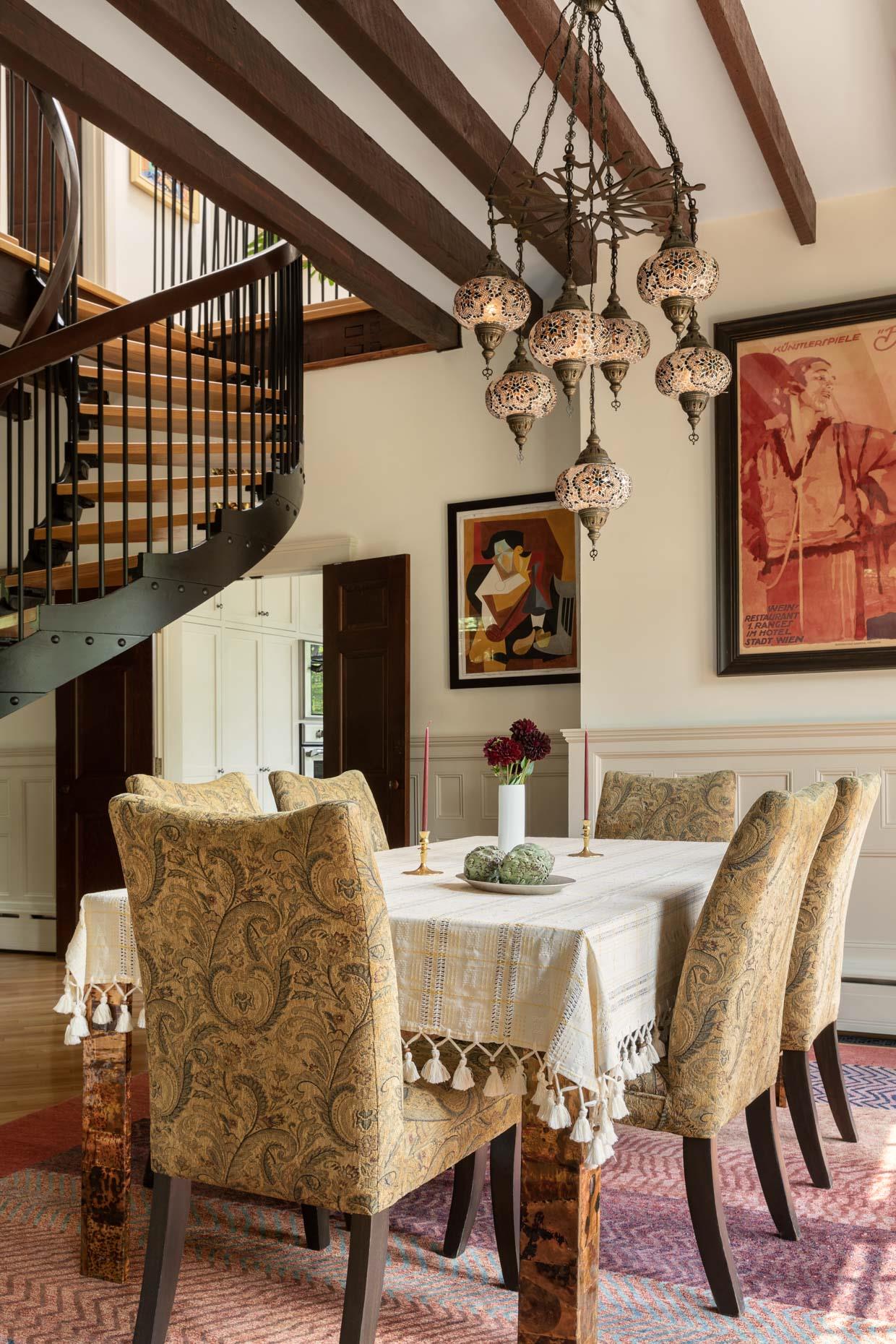
One of the ways Sidford respected the intimacy of the home was by including as much original detail as he could. “My job is trying to understand what (clients) want in a perfect world, then see how little we can change the house,” he says. “It’s a constant dialog between modern and historic.”
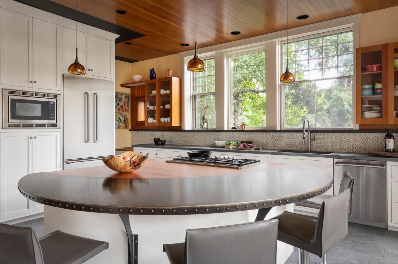
A good example of this is the Douglas fir ceiling in the kitchen, which is edged with black. It doesn’t reach all the way to the cabinets, because some of the planks were damaged and some of the walls were moved. “We could have patched it with new Douglas fir, which would never match, or we could have taken it all out, which would be sad,” Sidford says. What they did instead was trim it off and accentuate the story of where some of the walls used to be where the Douglas fir stops. “We wanted it to look like a suspended artifact, not just a new ceiling, so it not only highlights the old ceiling, but it tells a story,” Sidford says. “When you’re in there, your brain is trying to process what is old and what is new. It heightens your awareness of what is there and why.”
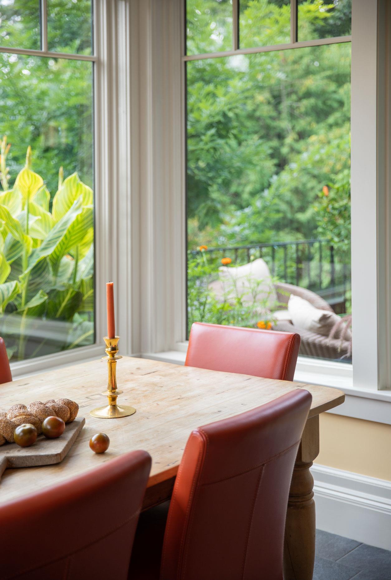
Touches like that throughout the home cause you to examine things you wouldn’t otherwise. “If it was a nice new ceiling, you wouldn’t notice it,” Sidford explains. “I like that clarity.”
Architect: Andrew Sidford Architects, 978-462-1657, asidfordarchitects.com

