Architect Dan Hisel has a clear strategy when it comes to working on historic homes: “Find ways of letting the historic elements of the house remain historic and then make specific interventions where the contemporary language is allowed to provide a contrast.”
For a family of four’s 1800s house in historic Newburyport, Massachusetts, the original staircase, the newel post and some of the first- and second-floor walls were the only interior elements he preserved during its renovation. “It was not a livable house when they moved in,” Hisel says. “We also kept the historic feel of the main exterior, with the gable roof, the two-over-two double-hung windows and the clapboard siding.” The homeowners wanted a major renovation that would bring a contemporary vision to the home, particularly in its main living area.

Newburyport 1: Dan Hisel Architect, original photo on Houzz
Great Room at a Glance
Location: Newburyport, Massachusetts
Size: 12 by 23 feet (3.7 by 7 meters), including the dining area
Designer: Dan Hisel Architect
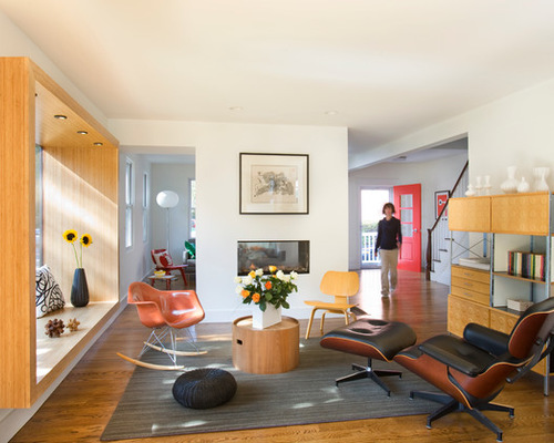
When visitors enter the house now, they can see all the way to the back of the home. “One of the first things we did was demolish a series of walls that was creating congestion at the front door,” architect Dan Hisel says. The previous layout included a tight entry room and a hallway that led back to a dark dining room.
This redesigned living space is the more public, active part of the house and connects to the renovated dining room, kitchen and new back deck. A new two-sided fireplace replaced the old cracked chimney and separates the living room from the more intimate front sitting room, while still maintaining a visual connection between the two.
Rocking chair, molded plywood chair, storage unit, lounge chair and ottoman: Eames
Living Room Ideas for an Open Floor Plan
Newburyport 2: Dan Hisel Architect, original photo on Houzz
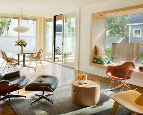
In addition to opening up the living area, Hisel brightened the space with windows, most noticeably with a new 7-by-5-foot bay window. The 2-foot-wide plyboo (plywood bamboo) sill projects about a foot into the room, framing the room’s standout feature while adding seating to the somewhat narrow space. “I’ve always been fascinated by pieces of architecture that are also furniture,” Hisel says.
Dining table and chairs: Eames; pendant lamp: Nelson
Newburyport 3: Dan Hisel Architect, original photo on Houzz
With so many windows, the house definitely opens itself up to privacy concerns, which is something Hisel says the homeowners need to be on board with. “Contemporary design goals typically come with lots of glass,” he says.
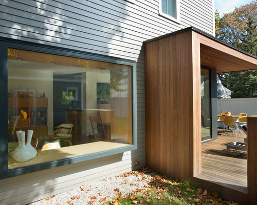
He incorporated some architectural interventions to shield the homeowners from view of the neighbors without blocking light or cluttering up the space too much with window treatments. The window seat, with its wide overhang, blocks views directly into the living room from the street. “It’s kind of like blinders on a horse,” Hisel says.
Newburyport 4: Dan Hisel Architect, original photo on Houzz
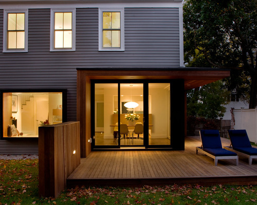
The roof overhang between the dining room and the deck wraps around the sliding glass door frame as a screening device, as does the wall that projects off the new ipe deck Hisel built off the back of the living room.
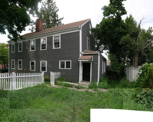
Newburyport 5: Dan Hisel Architect, original photo on Houzz
BEFORE: Hisel removed the existing shed off the back of the 1800s house to add the deck, eliminating square footage but improving the quality of what remained.
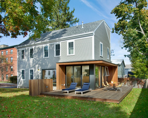
Newburyport 6: Dan Hisel Architect, original photo on Houzz
AFTER: The front facade remained the same, but the renovated back stands out in the neighborhood.
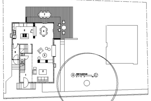
Newburyport 7: Dan Hisel Architect, original photo on Houzz
The renovated living room (3) and dining room (4) wrap around into a remodeled kitchen (5). The new ipe deck (7) adds significant square footage to the downstairs living space.

