It seems counterintuitive that taking away cabinets would actually increase the amount of storage space in a kitchen, but that’s exactly what happened when Paul and Sheryl Sciaudone remodeled the kitchen in their North Andover Colonial, where they’d lived for 12 years.
The Sciaudones had long been planning a kitchen renovation. They’d spent years browsing through magazines and Houzz for ideas and knew the kinds of elements they wanted their new kitchen to include: gray cabinets, white and gray countertops, a large island, no appliances on the counters, no exposed outlets on the walls, and the biggest window they could fit.
“We knew from the beginning the look we were going for. We just didn’t know how to put it together,” Paul says. They knew that, “Whatever we do, we want to make things as discreet and as clean as possible.”
Enter designers Nancy Hanson and Sherry Croft of Heartwood Kitchens in Danvers, who pulled all of the Sciaudones’ ideas and wish-list items together into a real, functioning kitchen.
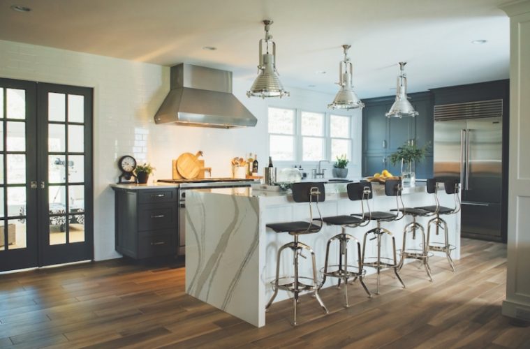
“She just nailed it,” Paul says of Hanson’s designs, which included giving up their kitchen table and chairs in favor of a long, working island, opening up the space, and moving appliances to help with the flow.
They were ready to move forward with their design, but major construction was needed first in order to make room for the large island. To create more space, contractor Jim Testa removed the wall between the living room and kitchen. The design also required moving a structural post and installing a large support beam that runs from the front to the back of the house. Testa then paneled the post for a more decorative look.
“It was pretty imperative that that happen in order to make this whole design work,” Hanson says of moving the beam. “They really wanted as large an island as we could give them.”

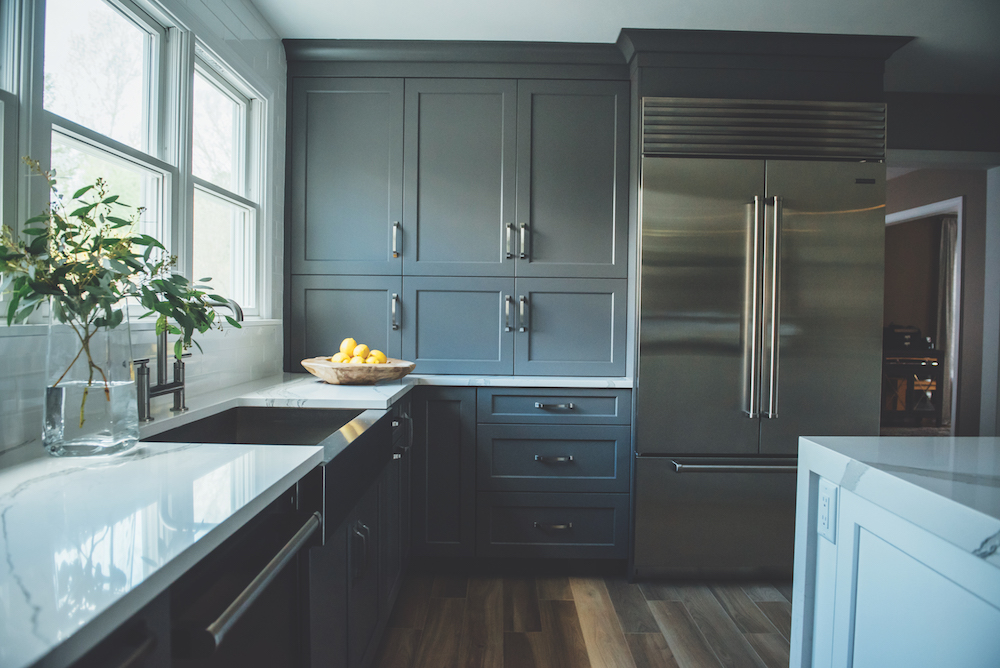
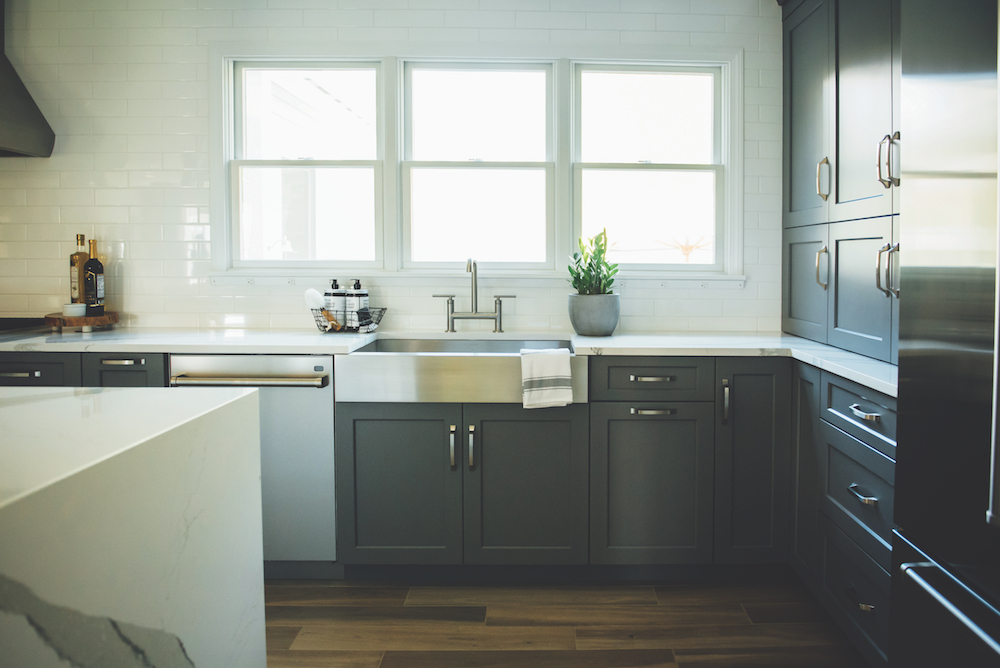
Once the space was opened up, the other design work could begin. Instead of having walls filled with upper cabinets, most of the kitchen’s storage space is made up of dark gray drawers, freeing up the walls for beautiful white subway tiles that are installed from one end of the room to the other. The few cabinets they do have sit on the countertop next to the refrigerator. The Wolf range and chimney hood also stand out and make a statement, since they’re not surrounded by cabinets.
“It gives them all the storage they need, keeping things nice and airy without the clutter of upper cabinets,” says Hanson.
With the drawers, every kitchen item has a designated spot. Large pots and pans and mixing bowls are easily accessible, plate drawers are near the sink and dishwasher, and a cutlery drawer right above the plate drawers makes unloading the dishwasher easy.
“We love the fact that everything has a space now. There’s nothing on the counters,” says Sheryl. “The whole layout and the whole flow of everything is just so readily accessible. It’s so organized.”
That clean look is also enhanced by the light-colored countertops and extra-large triple windows above the sink. A dramatic Cambria Brittanica waterfall countertop is the kitchen’s centerpiece and showstopper, and something that was a must-have for Paul.

Hidden features also add to the Sciaudones’ kitchen’s clean, unfussy design. A Wolf microwave drawer keeps that appliance off the counter and tucked away. Even the electrical outlets are discreet.
“You have to really look closely to find the electrical outlets in this kitchen,” Hanson says. “They did not want to cut up that backsplash; they didn’t want to break the lines.”
Contractor Jim Testa’s solution was installing a custom plug strip below the windowsill. Likewise, an outlet is integrated into the cabinetry at each end of the island, eliminating the need to cut into the countertops.
“The end result is you hardly can see them, but yet they’re there where you need them,” Hanson says.
Other design elements include vintage Toledo bar chairs, maritime pendant lights, and a wood-look floor that’s actually Italian ceramic tile.
“Tile that looks like wood is becoming a more popular choice in new kitchens for its durability and ease of upkeep,” Hanson says.
Sheryl says that the kitchen renovation, which was completed in April, changed the look and function not only of the family’s cooking and main gathering space, but also of adjacent rooms. For instance, it’s made the fireplace in the living room more of a focal point, since the kitchen design complements the fireplace’s stone. Sheryl says friends have asked whether the fireplace is new, too.
“It just looks like a totally different space,” she says, adding that their sons, ages 11 and 8, love it, too. “They think they’re in a resort.”
The whole family also loves how they can be together without being overly crowded.
“We have a modern farmhouse kitchen and I absolutely love it,” Paul says. “If we move, I’m taking the kitchen with me.”
Designer: Heartwood Kitchens, 978-762-7472, heartwoodkitchens.net
Contractor: Jim Testa, Testa Building & Remodeling, 978-682-2023

