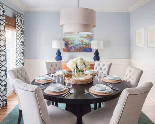
A piece of artwork inspired the color scheme for this family’s dining room makeover. Interior designer Jamie Keskin started almost from scratch. The Massachusetts dining room already had lovely traditional woodwork but was empty except for a dated chandelier and walls covered in navy blue and early-1990s wallpaper. Starting with a colorful abstract painting and moving on from there, Keskin infused the room with light, cheerful hues and contemporary elements the family loves.
.jpg)
Dining Room 1: Kyle J Caldwell Photography, original photo on Houzz
Photos by Kyle J. Caldwell Photography
Dining Room at a Glance
What happens here: A young family of five gathers for meals, mixes drinks and entertains.
Location: Medfield, Massachusetts
Size: 140 square feet (13 square meters)
Designer: Jamie Keskin
“I suggested that we start with a piece of art,” Keskin says. The painting over the buffet provided a jumping-off point for adding color. Blue lamps and a teal rug tie into the colors in the artwork.
The buffet is a versatile storage and serving piece. “I love to put two lamps on a buffet. It really grounds the piece, and it provides symmetry around the painting and in the room,” she says. The faceted take on the classic gourd lamp and the acrylic material give them an updated look.
Painting: “Kaleidoscope,” by Erin Gregory; wall paint: Light French Gray, Behr; lamps: Lamps Plus
.jpg)
Dining Room 2: Kyle J Caldwell Photography, original photo on Houzz
After considering several layouts, Keskin advised her clients that a round pedestal table fit the space the best. This one is versatile; it has leaves that can extend it to serve 10 to 12 people for a larger dinner party. While the table, geometric drapes, drum pendant light, buffet and bar are contemporary, the tufted linen chairs with nailhead details tie in a more traditional element that works well with the wainscoting and dentil molding. They also add inviting comfort.
Dining table: Arhaus; dining chairs and pendant light: Restoration Hardware; rug: Crate & Barrel
.jpg)
Dining Room 3: Kyle J Caldwell Photography, original photo on Houzz
“I love to layer in natural woven wood shades whenever I can,” the designer says. “They are classic, and they add texture and warmth — white woven shades would have been too stark in here.” Next she layered in softness and a bold geometric print via the long drapes.
Drapery fabric: Kravet
Go Bold With Geometric Window Treatments
.jpg)
Dining Room 4: Kyle J Caldwell Photography, original photo on Houzz
The couple wanted a bar cabinet for entertaining. “This piece is really cool because it has that reclaimed-looking wood and iron, and then when you open it up, there is antique mirror inside, which adds a little glam,” Keskin says. “The oranges in the painting tie in some of the tones in the wood as well as the woven shades.”
The bar’s rustic style juxtaposes the more refined pieces, like the chairs.
Bar: Crate & Barrel
.jpg)
Dining Room 5: Kyle J Caldwell Photography, original photo on Houzz
The couple like to leave the bar open when they are entertaining so it’s easy for their guests to grab a drink.
.jpg)
Dining Room 6: Kyle J Caldwell Photography, original photo on Houzz
“We added a plant and wine bottles, but [the homeowners] can switch out whatever they put here seasonally,” the designer says.

