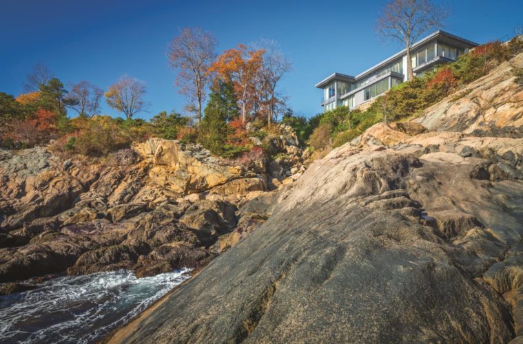
If you are from around these parts, you know Kragsyde. The iconic Peabody & Stearn Shingle-style mansion, built in 1835 on a 70-foot cliff in Manchester-by-the-Sea, was the summer home of a real estate heir and his wife, who spent the
The current home on the site is the fourth that has sat on its foundations.
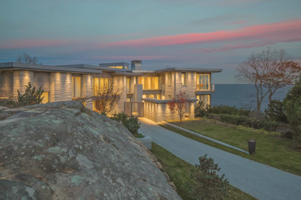
Architect Adolfo Perez designed this nearly 7,000-square-foot contemporary incarnation for a local family. Project manager David Demeter oversaw the two-plus-year long construction of this spare four-bedroom home, constructed made from monochromatic Chester Blue granite and plenty of glass, is and set amid rock outcroppings overlooking Lobster Bay. Patios wrap around the L-shaped plan, incorporating terrace walls from the estate’s original landscape, designed by Frederick Law Olmsted.
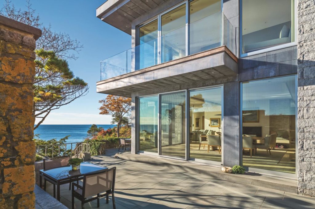
“Stone is an obvious choice to withstand the elements that come from the exposed nature of the site,” Perez says. “I wanted the house to appear to grow out of the major granite outcropping it sits on.”
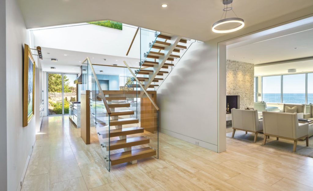
Arrival is through a minimalist portal, or
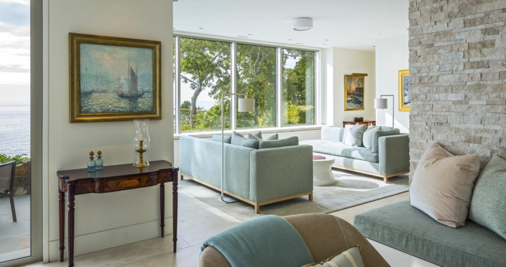
Meichi Peng, who designed the interior millwork, finishes, and furnishings, used restraint so as not to overpower the view. The house is light and airy, with warm white walls that seem to float. Sand-toned 18- by 36-inch slabs of Italian travertine, with veining that aligns from one tile to the next, gently grounds
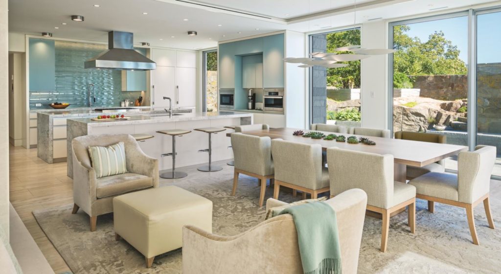
A seafoam-colored glass tile backsplash that references the ocean anchors the kitchen, which is located just past the stairs. Two identical parallel islands—one for cooking and one for cleaning and seating—have White Princess quartzite waterfall countertops and encase plain-fronted white lacquer cabinetry.
When it came to furnishings, the couple requested a slightly relaxed feel, both for comfort and to accommodate some existing antique furniture pieces and a collection of nautical seascapes. They also have three dogs, so durability was important. “The architecture is very contemporary, but the furniture is a bit softer,” Peng says.
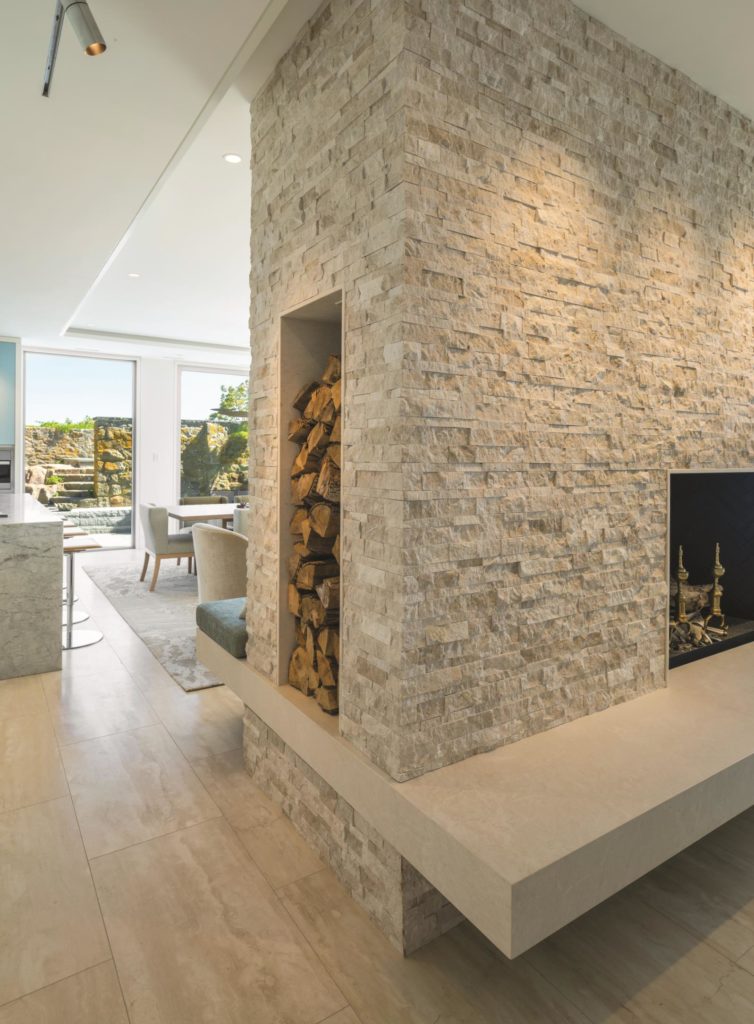
Extra-wide upholstered chairs surround a rift-sawn white oak table atop a textured rug. A brushed aluminum light fixture resembling a school of fish hangs above. A pair of custom lounge chairs upholstered in heavy-duty velvet face a leather ottoman set in front of the two-sided fireplace, a feature that topped the homeowners’ wish list. Peng faced the chimney breast with textural beige limestone tiles that echo the home’s exterior granite façade and provide a neutral but nuanced backdrop to the main living space.
The seating arrangement of the living area on the other side of the fireplace is more formal. Here, a tailored sofa and four chairs are arranged at right angles around a rift-sawn white oak coffee table. Peng infused color into a sitting area by the windows using a pair of mirror-image seafoam-green chaises that pick up the color of the sea. There’s also a family room tucked into the far corner of the first floor, with a daybed holding pride of place in a glass bump-out overlooking the ocean.
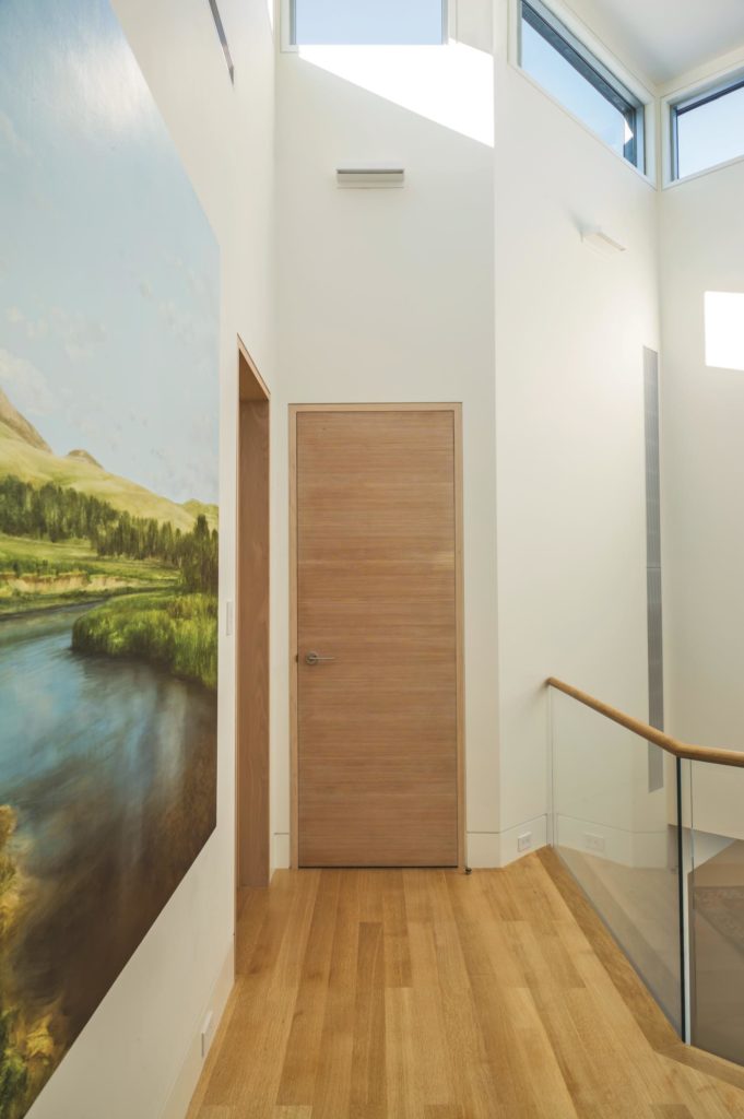
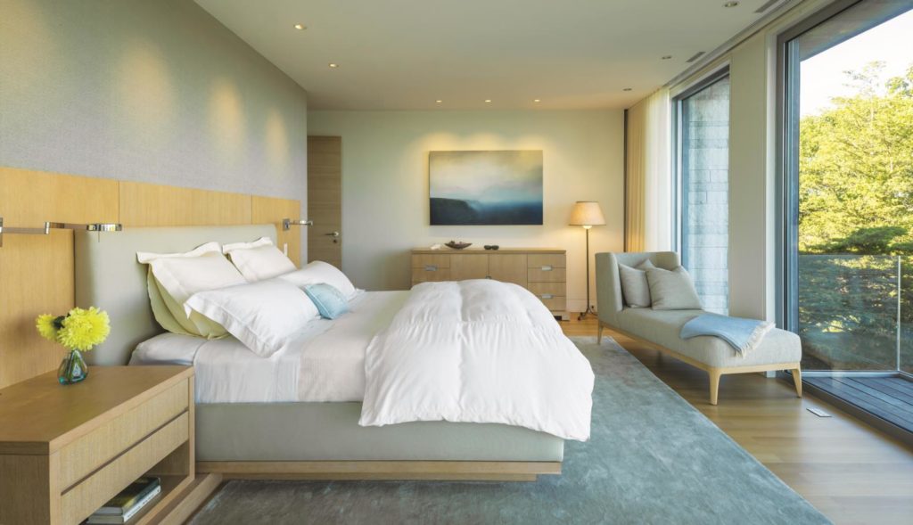
Upstairs there are clerestory windows, rifted-sawn white oak floors, and tall doors made from wire-brushed fir boasting horizontal graining. Save for the wing with two bedrooms and a media lounge that stretches across the top of the
The master bath is a crisp study in grey-veined Lincoln marble. The tub, set against the chimney structure, which is wrapped in matching marble slabs, seems to float. “We didn’t want it to feel massive, so there’s cove lighting underneath,” says Peng. The horizontal floor tiles are purposefully staggered to create rhythmic patterning. Perimeter walls are lined with vertically stacked pale seafoam–colored glass tile. The floating double vanity, makeup area, and recessed cabinetry are done in smooth, flat planes of glossy white, with not a speck of hardware in sight.
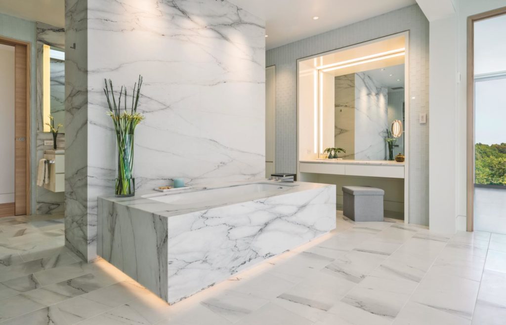
The scheme is minimal and clean
Architect: Adolfo Perez
Interior Designer: Meichi Peng

