Beach house design is often synonymous with cutesy: signs that point “This way to the beach” and cartoonish fish and flip-flop sandals punctuate the décor. But that’s worlds away from how Lisa Duffy designs oceanfront homes.
Duffy, owner, creative director, and lead designer at Andover-based Savoir Faire Home, channeled this appreciation for the natural beauty of the sun, sand, and surf in designing a newly constructed weekend summer house for a couple who craved the ease and simplicity of seaside living and plan to retire to their new home someday.
“They’re literally right on the beach,” Duffy says of the dreamlike spot abutting sand dunes where the home was built—adding that the homeowners can see water from every room in the house. “The water talks to you; it does something to your soul,” she says. “It does something to my creativity. It just inspires me.”
Duffy says she started working on the project when her clients were finishing the architectural plans; there was a foundation in, and they were putting up the walls. Also working on the home was Gray Construction LLC and the cabinetmaker Knock on Wood LLC, both based in southern New Hampshire. Duffy says getting in on the process early was helpful, since she was able to guide the flow of the house. The key here is how the couple planned to use the home: to relax and entertain. They wanted a space that was at once elegant and comfortable, with clean lines that exuded comfort and ease.

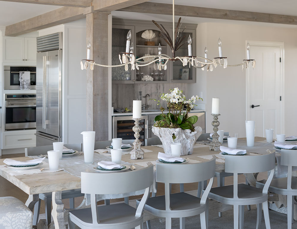
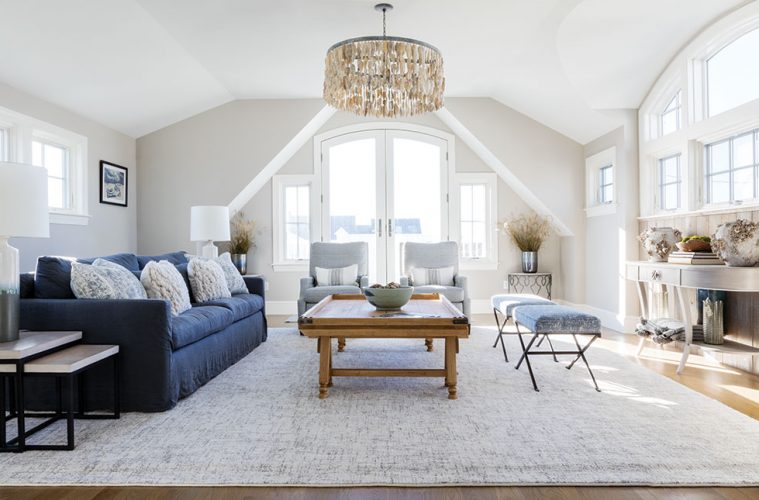
For instance, Duffy wanted to ensure that the flow between the kitchen, dining, and living areas was unobstructed and simple. A strategically placed dining table and sofa ensured that people in each space could see and talk to one another easily, but also clearly delineated the three areas.
“It felt like a separate space, but the flow was very smooth and comfortable,” she says.
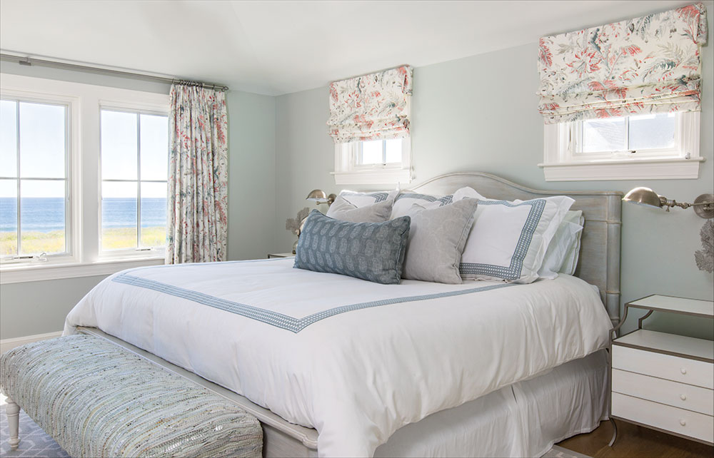
Separating another room from the dining area by a barn door ensured that the homeowners and guests also have a quieter, more private retreat to socialize or watch a football game. Duffy also helped with the large third floor, making sure that the two rooms there flowed seamlessly as a large master suite, rather than as two separate rooms. The draperies in the master suite soften the look, but don’t cover the windows at all, so they don’t hamper the view.

“We took them right to the edge of the windows and nothing was obstructed,” Duffy says.
Duffy also used the home’s surroundings as inspiration, often in unexpected and delightful ways, resulting in a design that’s airy and sophisticated with touches of whimsy and nods to the natural world, such as driftwood and oyster shells making cameo appearances in the décor. The same is true for the home’s color palette.
“We literally took the colors of the horizon and brought those into the paint colors, the sofa colors, all the fabric choices,” Duffy says.
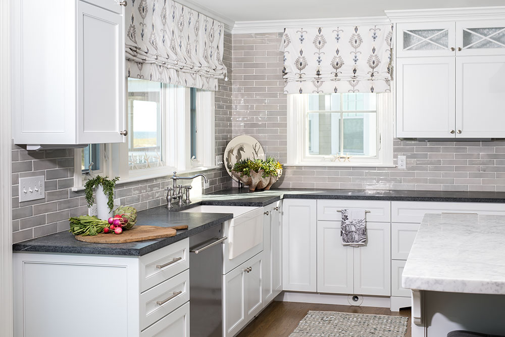
Duffy says there’s nothing stark in the home, nothing that’s overly bright to the eye. Instead, everything feels soft, soothing, and natural. Even the kitchen island doesn’t have hard edges; it’s curved and topped with a 2-inch-thick piece of marble that’s a soft, neutral white with gray undertones. Elsewhere in the kitchen, soapstone counters and candied brick tile stretch to the ceiling.
In the entryway, a natural stone floor gives way to white oak that was custom stained to look like the sand outside.
The four-bedroom, three-story, roughly 4,200-square-foot house also features a number of design elements that are signatures of Duffy’s style, including beautiful Italian fabrics and Belgian linens.
“I love fabric,” she says. “I like it to feel very textured and layered and soothing.”
There’s also custom lighting, like antique-looking gas lanterns, oyster shell chandeliers, and a nautical rope chandelier. Elements like demilune chests with a Swedish influence and a floor-to-ceiling dressing mirror made from antique flooring tiles give a “collected over time” look to the décor as well.

All of this adds up to a home that’s beautiful, certainly, but one of the most important elements is an intangible: feeling comfortable and homey. Duffy wanted things to look easygoing and like nothing was off-limits—rather than stiff, formal, and too perfect.
“If people wanted to put their feet up on coffee tables and sofas, it wouldn’t be an issue,” she says. She wants people to think, “Oh, this feels like home.”
Duffy seems to have achieved that. She says she got a call from one of the homeowners soon after she had spent the first night in her new home.
She told Duffy, “I cannot stop pinching myself that this is mine.”

