When its owners purchased the turn-of-the-century, Shingle-style home in Manchester-by-the-Sea, it had already been thoroughly renovated. North Shore-based designer Honey Collins collaborated on the refresh and masterminded all of the interior design.
While the interior was beautiful, it was a little too subdued for its new owner, who craved a richer color palette and bolder style. She asked Collins to once again freshen the scheme for her tastes, starting with two key rooms: the living room and the home office. She also asked if they could focus on one hue in particular.

“I just love green; I’m really drawn to it,” says the new owner. “This house is surrounded by woods, and I liked the idea of bringing the outdoors in and making the rooms feel green and alive no matter the season.”
Embracing color is no problem for Collins, whose design roots reach all the way to Atlanta, Georgia, where she grew up amidst the fabric samples, art, and antiques collected by her decorator mom. While Collins has lived on the North Shore for two decades, there is a discernible Southern aesthetic woven throughout her work, and Atlanta is still her favorite treasure-hunting destination.
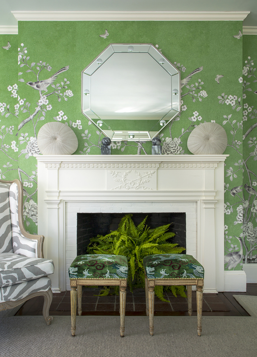
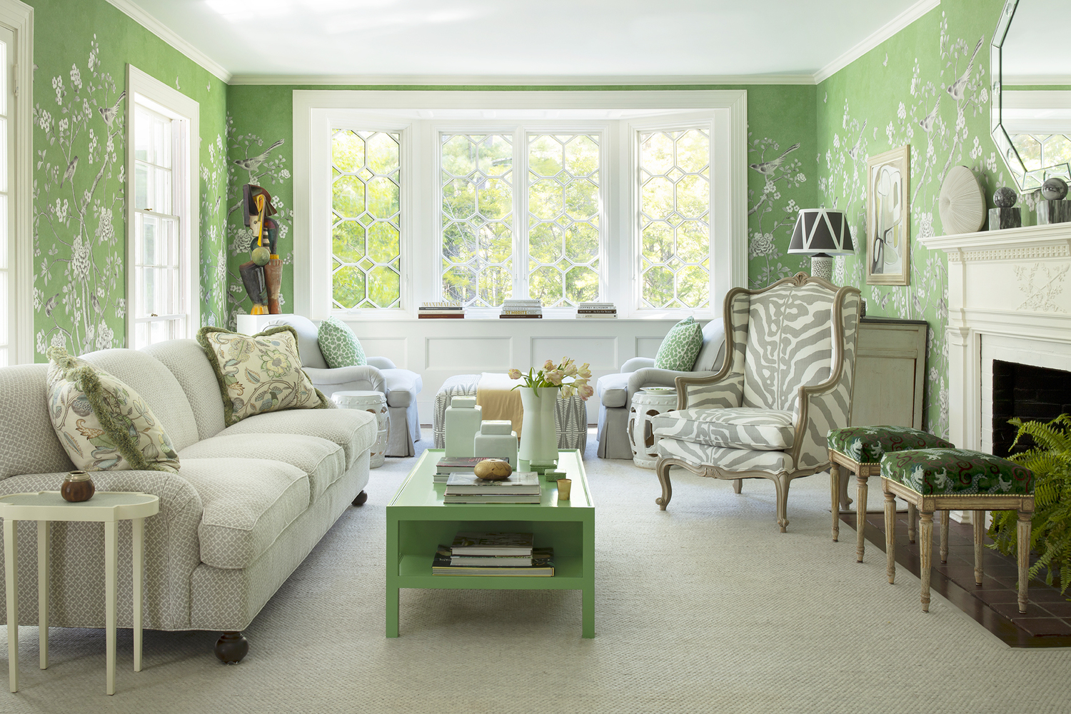
Collins established the living room’s nature-derived decadence with a bold jumping off point: the “Chinois Palais” wallcovering by Schumacher. “The room is long and narrow; it just screamed out for chinoiserie,” she notes. “The exact color is ‘Lettuce’—it’s more of a yellow-green that sets the tone for the entire space.”
With the paper’s unifying garden scene in place, Collins filled the room’s expanse with distinctive destinations, each with its own purpose and flair. The central seating area, oriented on the fireplace, is for entertaining. Two repurposed furniture pieces—the coffee table, refinished in a high-gloss green, and the armchair, reupholstered in a zebra pattern by Scalamandré—are statement pieces on their own yet contribute to the room’s wilderness vibe.

Using big pattern or bright color is a lesson in balance, cautions Collins, who counteracted the Schumacher wallpaper with a neutral Holland & Sherry fabric on the sofa. “Its small geometric pattern provides some texture without overwhelming,” notes the designer, who introduced another chinoiserie motif, a dragon-patterned Schumacher fabric, on a pair of vintage stools.
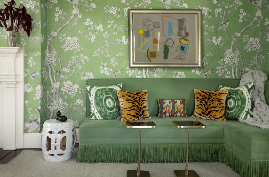
A second gathering spot is the banquette, custom designed by Collins to fill up one end of the living room. The rich forest green upholstery by Romo is washable and durable and its bullion fringe nods to 1970s swanky glam. “We went a little old-school but kept it feeling updated,” she says. “The same applies to the chinoiserie elements—they’ve been around forever but using more current prints and modern colors keeps them from feeling old-fashioned.”
“It’s just brilliant,” says the owner of the banquette, which she uses for book club gatherings, and cocktails with friends. “It has plenty of seating and really expands the way we use the room.”

On the room’s opposite end, oriented on a bank of windows, are two cushy club chairs. “Those windows frame a gorgeous Japanese maple. It’s just a really pretty spot to sit and enjoy the landscape,” describes the client, who adds that it’s also where she goes to get some sun.
In the corner of this light-filled nook is a sculpture by Kimo Minton, and over the banquette is a drawing by Brian Coleman. Collins uses artwork strategically to expand a room’s style horizons: “I really like to contrast a modern art piece with a very traditional furnishing, for example. It adds dimension to a space and makes it more interesting,” she says.
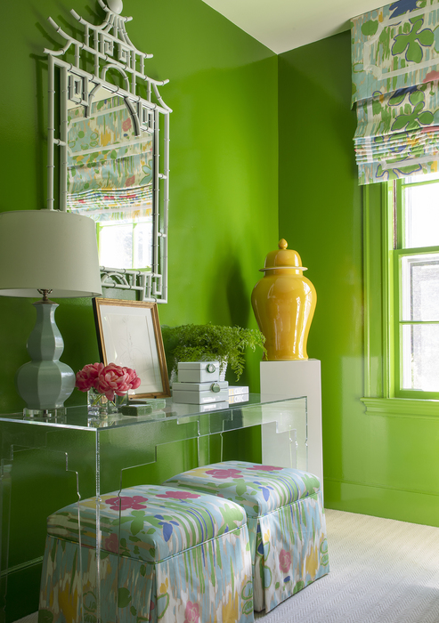
But Collins’ most creative stroke of all is in the home office, where she tapped into green’s higher-wattage side. “She wanted something bright,” recalls Collins of her client’s wish, “so we went with this Fine Paints of Europe green in a high-gloss finish on the walls, window trim, and baseboard. When you use a strong color, you don’t want stops and starts,” she continues. “You want it to envelop the entire space.”
Owner and designer both fell in love with the traditional floral Schumacher fabric, used on the office stools and window treatment. “It reminds me of patterns I saw growing up in Atlanta; it’s a fresh take on ‘granny chic,’” says Collins. An online find, the bamboo mirror with its pagoda motif was given a fresh coat of crisp white paint. The Lucite console lends a contemporary edge.
In her work across the North Shore and beyond, Collins doesn’t always get to use such saturated color. However, she feels that some homeowners are coming around to the idea, especially after spending so much time at home recently.
“Green makes this client happy—it’s her happy color,” Collins contends. “Who doesn’t want to feel happy when they’re at home?”
For more information, visit lwcinteriors.com.

