Renovating a small house calls for big ideas. When interior designer Justine Sterling was asked to spearhead the redo of a 1,500-square-foot Cape in Melrose, which included putting in a small new addition, her first step was to assemble a team that included longtime collaborators of hers—Stephen Reilly from SLR Architecture and local Melrose contractor Glen Mistretta.
“Every room was petite,” says Sterling, whose charge was to create a more open first-floor plan that included an eat-in-kitchen and dining area, and a mudroom with a side entrance accessible from the driveway. A deck off the kitchen was also part of the plan. By the time the project was completed, every room in the house had been improved upon in some way, whether it was simply a new coat of paint or cleverly crafted built-in storage. “When you enter the home now, it doesn’t feel like a teeny Cape anymore,” says Sterling.
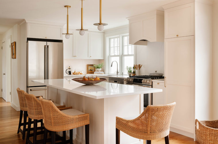
“The homeowners needed to turn the house into something that they loved,” she continues, sharing that the couple wanted to be able to observe and enjoy nature from the comfort of their home. In the new kitchen, both an oversized window and a six-panel glass door offer views to the backyard garden, which was a house-buying incentive for the couple. The kitchen is mainly a palette of neutrals—crisp, clean off-white cabinetry complemented by a full-height quartz backsplash and brass finishes. Rattan chairs and woven counter stools introduce texture into the scheme.
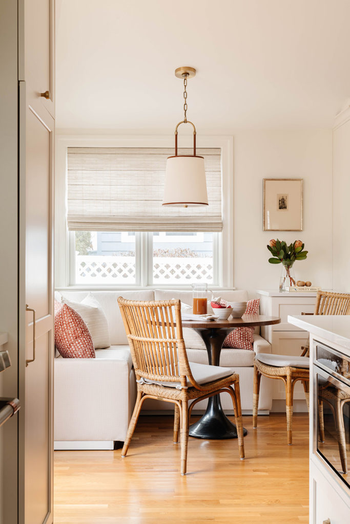
Adequate space for entertaining family, including young grandchildren, was also important to the homeowners. In the kitchen, Sterling designed a roomy, cushioned banquette that, she says, “looks more like a sofa than an ordinary bench.” The use of indoor-outdoor fabric, here and elsewhere in the house, is also a concession to the little ones, but given the high quality of durable materials these days, the stylish décor is in no way compromised.
“I’m a big proponent of having the colors, materials, and finishes help with the natural flow as you walk through a home,” observes Sterling. “I gravitate toward keeping the colors in a palette that will lead you from one room to another, especially when it comes to the walls.” Using Benjamin Moore paints, the kitchen’s Simply White walls and cabinetry transition to Edgecomb Gray in the mudroom and living room, all with ceilings and trim painted White Dove. For contrast, Taos Taupe was used on the three first-floor doors that lead to the outside.
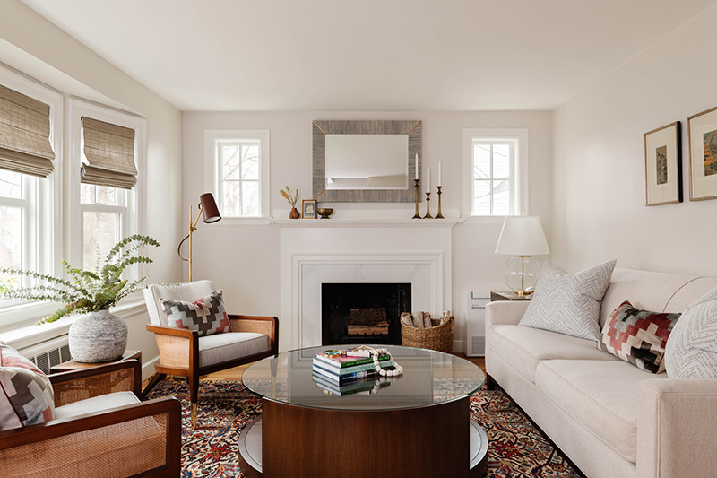
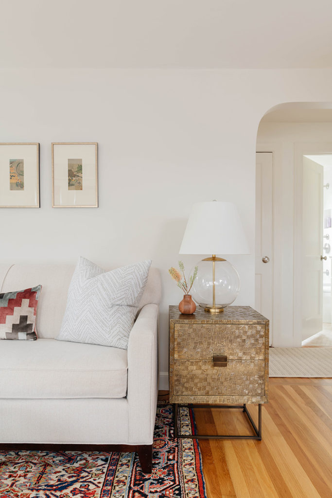
Against these neutral yet warm-toned walls and ceilings, Sterling placed repurposed and new furniture strategically throughout the house, often taking into consideration where splashes of color would add a nice pop. The deeper colors in the homeowner’s living room carpet, for example, served as a springboard for the pillow fabrics selected for that room. Impressed by the homeowners’ art collection, Sterling guided the selection, reframing, and positioning of pieces she felt worked best in the refreshed home.
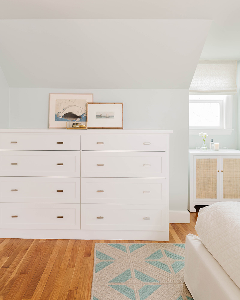
Though relatively small, the new addition brings a lot more open floor area to the home, which is a boon for the young, active children who visit. Without changing the square footage of the two bathrooms and the main bedroom, these spaces were also part of the overall project. All three were renovated with new cabinetry, finishes, and fixtures, and the main second-floor bathroom has a zero-entry shower. Sterling’s clean, minimalist approach to the project gave the homeowners a more streamlined interpretation of their main bedroom, with custom closets and cabinetry to address their storage needs.
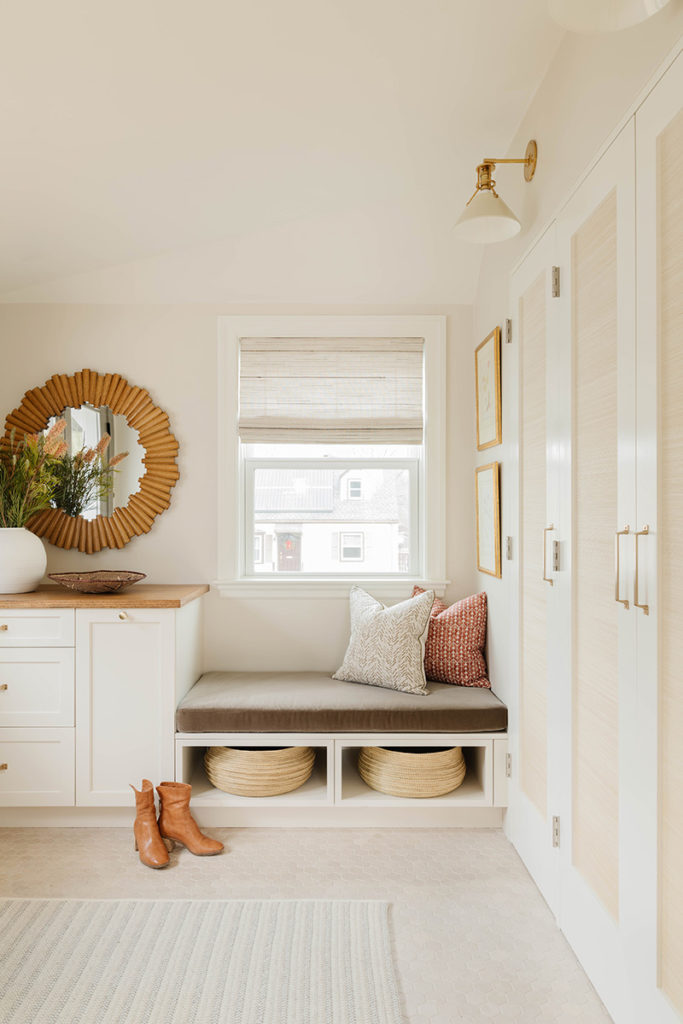
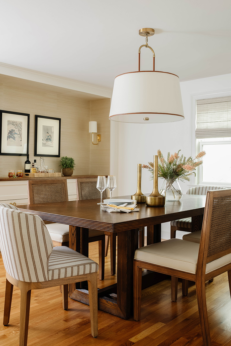
Limited storage throughout the house required the addition of custom closets and cupboards, starting with the mudroom. There, full-height storage hides behind grass cloth–paneled doors, and there are slide-out recycling bins for excess mail along with a drawer for keys as you enter the room. The new dining area, which connects effortlessly to the kitchen, includes a custom, wood-topped niche that provides a focal point as well as substantial storage.
Early on in the project, the homeowners felt they would redo the home office themselves. But, says Sterling, “they reached a point where, with everything looking so great, they decided there was no way they could do the office without my help.”

