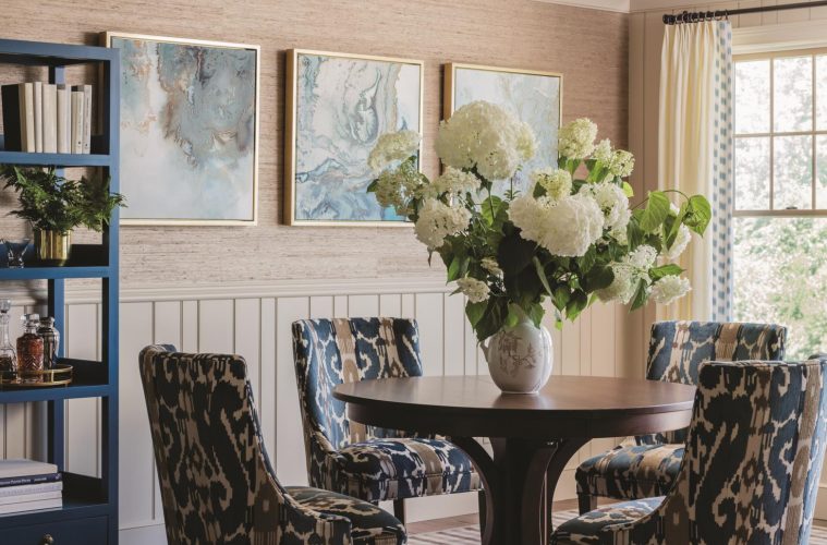
“What attracted me to the condo in the first place was the view,” says the wife, who bought the Amesbury unit in 2006 when it was brand-new. She lived there until she remarried in 2011 and moved to her husband’s house. Not wanting to part with the condo, the couple rented it out until they were ready to downsize three years ago. The appeal of less maintenance and the beauty of the hilltop location overlooking Newburyport guided them as they packed their things.
But they wanted the condo to truly feel like home. The first floor, which has a kitchen, living and dining areas, and a master bedroom suite, would be where they spent most of their time, especially as they got older, so they wanted to refresh those spaces and make them as comfortable and as spacious as possible, but also utilize them to their full potential.
“It was a matter of reorganizing the spaces so they are intelligently laid out and maximizing efficiency for daily living,” says interior designer Jenn Sanborn, who knew right away the elements that weren’t working. A wall near the entrance cut off the sight line to the back windows with the view. The entrance from the garage was unnecessarily large. The kitchen had too much distance between the sink, located on an awkwardly angled peninsula, and the stove. In the living room, a corner fireplace made the furniture layout difficult and the built-in cabinetry was bulky and dated, created for an older, deeper television. The master suite worked well enough except for the closet, which was too cramped for two people.
Sanborn, who owns Sacris Design in Amesbury, worked with carpenter Scott Fortin to come up with the idea of a floor-to-ceiling storage unit built into the central wall, which was fabricated by Advanced Custom Cabinets of Brentwood, New Hampshire. In addition to providing a space for items such as shoes and jackets, it helps define the kitchen and dining and living areas while still keeping them open to each other. With the stove and refrigerator along the wall on the far left, the pathway from the front door to the living room is clear and uncluttered. “Now when you walk in,” says Sanborn, who completed the project in 2017, “you see this spaciousness, this view.”
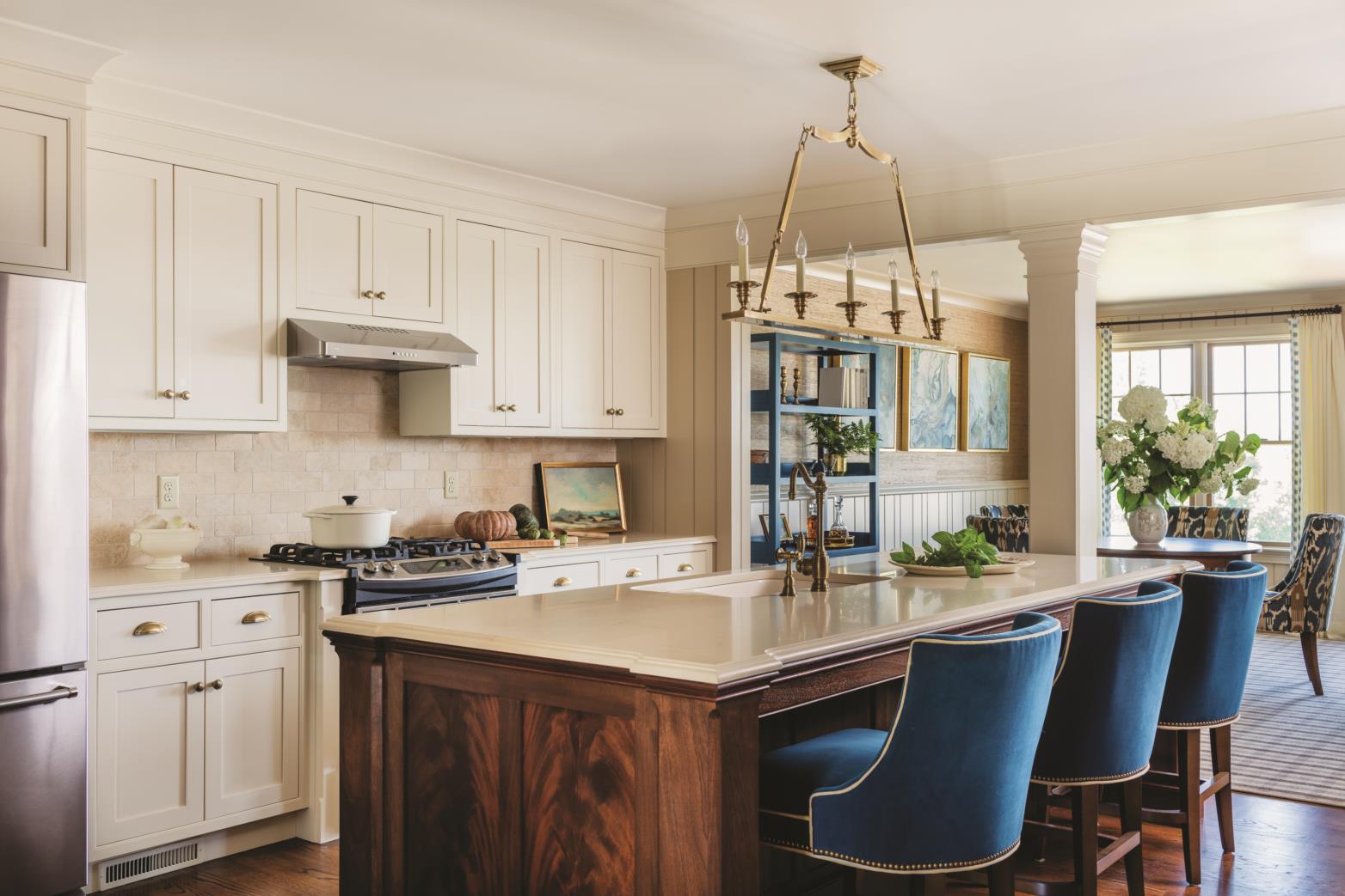
In the kitchen, cabinetry coordinates with the interior’s “warm almond with golden tones,” says Sanborn. For some color, they added peacock blue in the counter stools from Wesley Hall and the êtagére in the dining area. A powder room is by the front door and a small pantry is tucked around the corner, but at the center of the kitchen is a large custom mahogany island made by Advanced Custom Cabinets to look like a piece of furniture. “I took the millwork details for the island from an antique piece I had found,” says Sanborn, pointing out details such as the crotch end panels and stopped chamfered edges. It is topped with Caesarstone, and a pendant light from Visual Comfort hangs above. “I try to make kitchen islands special and unique to each project, because they are so important and are really where people come to gather,” says Sanborn.
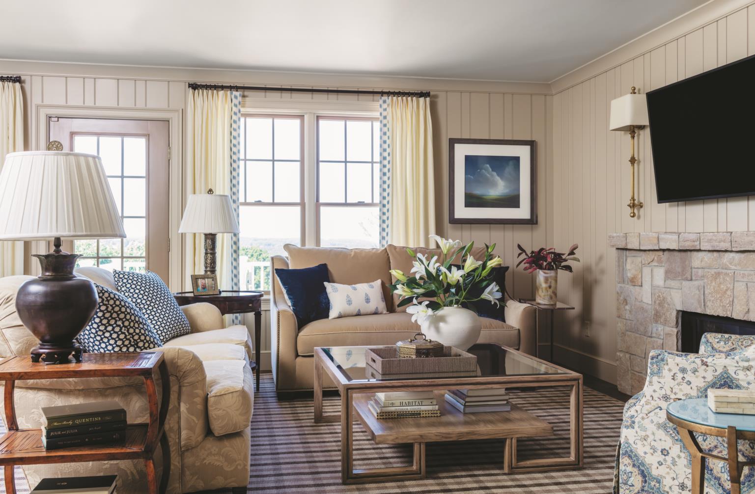
They ultimately decided to move the fireplace from the corner to the wall between the living room and master bedroom, which allowed the installation of a two-sided model. With the television above the fireplace, two sofas and an armchair fit comfortably. A round dining table has leaves so it can be expanded for guests, and a custom wool check rug from Stark is underfoot. Between the windows, a door leads to the deck, which was enlarged during the renovation. “Now there’s even more of a view,” says the husband. “You can see Plum Island from the new portion of the deck.”
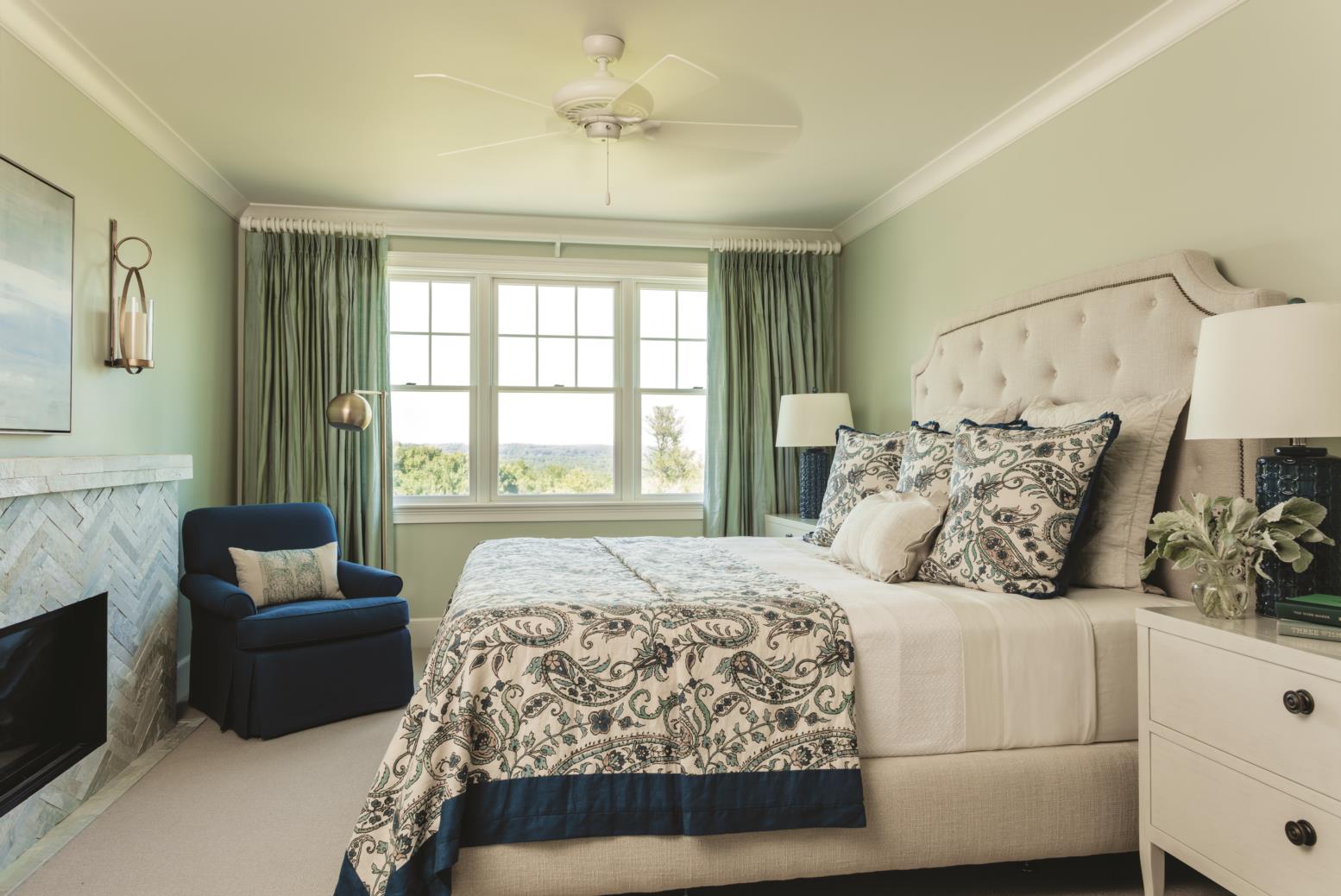
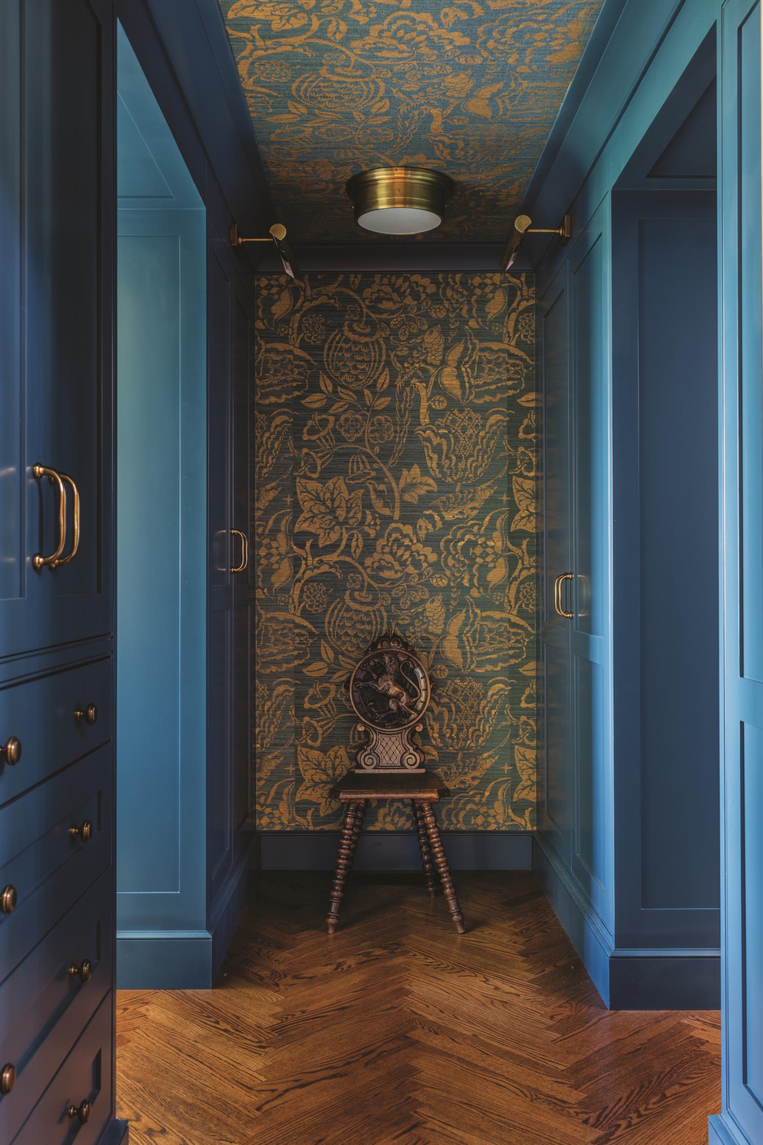
A new dressing room fixes the problem of not having enough closet space. With the bedroom to the left and the bathroom to the right, it can be easily closed off from the living room with a pocket door. But with its herringbone wood floors, peacock blue wood and millwork, and Schumacher wallcovering, the room is a beautiful focal point. Sanborn designed a closet system, made by Advanced Custom Cabinets, for the room that takes advantage of every square inch, and then turned the bedroom into a haven with a herringbone stone fireplace, serene palette, and windows that overlook the view.
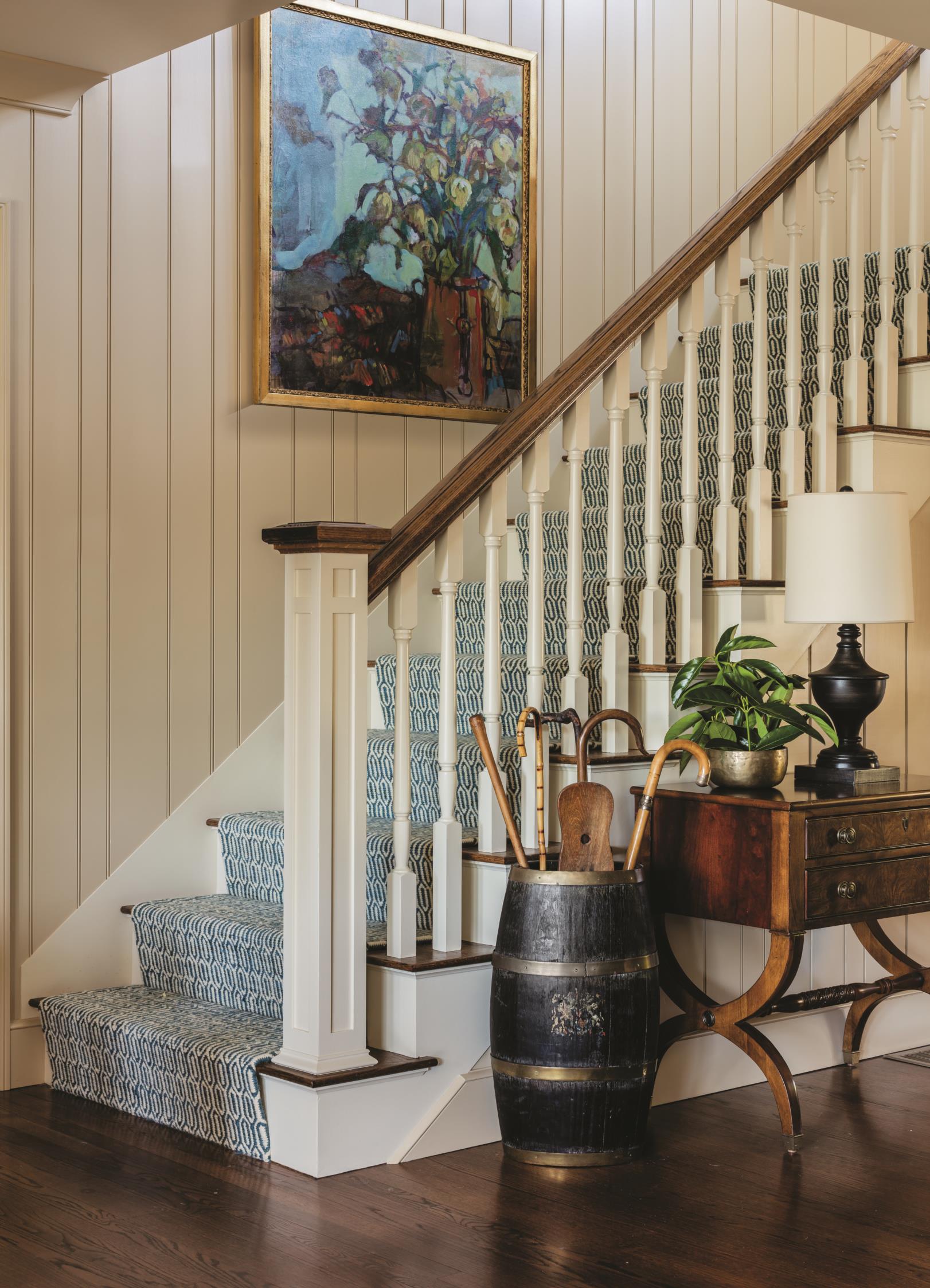
“Coming from a much larger house, we haven’t felt like we need more space,” says the wife, who used the feeling of an English cottage to guide the overall look. Variegated millwork in three widths adds coziness and character to the walls. They didn’t want bright white millwork, so they painted it Shaker Beige by Benjamin Moore. Red oak floors have a walnut stain, and the rustic stone of the fireplace and tumbled travertine backsplash tiles add to the country vibe. Sanborn brushed the fireplace grout with watered-down paint to get the lighter color just right. “It’s not exactly big,” says Sanborn, “but it makes a big difference. I take my projects very personally.”
Upstairs there’s a family room and guest bedroom and bathroom, and downstairs there’s an office, laundry room, and storage closet, but the couple, as they envisioned, spends most of their time on the main floor, with its newly styled and reconfigured spaces. “We love it here, and Jenn made it better for two people to live in,” says the wife. “We could basically live on just this floor, which was the goal.”
Interior Designer: Sacris Design, 978-388-5948, sacrisdesign.com
Carpenter: Scott Fortin of South Hampton, New Hampshire
Cabinetry and millwork: Advanced Custom Cabinets, advancedcustomcabinets.com
Counter stools: Wesley Hall; wesleyhall.com
Countertop: Caesarstone; caesarstone.com
Backsplash: Portico Fine Tile & Design, Greenland, NH; porticofinetile.com
Pendant light: Visual Comfort; visualcomfortlightinglights.com.
Rug: Stark; starkcarpet.com
Dressing room
wallpaper: Schumacher; fschumacher.com
Paint colors:
Variegated millwork: Shaker Beige, Benjamin Moore; benjaminmoore.com
Master bedroom: Sea Salt; Sherwin-Williams; Sherwin-Williams.com
Dressing room millwork: Blue Danube; Benjamin Moore

