To see the “before” picture of the 100-year-old home in Manchester-by-the-Sea is to experience the true meaning of plain. Designed as a foursquare—popular in the early 1900s as a reaction to the ostentatious Victorian era—the house in the photo is dark, flat-fronted, and boxy, the exterior punctuated with small, uninspired windows. Further masking the home’s identity was an addition and mishmash of architectural details done in the 1970s and ’80s. But with a little imagination, it’s clear that even then, the house had a good dose of New England grandeur, especially in its grand old bones.
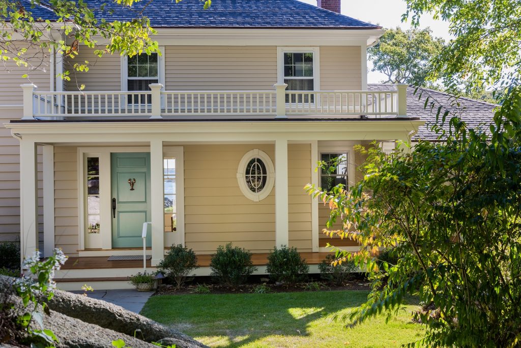
Under the guidance of architect Rob MacNeille and interior designer Anne T. Alberts of Carpenter & MacNeille in Essex, the home’s New England vernacular has morphed into a genteel, classic Cape Ann. The transformation didn’t come easily; MacNeille and Alberts gathered all their resources—including the creativity and craftsmanship of the firm’s woodshop, C&M Woodworking—and got to work.
MacNeille, the firm’s president and design principal, created a new floor plan, which added several new rooms, including a light-filled conservatory and an above-garage game room, and introduced a new openness and easy livability. But Alberts and the Carpenter & MacNeille interiors team had more influence over the gleaming interior’s fine points, coordinating architectural features as well as color schemes and other aspects of the design.
“The house had personality, but it was a jumble of details,” Alberts recalls. “We had to clarify to make it more in keeping with what the clients wanted—a coastal, inviting retreat they could call their own.”
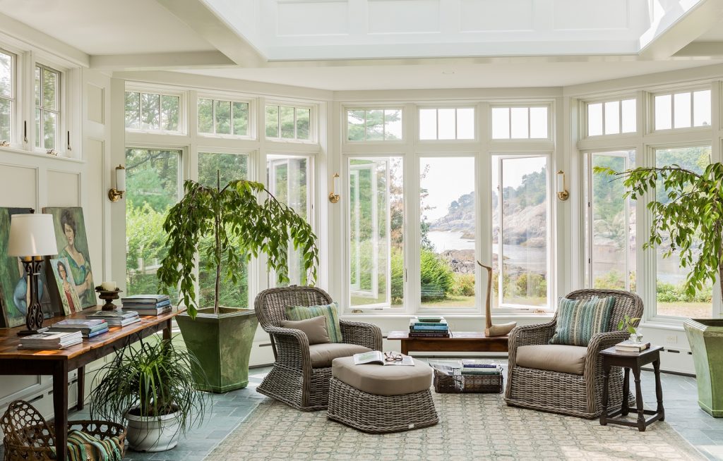
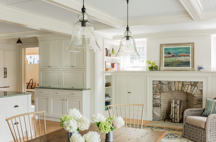
Alberts and MacNeille focused on the home’s first-floor common spaces. The kitchen and dining room were combined to produce a spacious family area, which now opens to a sunny new conservatory with an expansive bay window that reveal a spectacular view of the rocky cove beyond.
“The whole project was focused on the view,” Alberts says. The star of the show is the conservatory, with a large central skylight and bay window that open to the ocean. With the stunning bay, transom windows, and doors that open to a deck and then a small patio, the room is awash in light, the soft green walls changing throughout the day. “We made the windows as big as we possibly could,” Alberts says, “and we aimed at making it a beautiful paneled room.”
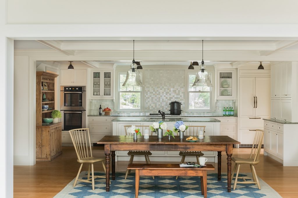
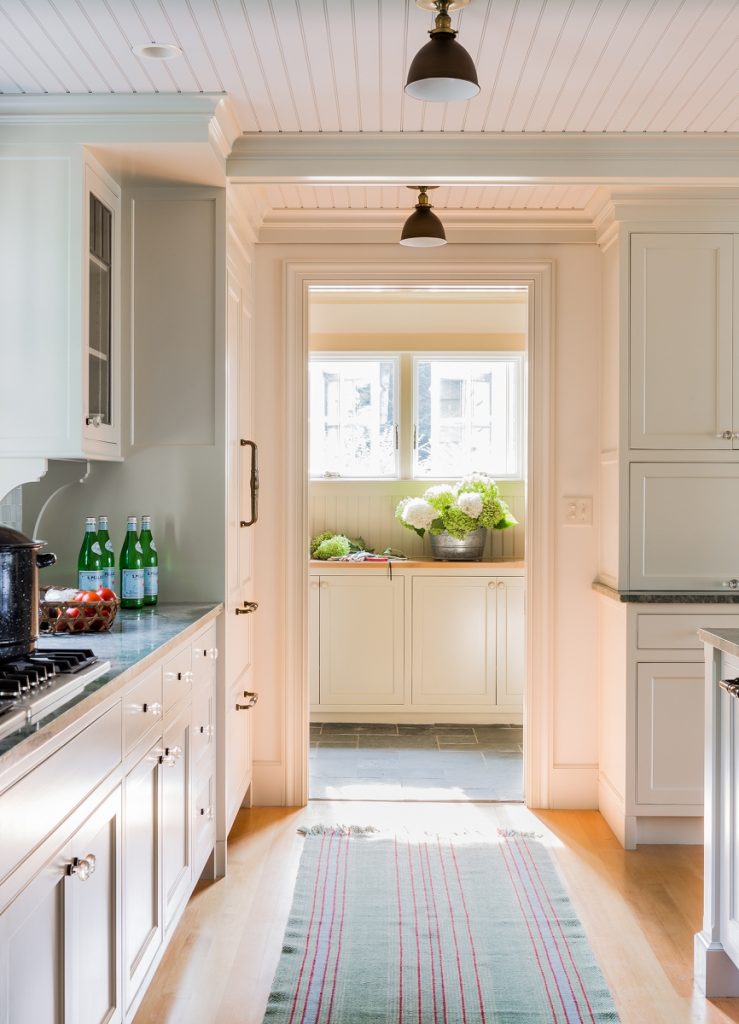
The paneling, window casing, and crown molding—all crafted by C&M woodworkers—along with a color scheme dominated by a lovely seafoam green, unify the entire first floor. “She, in particular, is a fan of seafoam, teal, and turquoise,” Alberts says of the homeowner. The color preferences worked perfectly with the natural colors outside, including the ever-shifting blues and greens of the ocean, rolling terrain, and rocky ledge. While nature changes constantly, “the coastal seafoam shade is there throughout the year,” Alberts says. The shade reappears in the soft green slate on the floor of the conservatory and nearby mudroom. “The slate was important; we wanted it to feel like it was local to New England,” Alberts says. “Slate wears really well and creates a patina that makes it look like it’s always been there.”
The slate had a big role in helping to refine the home’s “story.” Alberts and MacNeille talk deeply with homeowners to determine what kind of house the clients want to spend their lives in. Another big piece is aspects of the past, especially when remodeling historical houses. To express that, designers at C&M are fond of creating a story around each house that helps lead the planning. “We enjoy creating a unique narrative for each home,” Alberts says. “We wanted the sunroom and mudroom to feel like they had always been here.”
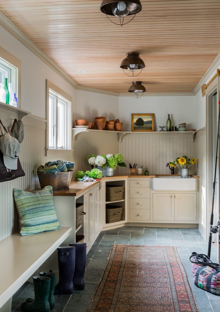
One of the most intriguing spaces is the mudroom, which connects the garage with the kitchen. With beadboard walls capped with a shallow-depth shelf and custom brackets, and painted plaster above, the room echoes the past without sacrificing a refined, polished tone. “It might have been a breezeway that was closed in,” Alberts says. “It’s relaxed but very tailored.”
Nuanced detailing in the interior and exterior is subtle but makes a major impact. In the remodeled powder room off the entry hall, an oval window with divided lights is a beauty. For the stone fireplace in the dining room—which the homeowners had requested—Alberts and other the Carpenter & MacNeille staff scoured sources to find stone with the right scale, proportion, and shape to work with the paneled room and reflect the physical setting. “They could have been plucked from the beach outside,” Alberts says. A custom-made balustrade above the new front porch shows how fine craftsmanship fits with high-caliber architecture.
Today the house, with all its elegant refinement, evokes a hearty, practical New England spirit. As Alberts says, “It’s not too fussy and not too plain. It’s a fun house.” The homeowners, empty nesters who often host visiting children and grandchildren, have found the house for creating their own story. Says Alberts, “They love it.”
Carpenter & MacNeille
978-768-5618
C&M Woodworking
978-768-0106
carpentermacneille.com/portfolio/cabinetary-and-millwork

