Designing a neutral-colored kitchen won’t leave you with a lifeless room if you make an effort to choose interesting textures, fine finishes and other details that provide visual interest without bright hues. These 6 tempting examples should fire up your creative engine and put you on the road to neutral nirvana.
.jpg)
Kitchen 1: Alex Maguire Photography, original photo on Houzz
1. Show your metal. Like unpainted wood, stainless steel is a neutral with textural interest. These metal cabinets are an industrial-inspired choice reminiscent of a commercial kitchen. But with inspired additions like marble-look countertops and apothecary-style cabinets, the effect is eclectic and elegant.
.jpg)
Kitchen 2: De Rosee Sa, original photo on Houzz
2. Style with subtle stripes. For fuss-free detailing that will soup up a simple kitchen, consider shiplap-style paneling. Here, vertical panels clad the whole cooking area, creating architectural interest without the need for strong color. Medium-density fiberboard is a good choice for cabinetry and walls, as it won’t warp like wood and can become moisture-resistant with a durable paint.
.jpg)
Kitchen 3: Crown Point Cabinetry, original photo on Houzz
3. Bring in tile. With so many tiles to choose from, it can be tricky to make a decision. Subway tile is a classic choice that will work with almost all kitchens, from traditional to contemporary. For future-proofing, stick to smaller, slimmer styles, which tend to look more timeless.
The tactile beauties here have a handmade quality that enhances the rich hue of the wooden cabinets.
.jpg)
Kitchen 4: Alex Maguire Photography, original photo on Houzz
4. Dabble on the dark side. Remember that neutral doesn’t have to mean nondescript. Saturated shades like black and gray will give your design historic appeal. Consider combining dark cabinetry with light walls to avoid making the room feel too enclosed. Copper is a characterful choice for the backsplash, merging traditional and contemporary ideas.
.jpg)
Kitchen 5: 1st Option, original photo on Houzz
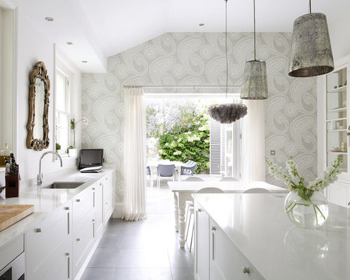
5. Pick the perfect paper. <a href=”http://www.houzz.com/ideabooks/18218537/list/cant-find-the-right-wallpaper-make-your-own”>This wallpaper’s soft hue</a> and large-scale paisley print are seriously sumptuous, particularly when partnered with an all-white Shaker-style kitchen. Antique accessories, such as a carved mirror and mercury glass pendant lights, produce a luxuriously layered effect.
The Case for Using Shaker Cabinets Today
.jpg)
Kitchen 6: Nathalie Priem Photography, original photo on Houzz
6. Make magic with mirrors. In a one-color kitchen, small details can make a big difference. When cabinets and walls are the same shade, it blurs divisions in multiuse spaces, and you need special finishing touches to provide a little extra oomph. Here, brass handles and a mirrored backsplash impart shine, lift light levels and set off the soft gray palette.

