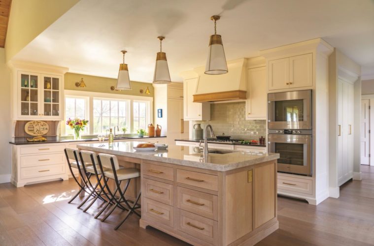
This sunny kitchen sheds light on the meaning of a functional and beautiful space
When an Essex couple first approached Paula Accioly, they desperately needed a fresh set of eyes. It was 2016 and the couple was in the midst of planning their first shared home, built on a site brushing up against marshlands and all order of natural beauty. But there was one major hiccup: they weren’t fond of the kitchen, a vanilla-looking design centered on an L-shaped layout, a seen-it-before island, and unexceptional details.
After switching architects, the couple visited the Boston showroom for Jewett Farms + Co., where Accioly serves as lead designer and showroom manager, for a dose of inspiration. In the showroom, they beamed over the cabinet joinery, discovered ideas for woods and finishes, and departed with a new designer for their perfect kitchen. “These clients saw what we did and said, ‘I love this. Now please make something that will work for us,’” Accioly says. “They really trusted in what we would design for them.”
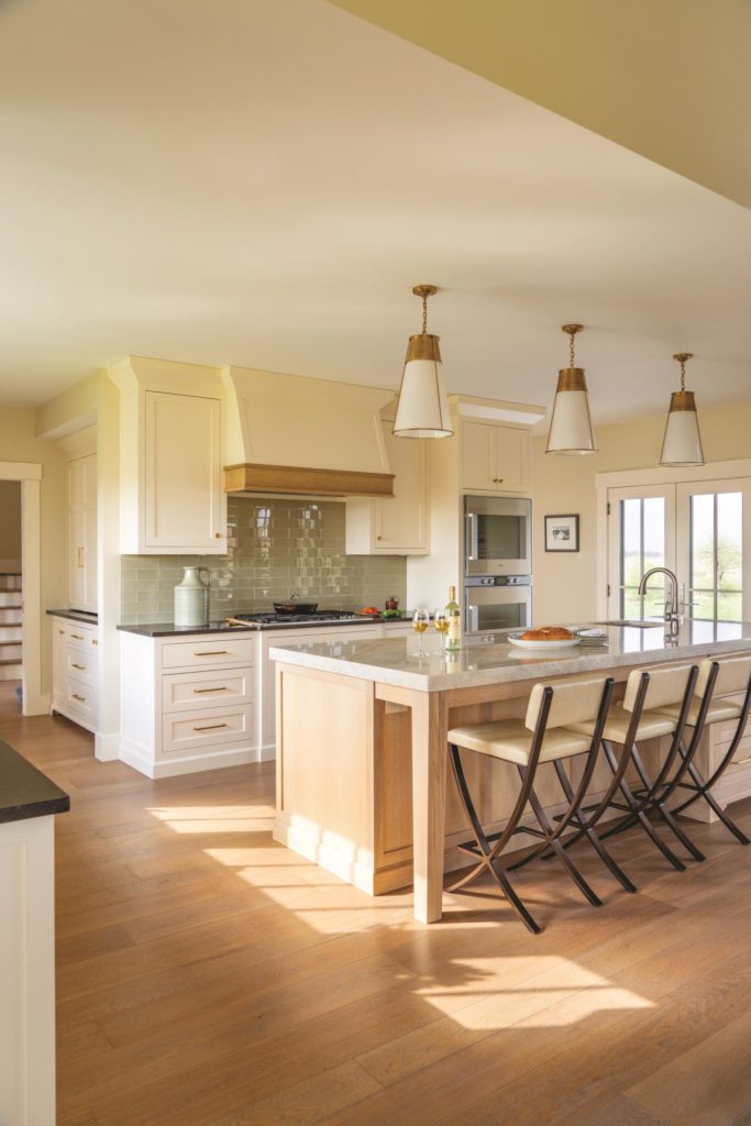
Before finalizing plans in September 2017 and completing the project in late 2018, the kitchen design evolved out of a fruitful, unique collaboration. Elaine Scales—the architect from Jamaica Plain-based Scales Architecture, who took over the project and substantially changed the bones of the home—worked with Accioly to complement the new vision for the kitchen.
They shrank windows to make room for a larger hutch, resized doorways and pushed back walls to free up space for a breakfast area, and emphasized views of the outside scenery wherever possible. “I always find that being introduced to a project in the beginning can impact the kitchen design a lot,” Accioly adds. “Instead of figuring out how to fit cabinets into an existing environment, our input in the layout prior to that creates a much better space.”
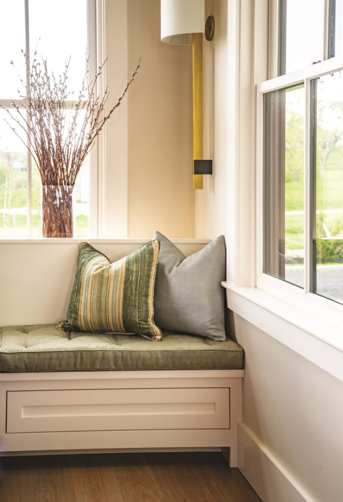
The result is a timeless, classic New England kitchen with Taj Mahal quartzite-topped island, banquette, hutch, and a host of other features—a place for cooking and entertaining with an emphasis on symmetry. Along with reducing the numbers of drawers and doors (and beefing up their size) and incorporating appliance panels to achieve a more cohesive look, Accioly used a unique approach to cabinet design: inset cabinets with a single-face frame. “This gives the cabinetry the look of built-in-place furniture,” Accioly says.
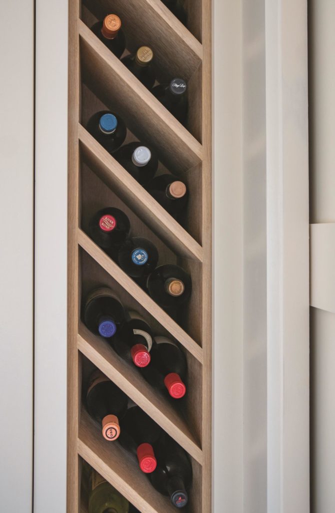
Rift and quartered white oak with rubio finish is a motif throughout. Beyond the island, strategically placed wood accents appear around the hood, inside the hutch, and the parallelogram-patterned wine rack. Understated crown moulding, simple Shaker doors, and a neutral color palette ensure that the kitchen complements the stunning natural scenery outside.
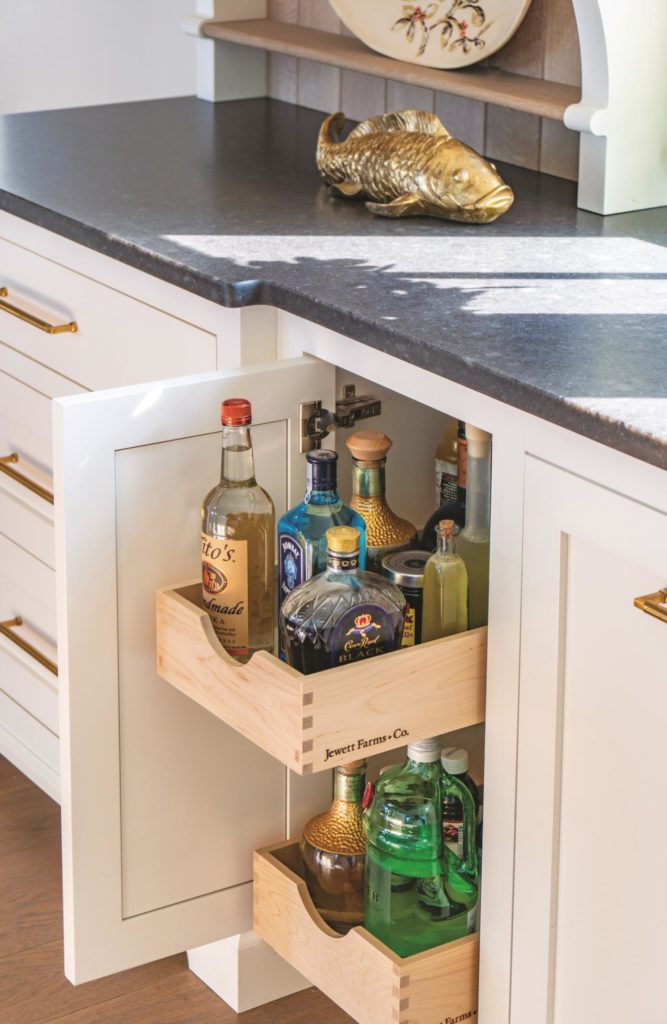
Though there are few upper cabinets, there’s no shortage of storage. A large pantry hides food and small appliances. Island drawers outfitted with inserts and rollouts maximize the space. In the breakfast area, bifold pocket doors hide the coffee machine, toaster, and other morning essentials. “Even though they don’t have a lot of uppers, they have a place for everything,” Accioly says.
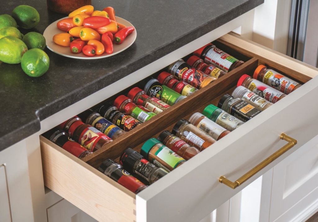
And while the couple’s initial emphasis on symmetry in the kitchen still shines through—most dramatically around the range and sink—Accioly convinced them to occasionally relent when it meant greater functionality. For instance, the dishwasher is located closer to cabinets where silverware and plates would be stored.
“They were very open to new ideas,” she says. “As we walked through the design they discovered that, if the sink is two inches to the right, symmetry isn’t as important because it’s going to function better. It’s always a combination of making it very beautiful, but also very functional.”
In the months since the kitchen was completed, the couple has been overjoyed with the finished product—Accioly says they’ve told her they consider it the best part of their home. “In the end, this was a fun project,” she adds. “When you’re open-minded and people trust you, you can create something they’ll love.”

