This handsome 1890s Melrose Victorian had seen an early 1980s kitchen renovation.
“A bad one,” says Kathy Marshall, the Wenham designer whose stylish and functional kitchens are an ongoing feature of “This Old House,” the venerable PBS television show.
“That was the bad news,” Marshall says. “The good news: Nothing else was touched.”
When the current owners, a couple with four young children, approached Marshall for design help, she knew her first order of business. “To get the character back,” she says.
The homeowner wanted clean, organic style in a family kitchen that looked as though it had always been there while providing the ultimate in function.

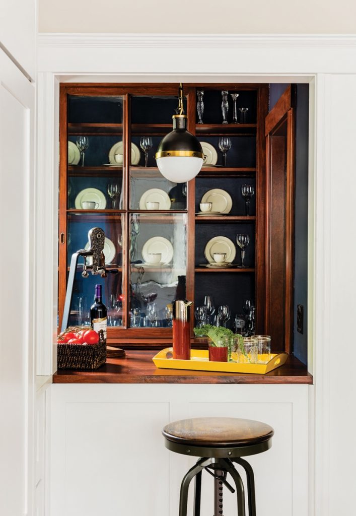
To that end, Marshall designed a handsome new kitchen that, while providing much-improved cooking and storage facilities, also connects to some of the house’s handsome historic elements. One of those is a butler’s pantry that boasts the sliding doors’ original 100-year-old wavy glass.
“The pantry was only accessible from the dining room,” Marshall explains, “so we created a pass-through from the kitchen. It’s functional, but also opens the kitchen up to a view of the cabinet doors while connecting it to the rest of the house, stylistically.”
For unexpected and effective graphic punch, the shelves and rear walls of the pantry were painted a deep navy blue. Marshall also exposed a brick wall for texture and interest; it is the rear of the brick fireplace wall that serves the dining room. She removed the cladding from a boxed-in staircase and added a mudroom.

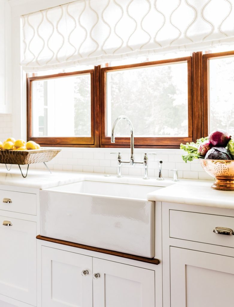
“When you have kids, you need a proper mudroom,” she says. She called for a sunny yellow stenciled pattern for the mudroom floor, while the flooring in the kitchen proper is random-width wide-plank pine, stained a dark walnut color. Throughout, dark wood tones speak of the woodwork in the Victorian house: The window muntins are painted dark brown, the recessed workstation has a dark walnut countertop, and the interiors of the custom cabinets echo those tones with dark wood sides and dividers. A subtle but important element is the dark wood bullnose at the bottom of the apron sink.
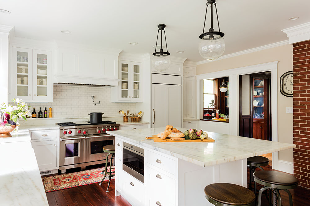
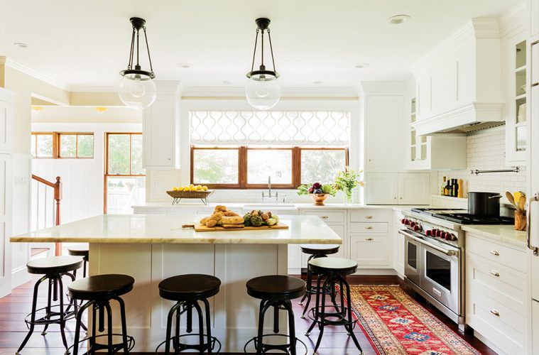
“That’s to make the sink look like it’s resting on something,” Marshall says. “So often, sinks are installed so they look as though they’re just hanging there.” The large central island, topped with a white marble slab and surrounded by black metal stools, was an essential element for homeowners who like to entertain informally.
“They wanted an island where they could seat a lot of people around it,” the designer explains. “This way, they can have a dinner party, but not in the dining room.”

Marshall also used white marble to top the perimeter counters.“The stone was sealed before it was installed, but the homeowner understands that with time, it will stain and etch,” she says.
Behind the 48-inch gas range, subway tiles form a traditional hard-wearing backsplash. Near the stairs are new food storage drawers; there is also a new coffee station and wine fridge. The lighting is simple, as befits an old house. Glass globes descend over the island, while task lighting is provided by recessed ceiling cans and under-cabinet lights. In historic kitchen fashion, the sink is positioned to provide natural light and views via a large window. Here Marshall used sheer linen with a geometric weave to create a simple Roman shade.
“A young family lives here, so the kitchen has a fresh feel,” she says. Fresh and functional, the kitchen is nonetheless tied into the historic fabric of the house in a way it has not been for many years. It is the best of both worlds.
K. Marshall Design
300 Main Street, Wenham, 978-468-7199

