Paul Lohnes grew up with his eye fixed on the house on Bass Rocks Road in Gloucester. With grit and gumption, he managed to make it his. And for the last 30-plus years, he has been resident renovator. He and his wife, architectural designer Jessica Pineo-Lohnes, started in the kitchen and haven’t stopped since.
Located adjacent to good harbor beach on the iconic Sherman’s Point—the subject of innumerable paintings and postcards—the Lohnes residence sits center stage among five houses on the point. The rolling 3.5 acres served the original owner as a small golf course. Today, the landscape has been cultivated, a granite wall erected along the property line, and an expansive lawn added to meet rocky outcroppings and dramatic drop-offs overlooking the Atlantic.
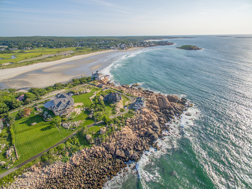
The site is the first of four components that Pineo-Lohnes says contribute to the success of the design program. “i always think of the house in terms of the site—where and how it sits.” Second is the original portion of the house, a shingle-style timber-frame structure with tudor details built in 1906.
The overarching compositional harmony, says Pineo-Lohnes, was achieved by layering “the site, then the original architecture, then the preservation of that architecture, then the newer design elements—in that order.” The challenge was to add onto something so “strong and elegant” and to enhance that elegance while bringing it up to date for modern living.
Pineo-Lohnes finds it difficult to talk about the house strictly from an architectural point of view; being so close to it, she describes “the experience” of the house more readily than its individual features. In fact, experiencing the house is something the couple invites hundreds of people to do each year. Much of the inspiration for its layout stems from a desire to accommodate their annual family party as well as weddings.
When a fire destroyed what was once a three-car garage with an apartment above, they reconfigured the space to be a four-bed/two-bath duplex apartment—ideal for hosting gaggles of guests. The post-fire design and construction proved an interesting opportunity for Pineo-Lohnes, whose schooling was in modernism. “i tried to work within the concepts of traditional shingle style,” says the designer. “i taught myself about the style and what is important to the design. Symmetry is important, but in this particular house, it’s not so much about symmetry as it is about balance. What makes it work is an overall balance, with localized symmetries that give it a playfulness.”
Designed “in the round,” there is technically no backside to the house. “it’s a 360-degree home,” says Pineo-Lohnes. “it’s really hard to decide which is the front or backyard.” One end of the house faces the beach, another side looks out over the ocean, and the traditional front entry on the veranda, which is not often used, overlooks Atlantic avenue. “because of that 360 requirement,” explains Pineo-Lohnes, “you have to think about every view you are going to get. Even though you are designing every face, when you start to see it in perspective and from the angle down below—it always had a presence, but now it has even more of one because of the tower i put in at the new entryway.” That vertical element offsets the sprawling horizontals; it was erected to balance the long length of the newer portion and tall height of the main house. The effect makes Pineo-Lohnes muse: “i always want to call it ‘the gables’ now because there are so many gables.”
.jpg)
Although it was once strictly a summer home, they added much-needed insulation and radiant heating throughout to extend the season. Waterproofing was another priority. “it was a constant source of anxiety—we’d have leaks all of the time,” recalls Pineo-Lohnes. The slate roof that was put on 20 years ago was a little too heavy and had not been properly installed. “the environment there is really intense, so things rust quickly,” she notes, mentioning the too-short non-galvanized nails that had been used on the roof. They have been very pleased with the replacement roof, which is made of rubber that simulates slate. Another waterproofing measure—soldered copper detailing around every window’s outside frame—turned out to be an architectural delight as well.
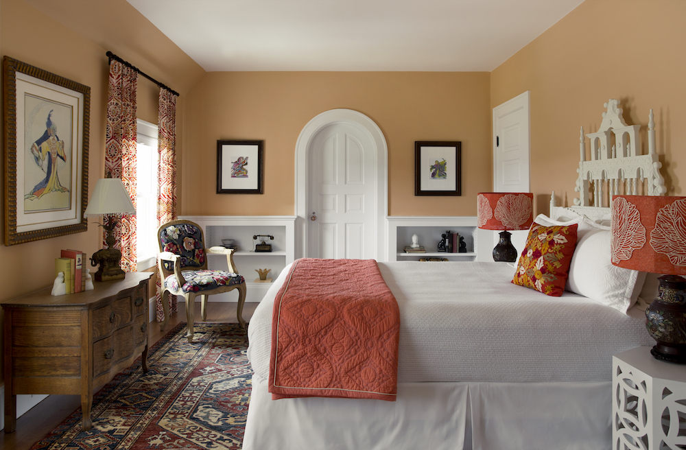
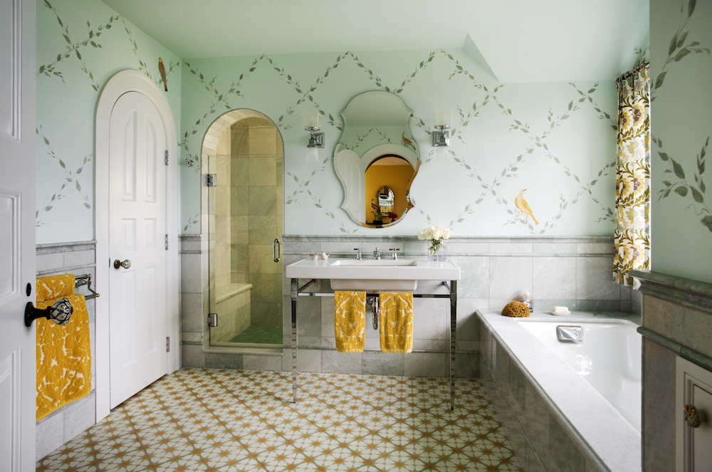
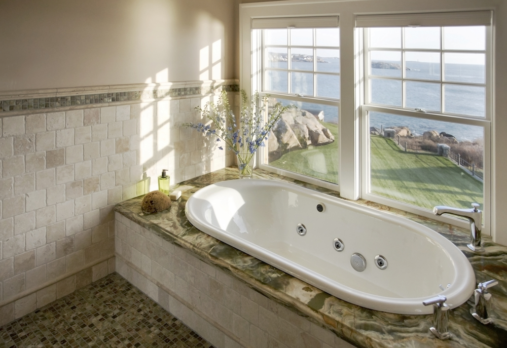
The main house includes seven bedrooms and an equal number of full baths plus four half baths—again, to accommodate large groups. Each of the bedrooms is themed and made personal with painted works by Susan McCann. In some instances, Pineo-Lohnes chose materials that would have been in keeping with people’s interest at the turn of the 20th century, when there was a growing appreciation for foreign imports and aesthetics. “i designed with materials that, were easy to get at that time, people would have used them. So, each room has its own character—there’s an Asian room, a bird room, Scandinavian room.”
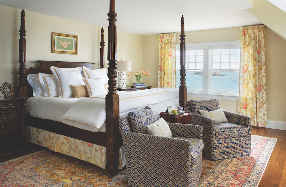
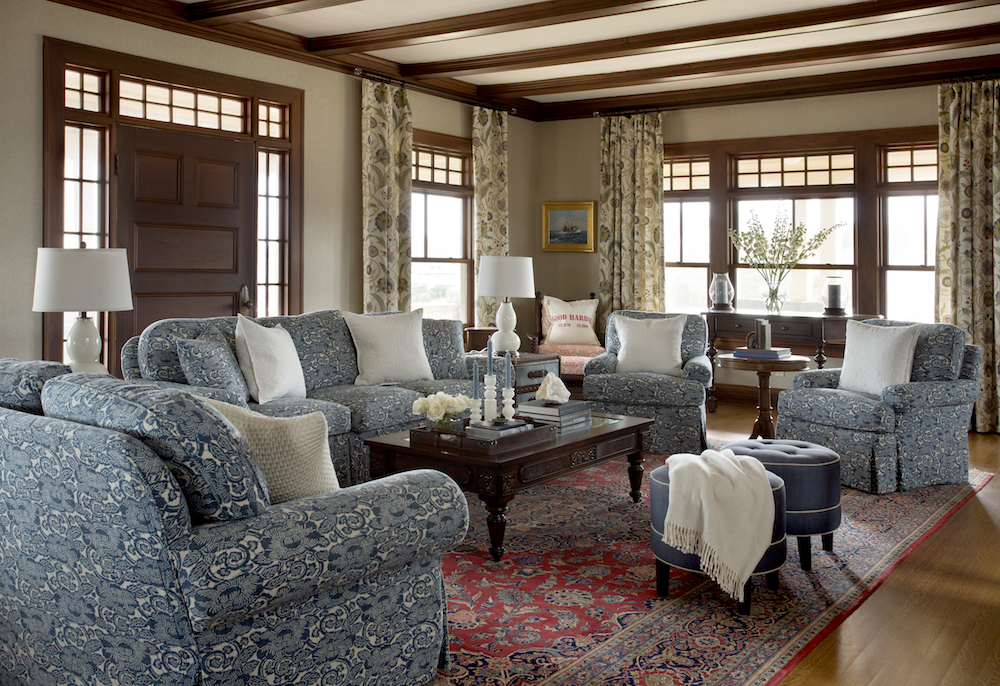
Pineo-Lohnes describes one of people’s favorite rooms as a “mini suite” that includes an exterior alcove designed out of an old widow’s peak—arguably, it enjoys the best view from the house. Other rooms of note include the formal dining room, which functions well for events; a restful semi-formal living room with a tertiary music room; and a third-floor billiard room and office with a large gothic-style window.
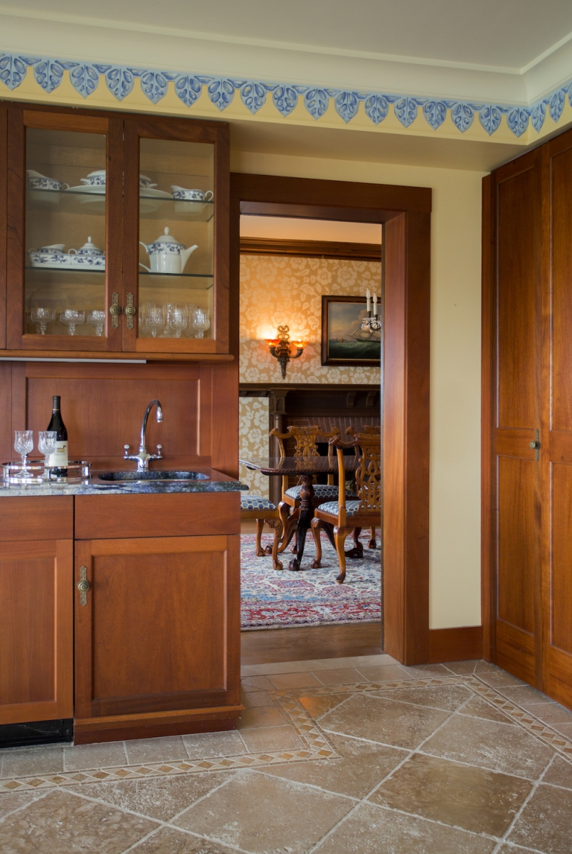
Inside the new main entry, located beneath the tower, a warm and friendly “caterer’s kitchen” features van gogh granite countertops, mosaic moorish tiles from morocco, mahogany cabinets, travertine floors, and a tongue-and-groove cedar ceiling. “it doesn’t look like a caterer’s kitchen, but it functions like one,” notes Pineo-Lohnes. There’s also a locker/changing room to accommodate sandy beachgoers. “there were a lot of practical decisions we made for the house.”
Pineo-Lohnes is quick to credit the craftsmen with building a house that is “as solid as a rock,” noting that it is equally, if not more, beautiful close up for its fine-grain level of detail. “everywhere you look, it’s like a finely hemmed dress.”
