Since moving to downtown Marblehead seven years ago, Sarah Golombek and Bryan Laskowski have been renovating their 3,900-square-foot antique home. Throughout the process, the couple took care to ensure that the house reflects their personalities and serves their young family. “We didn’t want to wait until our kids were grown to have nice things,” Golombek says.
The kids, who are five and eight years old, have the run of the place. Literally. “The new layout is great for hide-and-seek,” Golombek says. “It makes the best use of the space in a way that I couldn’t have imagined on my own.”
Golombek credits Carly Blackmore, founder of Habitat Design, with finessing the floor plan, among other things. Golombek first enlisted the designer’s help about five years ago with a project that took an unexpected turn. They had met at their daughters’ dance class two years prior. “Carly understands my scientific mind and my whimsical personality,” Golombek says.
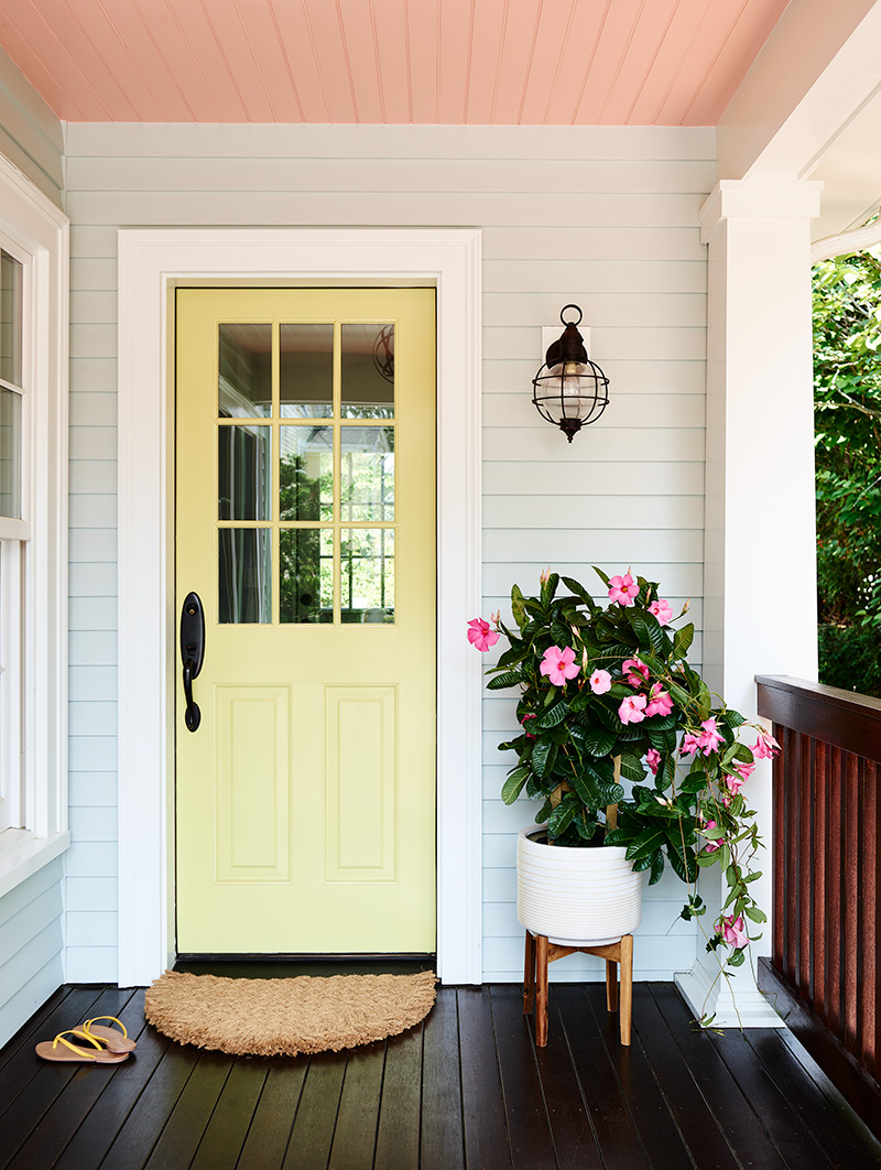
Intent on making a statement inside and out, the couple asked Blackmore to devise a color scheme for the home’s exterior. Using the interior palette as a jumping-off point, along with the colors that Golombek favors in her wardrobe, Blackmore painted the front and side doors an unexpected shade of chartreuse. The color brings cheer right into the entry hall, along with the same antique brass lobster knocker that Blackmore hung on her own front door. A Dash & Albert indoor/outdoor rug in a lively graphic pattern inspired by a palace in India, stretches color up the stair.
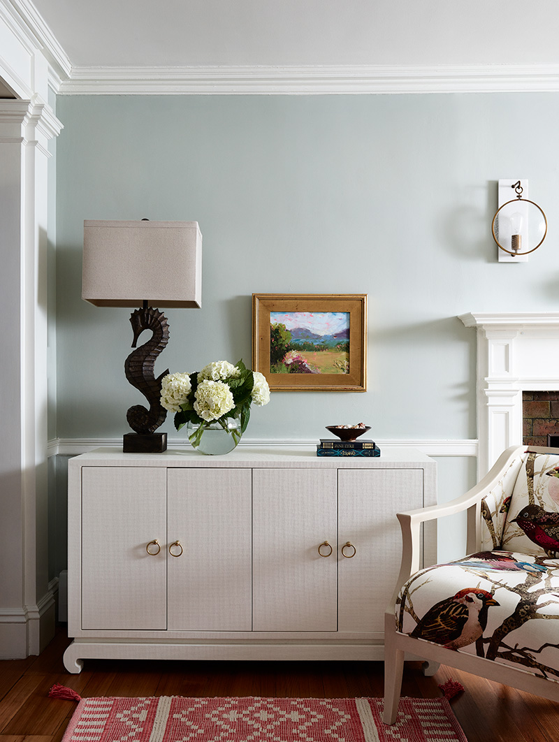
To the right, the formal living room is anything but. “The kids play in here all the time,” Golombek says. “The room is full of toys, you just can’t see them.” Blackmore made sure of that by stationing a lacquered grasscloth cabinet with chow feet by Bungalow 5 beside the fireplace to tastefully contain the clutter.
In terms of aesthetics, Blackmore took cues from the misty gray/blue walls. “We kept the coastal location in mind, but not in a typical way,” Blackmore says. “Sarah has a wicked sense of humor; I wanted the colors and textiles to reflect that.” Sparrows2 by Kravet Couture spoke to the homeowner immediately. Blackmore used it on an armchair, then added a pair of Chinese Chippendale chairs lacquered in robin’s egg blue with apricot jacquard cushions. The sofas and rug remain neutral, allowing the accents to pop.
To remedy the room’s flow, or lack thereof, the team broke through the wall on the other end of the fireplace. The new opening leads to the mudroom that the couple was adding to the side of the house. Blackmore also tucked a closet just beyond the opening. “This used to be a dead-end room,” the designer says. “Now you can meander to the mudroom and into the family room and kitchen.”
Blackmore outfitted the mudroom, which boasts a radiant heat floor, beadboard, and built-ins, with accessories that tie to the living room. A cushion made from a modern, magical toile with Asian flavor in persimmon, mustard, and blues tops the bench. The mudroom is the family’s primary entry point, and a lifesaver with two little ones. “There wasn’t even a coat closet on the first floor before,” Golombek says.
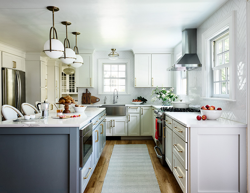
The biggest change was to the cramped, dysfunctional kitchen, where an oddly angled peninsula with a hulking hood separated the cooking space from the breakfast area, which in turn impeded access to the deck. The new setup has quartz counters that run along the side and back walls, hugging a hydrangea-blue center island with four Serena & Lily stools. “I like dinner parties that are communal events where we prepare the food together,” Golombek says. “With this layout, I can have butcher blocks on either side of the range looking out the windows, or two mixers for baking an army of gingerbread.”
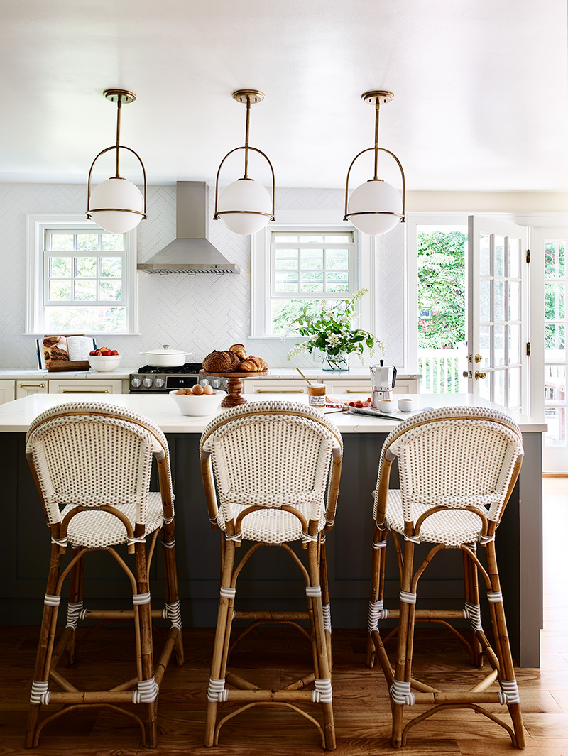
The space is light, bright, airy and not too serious. Elongated subway tiles set in a herringbone pattern reach the ceiling, and unlacquered brass hardware infuses a soft glow. “It’s clean, classic, and brings in texture,” Blackmore says about the backsplash. “The herringbone pattern offers a lot of impact without inflating the budget.”
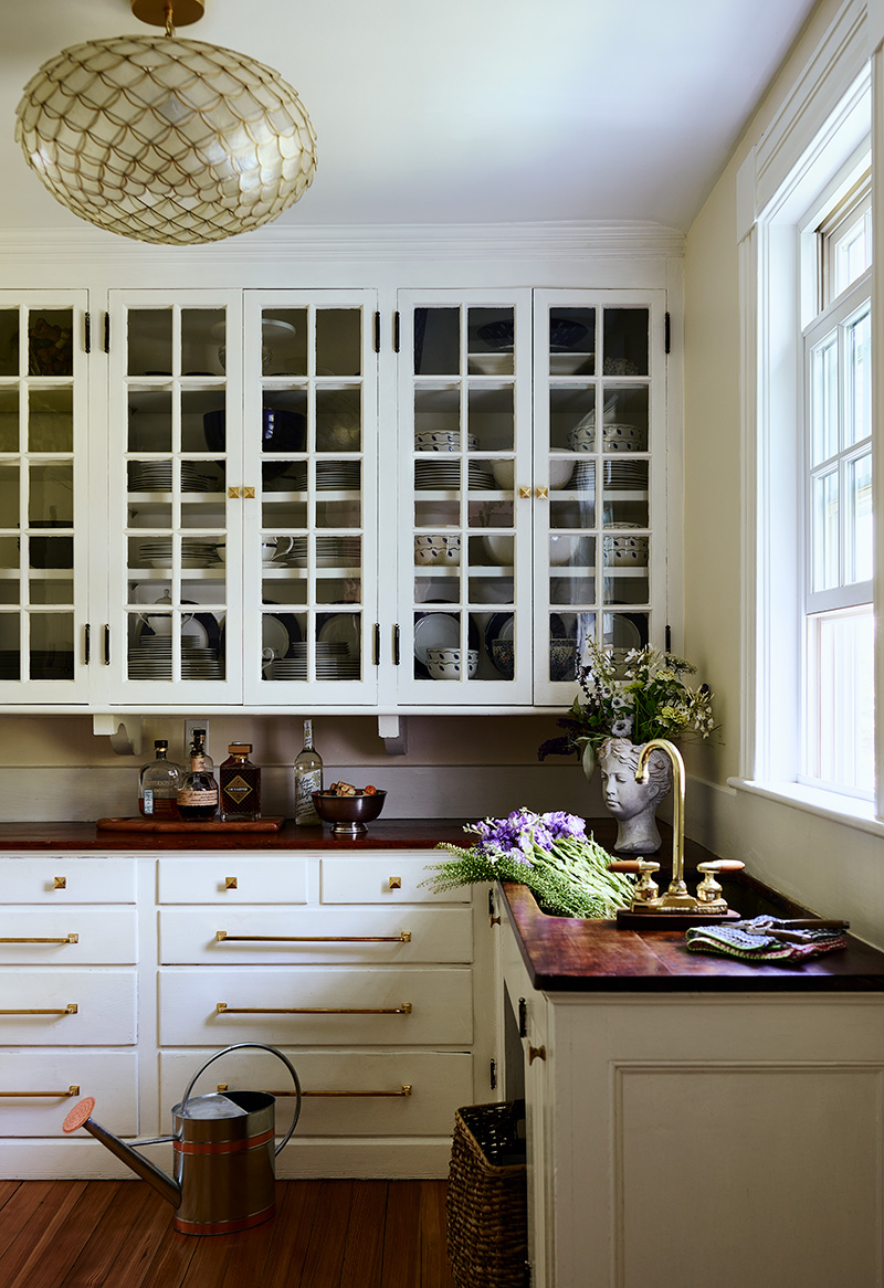
Blackmore also widened and reconfigured the passage that connects the main part of the kitchen and the butler’s pantry. It’s significantly streamlined—previously, there was cabinetry on both sides as well as a bulky fridge and double wall oven. Now, the fridge is nestled into a niche and all the function is on one side, with sleek pantry cabinets that flank a coffee/smoothie station where Golombek starts each day.
The kitchen looks lovely from the entryway too, a consideration that played into Blackmore’s design. “The end of the island is visible from the front door and the white glass globe pendants catch your eye,” she says.
The openness of the house appealed to the couple when they purchased it. That aspect has only gotten better. “The layout on the first floor used to be a loop but Carly’s changes gave us an infinity layout,” Golombek says. “It’s our forever house.”
Interior design: Habitat Design, habitat.design
Builder: Paul Haggett & Co., haggettcompany.com


