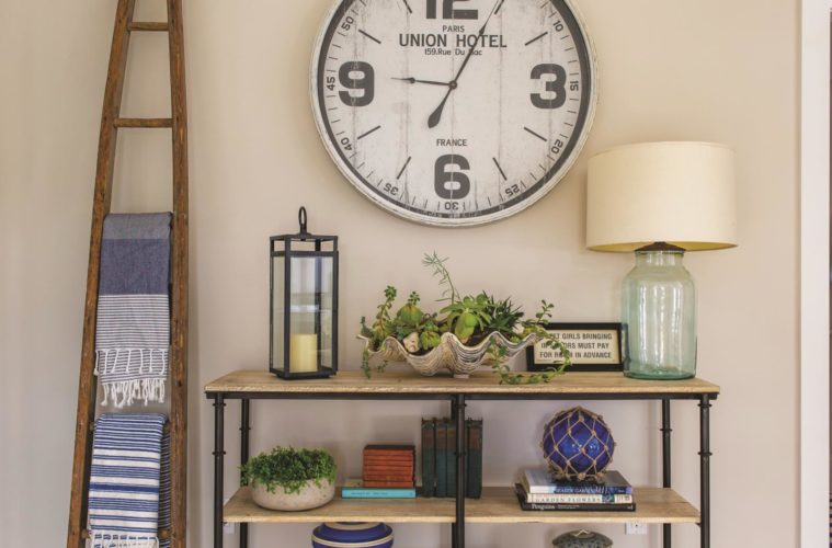
The home overlooks the water in Marblehead and is full of comfy, relaxed furnishings for lots of guests
When Sydney Jerabek found a gem of a home right on Marblehead Harbor, she turned to a designer she knew well—her daughter, Molly Frey—to spearhead the renovation. A Marblehead resident herself, Frey specializes in remodels and interior design, particularly kitchen projects and whole-house redos. The founder of Molly Frey Design is adept at problem-solving and maximizing an interior’s potential, but this particular project posed a unique challenge: transforming a two-family structure into a seamless coastal oasis.
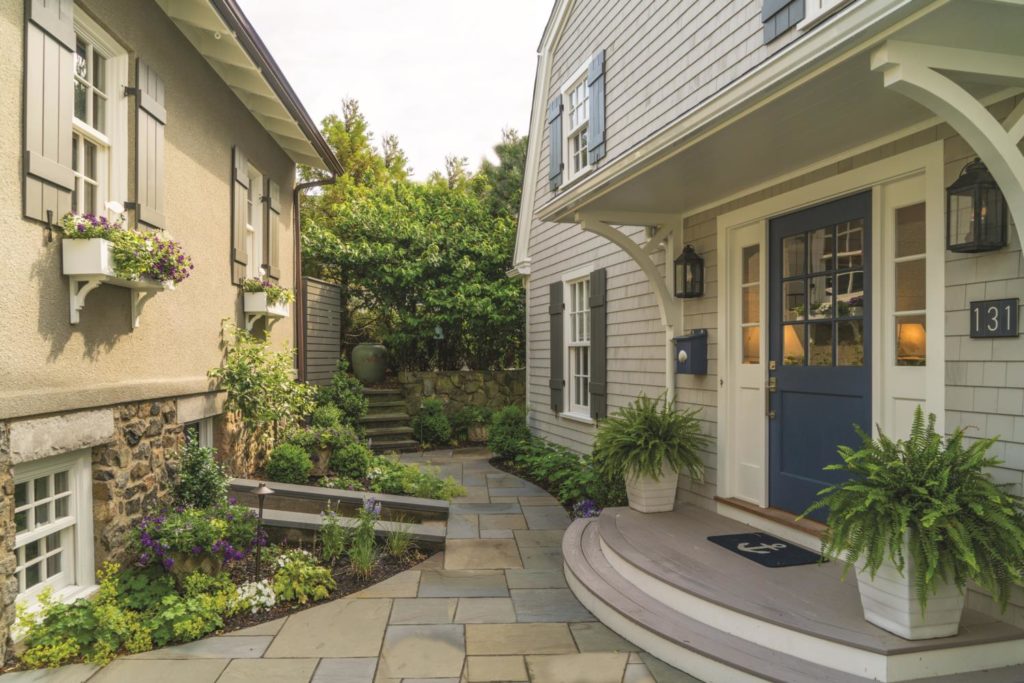
Its harborside setting was ideal, but its walled-in, dated apartments were not. “One of its strangest features was that it had two entry doors along the side off an alleyway, not where you’d expect them to be,” recalls Frey. “The first task was creating just one entry at the front, facing the courtyard between the house and the detached garage along the street. It was kind of a plain gambrel house, so creating a focal point with a new front door really helped with the curb appeal,” she explains.
In collaboration with contractor Malmquist Builders, Frey masterminded a complete redo of the interior, which involved dismantling the two walled-in apartment entries and moving the stair leading to the second-floor apartment. “Now when you walk in the front door, you can see straight through to the view. The reworked main floor is very open-concept,” says the designer.
As the project unfolded, the respective skills of mother and daughter blended well, with Jerabek handling all of her own decorating and Frey tackling the renovation’s architectural features and space planning. “My mom is an incredible decorator,” says Frey. “The goal was to personalize the house with her aesthetic, and my job was to help her figure out and apply that aesthetic.”
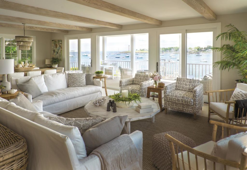
Creating a modern interior with clean lines and uninterrupted sight lines was one half of the design equation, notes Frey; at the same time, she adds, “We wanted to infuse some of the character that was lacking—we wanted to add warmth so it didn’t feel cold.” Various wood elements including faux beams in the living room, open shelving in the kitchen, and whitewashed white oak flooring throughout lend warmth, character, and charm. The staircase, which hitches from the lower-level master suite all the way up to the top level’s guest bedrooms, features a natural oak railing complete with steel cables.
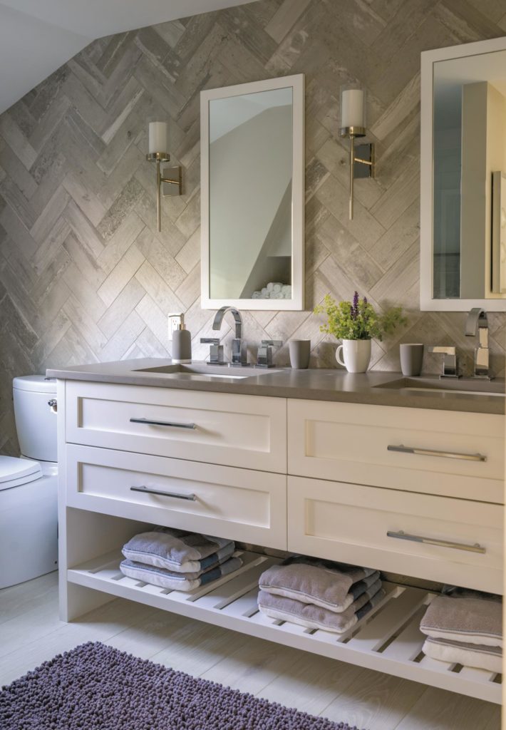
After selling her Beverly home and all of its furniture as a complete package, Jerabek was able to start from scratch and select appropriately scaled items for her new rooms. Many of her finds were discovered in home furnishing stores along the North Shore and throughout northern New England. On chilly nights, she loves sitting by the living room’s gas fireplace, whose contemporary look and airy feel is in keeping with the interior’s personality.
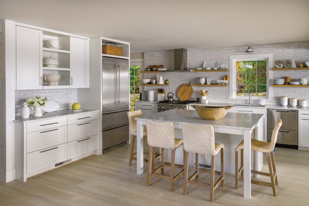
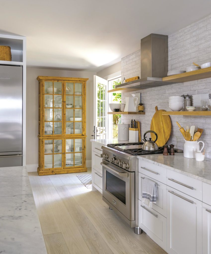
In the kitchen, neutral white custom cabinets mingle with stainless steel appliances, marble countertops, and a rustic cement brick backsplash. The space is bright and inviting, with woven island stools from Grandin Road and a pine cupboard, one of Jerabek’s many shopping finds, providing contrast against the colder surfaces. Besides the kitchen, dining room, and living room—all oriented toward the views—the ground floor includes an office off the front entry. “My mom is very creative; it’s great for crafts and organizing,” says Frey of the space.
Surprisingly, Jerabek’s master suite is on the lower level beneath the ground floor. “We could have put it upstairs, but she still has an amazing view at that level, and our decision left the entire top floor for a dedicated guest space,” explains Frey. “When people visit, she has her own retreat and they have theirs. She loves it because it’s very quiet and very private. There are no windows on the sides—it just opens directly out to the harbor. You can’t see another house from down there, and there’s a great sunrise.”
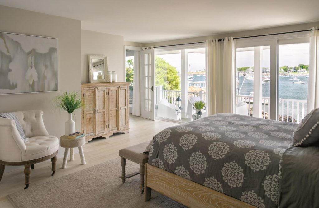
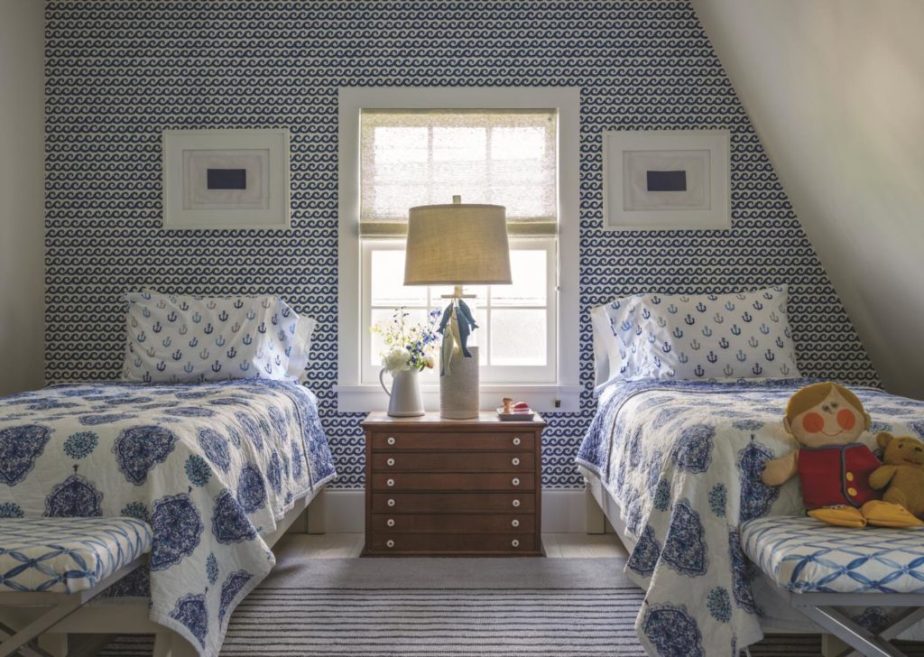
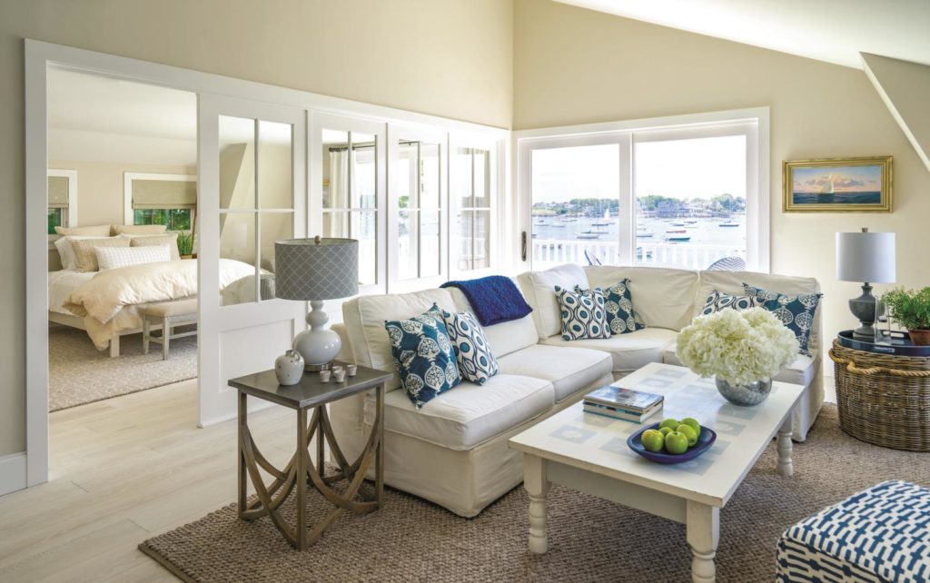
For the guest spaces on the home’s top floor, mother and daughter were inspired by the original two-family design and decided to emulate the feel of an apartment. There are three bedrooms, plus a full seating area with a deck. To keep the floor feeling open, Frey separated one of the guest bedrooms from the sitting area with a collapsible wall of windowed doors. “It seemed like a shame to close the two rooms off and block views,” explains the designer. “This way, guests can simply close the accordion and pull down the shades when privacy is needed.”
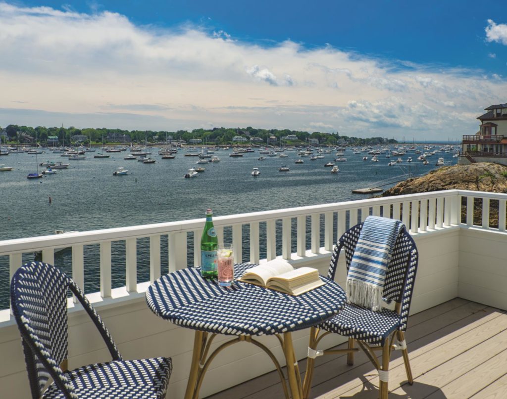
Jerabek’s serene interior palette of whites, grays, and beiges lets the spectacular views shine, and her occasional pops of blue echo the shimmery water just outside. One of her favorite spots is the first-floor deck, which Frey expanded from a depth of 5 to 9 feet to make room for a sitting area. “During the summer months, there’s a lot of activity in the harbor, so even if you’re just sitting and looking at the view, you feel like you’re actually part of things,” she says.
No matter how closely related the participants, a big, involved remodel project has its stresses. “Especially when you’re rearranging spaces and moving staircases, it’s hard for clients to visualize what it will be like,” admits Frey. But reassuring her mom came naturally, and the end result speaks for itself. “It was a fun, rewarding journey, and we made a great team.”

