Lisa Scarfi and Wayne Saltsman were so used to their Burlington, Massachusetts, kitchen feeling too small that they assumed their planned remodel would require extending the back of the house.
The room’s main design flaw was that it had six doorways, making it useful as a hub of family life but inefficient as a place to cook.
The kitchen was like the Grand Central of walkways,” says Scarfo. “It was a lot of throughway, which meant you couldn’t really put anything anywhere. Everything was pushed into one corner.”
After using this kitchen for 13 years, they figured the 252-square-foot space was just too small to accommodate date their needs. So they were surprised to hear from Michael Frechet, director of LIVE Architectural Specification & Design, that the area was big enough to house the kitchen of their dreams.
They had plenty of square footage,” says Frechet, who Scarfo and Saltsman tapped to design their long-anticipated renovation. “It’s just that most of it was underutilized. I reconfigured openings to rooms so there’d be a flow through the kitchen only if you’re meaning to go there.”
He took down the wall between the dining room and kitchen, relocated the entrance to the family room, and replaced the entryway from the main foyer with built-in pantry storage and a space to organize mail and paperwork.
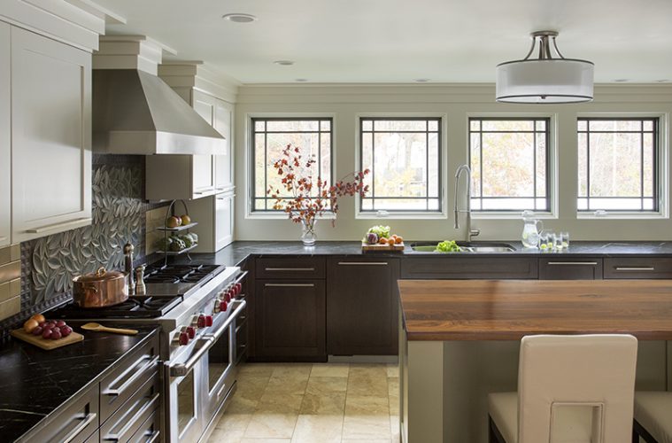
The previous kitchen design had left the homeowners feeling that the room was too dark, a problem that Frechet solved by incorporating a wall of windows facing the backyard. The change required removing the upper cabinetry on the back wall, and then unifying that space with the rest of the room using custom millwork.
The millwork was key to the design in this,” he says. “I took cabinetry and integrated it internally, so all the millwork is on one plane and connects seamlessly to the step-out crown, avoiding strips cluttering wall space.”
In a series of continuous horizontal lines, the casing above the doors, cabinetry, windowed wall, and dining room extend unbroken. As a result, the row of large windows fits well into the larger design, and the room has a cohesive, calming quality.
The focus was to keep those horizontals going,” says Frechet. “It gives the space the serenity that we were looking for.” The upper cabinet storage that was lost when windows were added was replaced with cabinets installed where doorways had been and with custom drawers in a new island. The design maximizes the use of these drawers to hold dishes, pots and pans, and cooking oils. The microwave, a top-of-the-line model by Wolf, even functions like a drawer.
Scarfo and Saltsman consulted with Nancy Hanson at Heartwood Kitchens, “going drawer by drawer and cabinet by cabinet” to figure out the best configuration for their needs, says Scarfo. “Now it just works perfectly for us.”
The color palette and types of materials and appliances were also important considerations for a kitchen designed to serve as an appealing center of family life.
When Scarfo mentioned that she loves green, Frechet took the suggestion seriously, ultimately incorporating seven different shades of green into the design. The countertops are veined green soapstone, the drawers in the island are painted a light sage, and the gridwork in the windows is dark green. The backsplash—one of the room’s most unusual characteristics—is tiled with deep-green ceramic leaves.
The room also picks up visual interest from the patterns expressed in the varied materials. The striation in the counters and the island’s walnut top contrasts with the floor’s mottled travertine tile.
The vein [in the soapstone countertops] gives a little bling to the surface without it being a tight, confusing pattern,” says Frechet.
A little “bling” is also provided by the prominent bright-red knobs on the Wolf 48-inch dual-fuel range. Incorporating high-end appliances was important to Scarfo, who loves to cook, and was made possible with the savings in the budget from not bumping out the house’s back wall. The room also features a Sub-Zero refrigerator/freezer and an Asko dishwasher with a Mouser custom cabinet panel.
The total effect is a room that is attractive and useful both for daily life and family gatherings. Scarfo’s large Italian extended family now has the space to cook together for holiday meals.
I have two daughters who love to help out in the kitchen,” says Scarfo. “We can all be here and be preparing a family meal, and there’s space for all of us.”
And on quiet mornings, Scarfo and Saltsman enjoy sipping their coffee at the island while looking out into the backyard.
Everybody who comes and sits down says, ‘I could sit here forever,’” says Scarfo. “It’s a nice place to relax.”

