Honey Collins, owner of Essex–based Honey Collins Interior Design, had just finished designing three rooms of a family’s antique home in Beverly Farms, when they called her again with a surprise: They sold their home, were moving to Beverly, and would like Collins’s help on the new house. Unlike the antique house, the family’s new four-bedroom home was recently built and possessed a completely different scale and character. It posed a unique design challenge for Collins.
“How do we incorporate the things we just finished into a brand-new house without having to completely start over from scratch?” she mused.
Whereas the antique house had rooms that were quirkier in architectural personality and smaller in scale, the new house was something of a blank canvas, with an open floor plan and ceilings that were at least two feet higher than those in the family’s previous space. The family trusted Collins to turn their new house into a home, by creating a comfortable design that combined traditional elements with more modern touches.
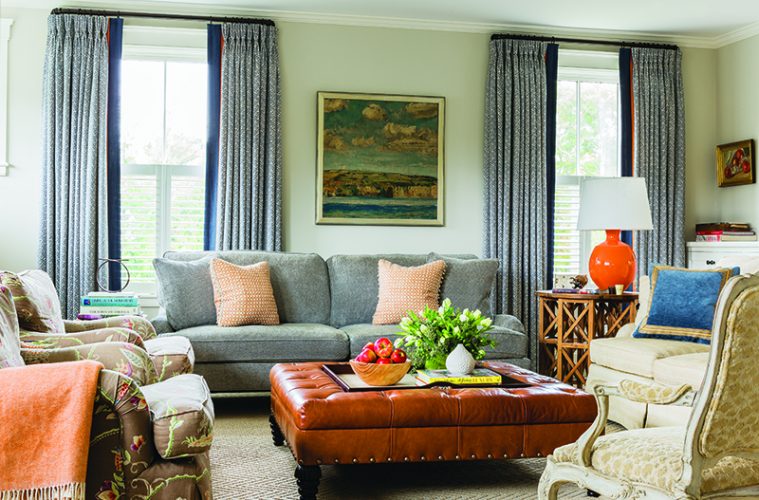
In the family’s living room, for instance, the walls are painted a soft, sandy brown, and two lighter brown chairs are paired with a brown-and-cream-colored leopard-print ottoman that adds just the right amount of modern style to the otherwise more traditional de?cor. Adding to this are pops of orange and bright white, in the form of orange throw pillows and draperies and white side table and accent lamps.
“I really love the draperies in the living room. I love just a little touch of orange coming out,” Collins says. “They don’t overpower you, but they frame that room really nicely.” The result is a room that’s very balanced, warm, and visually interesting.
The balance of colors and neutrals is also found in the master bedroom, where robin’s egg blue walls are matched with white bed linens, a white rug, white ottoman, and white bedside tables. The wall’s blue color is echoed in lovely patterned draperies, an upholstered headboard, and throw pillows to create a modern, clean space.
 |
A simpler—yet still comfortably inviting—palette is found in the front hallway, which has white walls and a geometric pattern painted on the wooden floor. Like the pops of orange elsewhere in the house, the tone-on-tone doesn’t overpower the space. Instead, it provides definition and breaks up the wood flooring to distinguish the hallway space in the open floor plan.
“I love the floor in the front hall,” Collins says. “I do love doing painted floors. I think it [does] a lot in terms of adding another texture and defining a space.”
The front hallway is just one example of the ways smaller spaces can have lots of personality and interesting elements. Another is the powder room, where Collins used a favorite technique: using a strong pattern in a small space. There, she used a visually striking Phillip Jeffries geometric print on burlap wall covering.
Collins was able to reuse many of the fabrics and upholstered pieces from the old house, but not all of them. “A lot of their old furniture did not translate,” Collins says. The most dramatic example of this was in the dining room, where Collins couldn’t use the old furniture at all. The reason? Proportion, scale, and balance.
“Regardless of what style you have, that’s the most important thing,” Collins says. The small antique dining table and chairs that the family used in their old home would have appeared drowned in the larger space with its higher ceilings and open floor plan.
“If we had put them in that dining room, they would have looked like child’s furniture,” Collins says. “They wanted it to look right from the beginning.”
Instead of using the more formal antique pieces, the family opted instead for a farmhouse-type table. “When you have an open floor plan and you don’t have a closed-off dining room, it tends to run toward a more casual feel,” Collins says.
That more rustic, farmhouse look was paired with dining room chairs that are upholstered with an indoor/outdoor fabric that’s quite forgiving for eating and “a little more functional than the antique,” Collins says. Neutral walls in the room allow the soft browns and blues in the draperies and upholstered chairs to take center stage.
Collins also delighted in working with the homeowners’ early teen- and tween-aged daughters, who chose their own fabrics for their bedrooms. Elements in the girls’ rooms—like pink and white, sea coral-print draperies, a capiz chandelier in tones of sea green, and a hanging rattan chair—are whimsical, but sophisticated enough that the girls will be able to grow into them, too. lwcinteriors.com

