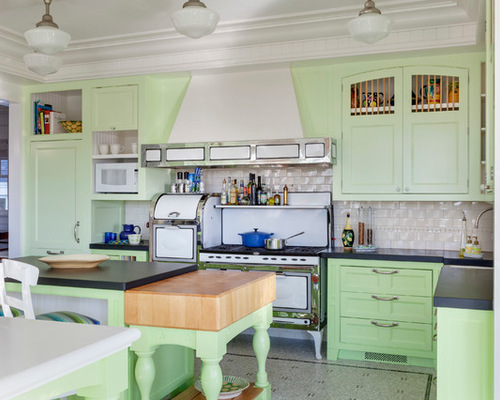
After spending hard-earned money to remodel your kitchen, the last thing you want is to walk into your new space and feel … nothing. To prevent that, consider adding a feature that lifts your spirits every time you enter. These three kitchens show how a little special something can make you smile again and again.

Fun Kitchen 1: Greg Premru Photography, original photo on Houzz
1. Try a Fun Paint Color
Designer: Chris Benson of Benson Interiors
Location: Cape Cod, Massachusetts
Size: About 450 square feet (42 square meters)
Homeowners’ request: Update the kitchen and breakfast area of a Shingle-style summer home in a new color, with new window shades and a new dishwasher
Special feature: Playful green cabinets. “It’s the way you want to start a summer day on Cape Cod,” designer Chris Benson says.
Professional Tips on Painting Kitchen Cabinets
Other special features: Restored gas stove and oven original to the home; black-and-white mosaic tile floor; two small islands; schoolhouse-style light fixtures. “The space is unique in the fact it has cabinetry, a stove and oven and schoolhouse lights that all fit the original period of the home — but the colors do not,” Benson says.
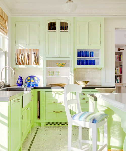
Fun Kitchen 2: Greg Premru Photography, original photo on Houzz
Why the design works: “Balancing the intense greens, using a different shade of the same green, and using pure bright whites help keep the space cohesive,” Benson says. “Using the darker or brighter green on the base cabinets with the pale green on the uppers also helps with balance and order.”
Designer secret: “Pay close attention to where you are stopping and starting a color,” Benson says. “Make sure you understand how much space you are going to cover with an intense shade, and realize the color’s intensity will increase with the light and the amount of space you cover. Select a neutral to help balance any intense color.”
Also on the team: Tom Catalano (architect); Sean Braney of Mad Hatter Painting; Greg Premru Photography
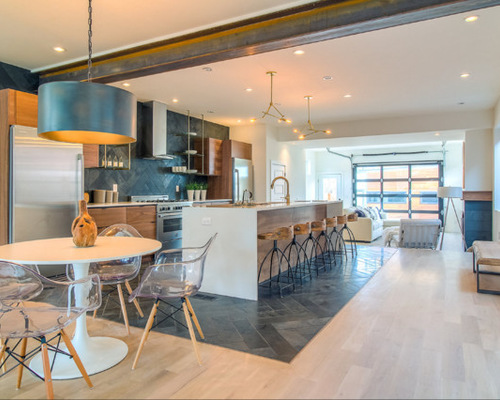
Fun Kitchen 3: Shawn Thomas Creative, original photo on Houzz
2. Use Tile to Define Space
Designers: Brad Weiman and Morgan Bilger of Work Shop Denver
Location: Denver
Size: About 300 square feet (28 square meters); 17 by 18 feet
Homeowners’ request: Because this was a spec home, the designers had full creative control. They were able to fabricate all the custom cabinets, wood elements and steel in their design-build shop. Finding a way to define the wall-less kitchen and yet have it feel connected to the surrounding spaces became their main challenge. They found their answer in tile.
Special feature: Honed slate tile (each 6 by 24 inches) set in a herringbone pattern on the floor and backsplash
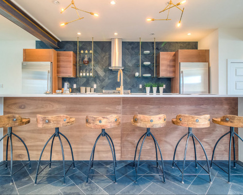
Fun Kitchen 4: Shawn Thomas Creative, original photo on Houzz
Other special features: Custom walnut cabinets; brass-colored floating frame with glass shelves to display white boneware collection; mini chandeliers
Fit a Crowd With More Counter Stools
Designer secret: The designers bought 12-by-24-inch tiles and cut them in half to save money. “It’s almost two times the cost to have a ‘designer’ size tile than it is to spend a couple hours of labor and $55 on a new saw blade or two,” designer Brad Weiman says.
Also on the team: Shawn Thomas Creative (photography)
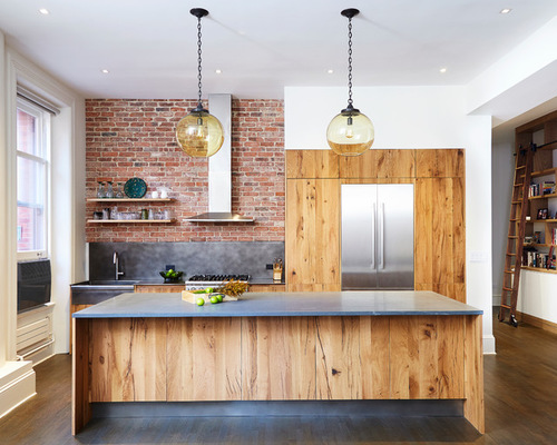
Fun Kitchen 5: Alyssa Kirsten, original photo on Houzz
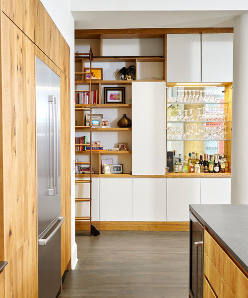
Fun Kitchen 6: Alyssa Kirsten, original photo on Houzz
3. Focus on the Materials
Designers: Lauren Rubin and Audrey Choi of Lauren Rubin Architecture
Location: New York City
Homeowners’ request: Remove walls to increase light and create a more open, loft-like experience
Special features: Distressed recycled railroad-tie cabinets; recycled brick feature wall; stainless steel backsplash
Other special features: Glass-and-iron pendant lights; library ladder.
Designer secret: “The design of the full-length built-in bookshelf with the rolling library ladder — from the 100-year-old local Putnam Ladder Co. — was our special contribution,” designer Lauren Rubin says. “Beautiful millwork with hidden storage is something of a specialty of our designs. The bookshelf has a place for everything — even a sparkling, antique mirror-backed liquor cabinet is concealed inside. It reminds you of a Prohibition-era speakeasy, which further supports our ‘modern meets downtown charm’ theme.”
“Uh-oh” moment: “The Pietra Cardosa stone countertop was always meant to be a single slab,” Rubin says. “When we finally found the perfect piece, we discovered that it would not fit in the elevator. We called every stone company we could think of until we found one who would be willing to hoist the piece up nine floors to the apartment. It took nearly a dozen guys to haul the slab up the stairwell, but in the end, the seamless piece was well worth the effort.”
Also on the team: FSB Consulting Corp. (general contractor); Urban Homes (kitchen manufacturer); Guth DeConzo Consulting Engineers; Alyssa Kirsten (photography)

