After 30 years in an Ipwich antique, renovating it and loving it completely along the way, Art and Betsy Dioli were ready for a new chapter. “Our house was in good shape and the kids had moved out, so we agreed it was time to sell and downsize. I didn’t really want to move,” admits Art, “but if we did, I wanted to pick a place that felt like a vacation when we got home from work.”
The couple started looking and discovered—or rediscovered, in their case—Little Neck, a summer beach community in their own hometown. “We knew about it and have friends who vacation there. It’s weird that it took us 30 years to realize what a great place it is,” says Art. Their realtor showed them one house with a prime location near the water, but the structure was rough: It suffered from water damage and a variety of malaise.
“I didn’t even want to go inside,” recalls Betsy. “But the realtor convinced us, and right afterwards Art took out a piece of paper and did a quick sketch. I said, ‘Well, if you can do that, then let’s buy it.’ And we ended up doing something pretty close to that original drawing,” she recalls.
Art’s ability to fully reimagine the property is no surprise. The veteran architect is a principal at OLSON LEWIS + Architects, an architecture, planning, and interiors firm based in Manchester-by-the-Sea. There was perhaps no better couple to buy this particular teardown; replacing it involved navigating various regulations and site challenges. “Little Neck is a privately owned condo association, and we could only make changes within the original envelope,” explains Art. “Also, Chris Ragusa and his team could only work in the off-season; the association doesn’t allow construction in-season.
“But unlike other houses we looked at—small cottages, low ceilings—this one had a second floor and a really great sense of space and volume. We knew we could make it work,” continues Art.
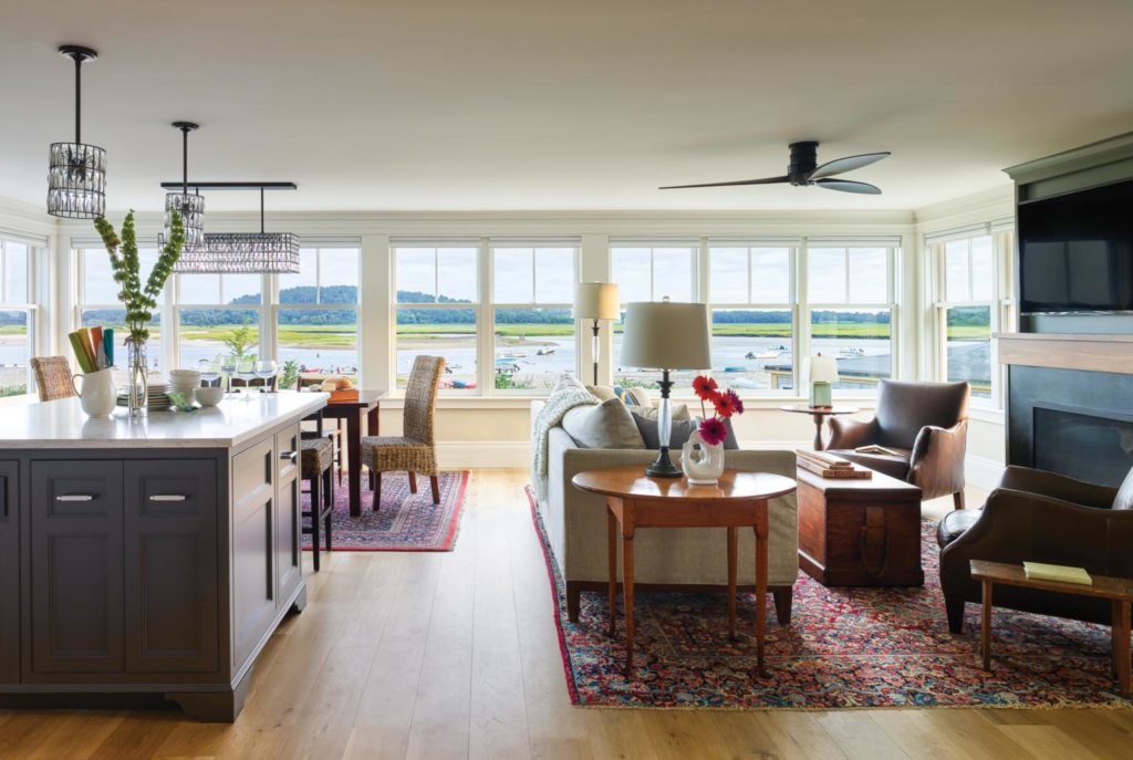
With 180-degree views of the Ipswich River and the back of Crane’s Beach to capture, Art developed a window-laden, open-concept plan for the first floor. Within a rectangular shell, he placed the kitchen, dining area, and living room on the beach-facing half and a full bath, mud area, and den to the rear. On the second floor, he combined two smaller bedrooms to create an en suite master. Two additional bedrooms round out the upstairs.
“The house is only six inches from the road,” explains Art. “We couldn’t push backwards, but we did elevate seven feet off grade. We were a little nervous about privacy with all the windows, but we’re high enough that we don’t even notice the road. We only see that incredible view.”
An avid cook, Betsy wanted a gourmet kitchen, and Art delivered by taking advantage of every available square inch. The couple—who worked as a team on all decisions—chose soapstone for the perimeter counters and quartz for the backsplash and island. All of the cabinets were custom milled by CM Ragusa Builders in its New Hampshire mill shop.
With so many decisions to make during construction, Betsy consulted with Paula Bramberg Gaull of New Leaf Redesign to help ensure a cohesive color scheme. “Doing the whole house at once was a challenge,” admits Betsy. “We wanted to keep the living spaces more neutral and have the bedrooms be more distinctive. Paula was great; she was very organized and knew exactly what we needed from her.”
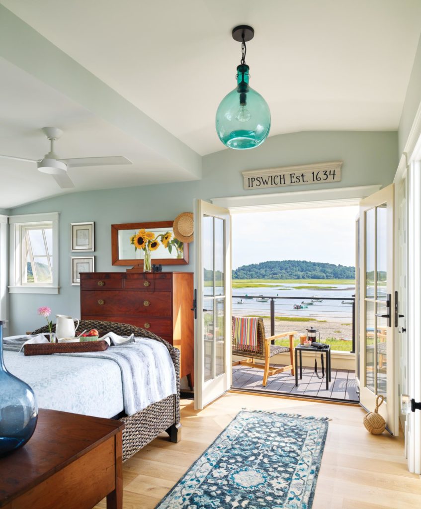
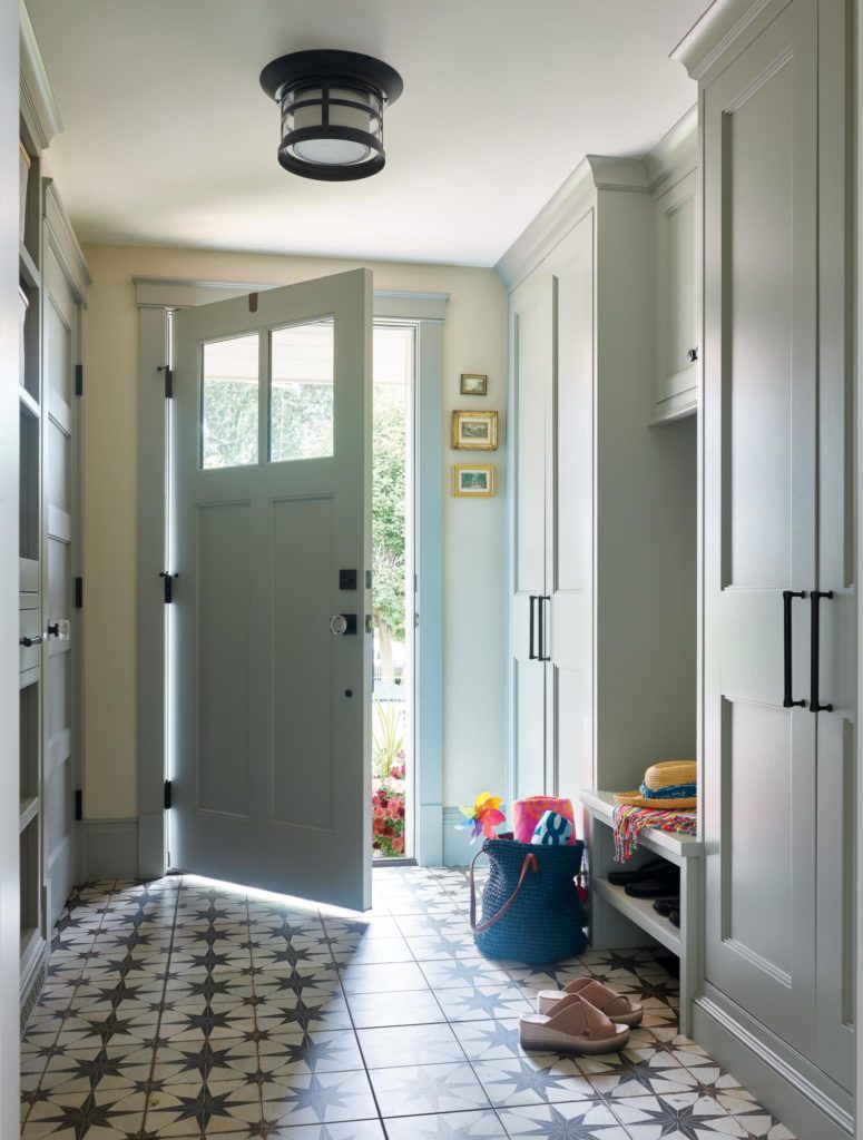
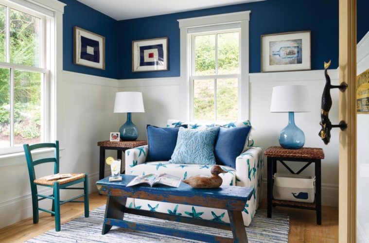
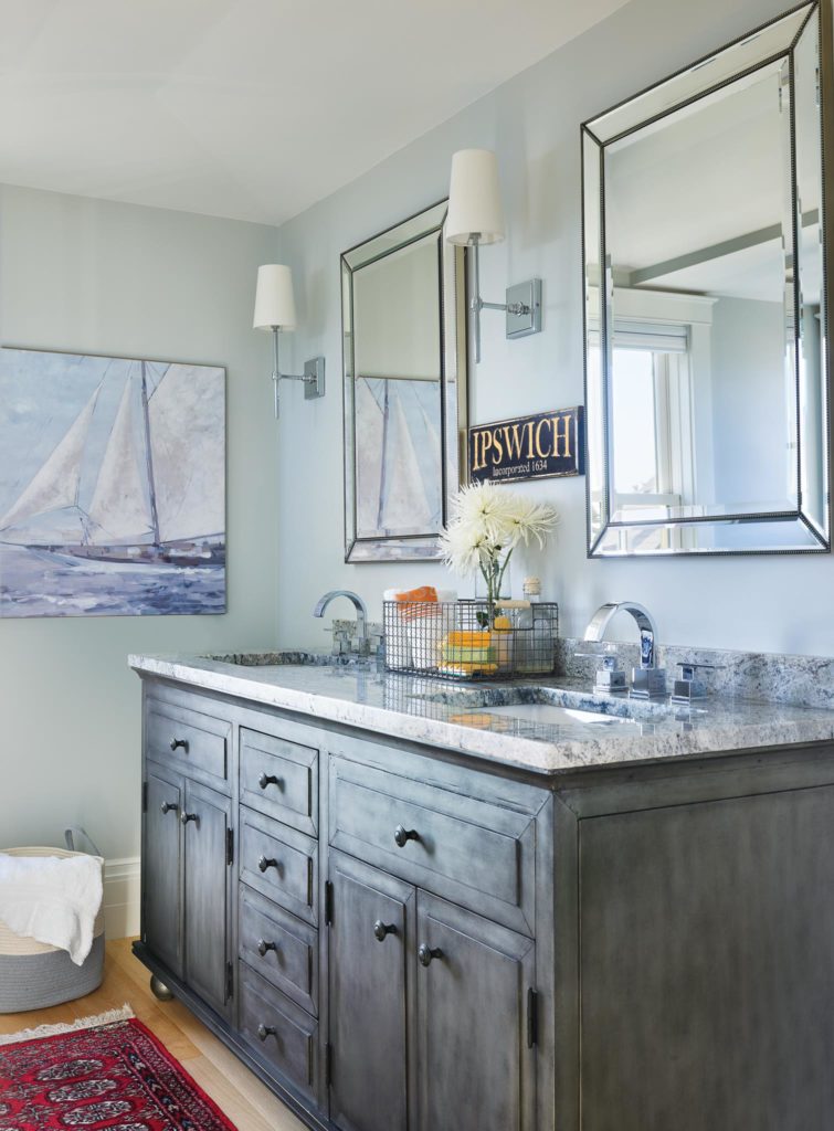
“When a house is under construction, it takes a lot of visualization to figure out how all the colors and finishes will work,” explains Gaull. “In this coastal setting, I wanted to pull in colors from outside and create a timeless palette.” They opted for Benjamin Moore’s “Tapestry Beige” for the main living area, “Iron Mountain” for the kitchen island, and a complementary “Amherst Gray” for the living room’s built-ins. Blues in the den and bedrooms echo the tidal river panorama outside.
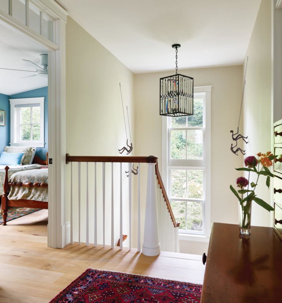
Although their new house is smaller, a true downsize, Art infused it with architectural detail. Three-quarter wainscoting in the den lends historic charm while a warm walnut, used for the fireplace mantel and wet bar counter, offsets the cool neutrals. Even the stairway balusters didn’t escape his creative touch: “I had the carpenter turn every other one upside down; it’s subtle and unexpected,” he describes.
Outside, the architect nestled a balcony into the roof and eked out enough room for a side porch and outdoor shower. Shingle detailing, one of his design signatures, is yet another intriguing feature. “After three four-inch shingle courses, there’s a two-inch course. Traditionally I put a diamond detail in the coursing, but I made ours a bit more elaborate with rounded petals,” he explains. The finishing touch is a “Crosswater” placard out front—the home’s moniker references the interweaving tides and currents offshore.
Excavating gained the property a split-level basement, complete with a six-foot-wide garage just big enough for a golf cart all their own. Now the Diolis fit right in. “Come July 1, everyone arrives,” says Art. “People are walking and golf carts are cruising. There are swim lessons and kids’ camps. But the winter is completely different,” he continues. “It’s when we sit on the couch with the fireplace on; it’s warm and peaceful.
His favorite part of the process was the detailing, a natural instinct for a perennial student of form. “There’s a saying that goes, ‘Architecture is what touches the spirit and everything else is just a building,’” notes Art. At Crosswater, there’s plenty of architecture to go around.

