Serendipity and design often go hand in hand. so when Anita Clark’s housekeeper mentioned to her that another employer needed help with a home renovation, the Salem-based designer seized the moment.
“I personally didn’t know the homeowners,” says Clark, “but, coincidentally, we shared the same housekeeper, who knew what I did for a living, had observed the family going through several renovations, and thought I would be a good fit for them. So she gave them my business card.”
The happenstance continued when Clark was interviewed for the initial project—“It turned out I had already done some work with one of their contractors,” she adds—and the designer was hired soon after.
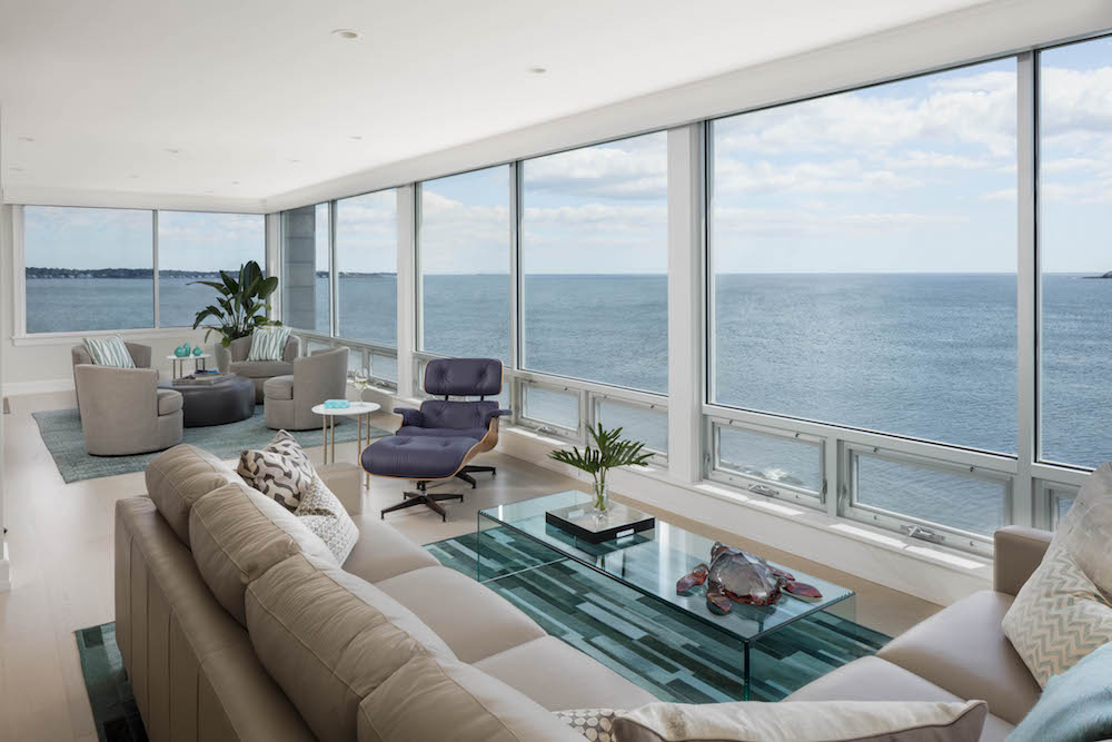
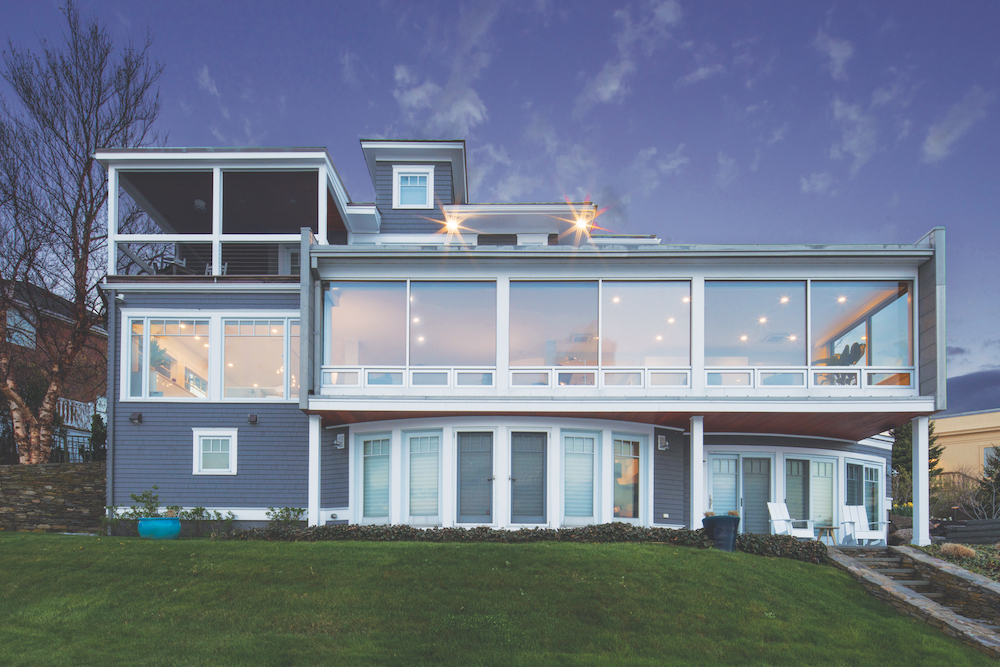
A second window of opportunity opened when Clark saw the house, a transitional Shingle-style home located about 15 miles north of Boston, perched on a rocky coastline, and boasting panoramic ocean views.
“The clients were focused on enclosing a large screened porch, and my initial task was to assist them with the finishes and furnishings of the great room,” Clark notes.
“But it became immediately obvious to me that they should consider redesigning the kitchen as part of the new living space, and doing the whole project at once,” she adds.
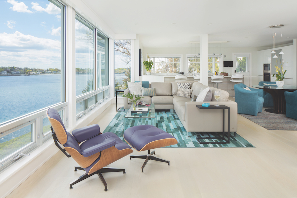
It didn’t take long for the homeowners to concur with her bold and exciting plan: Transform the outdated, poorly planned kitchen with a sleek and contemporary new design; add a walk-in butler’s pantry next to the kitchen; and turn the adjacent great room and enclosed porch into an open-plan living, dining, relaxation, and entertaining space.
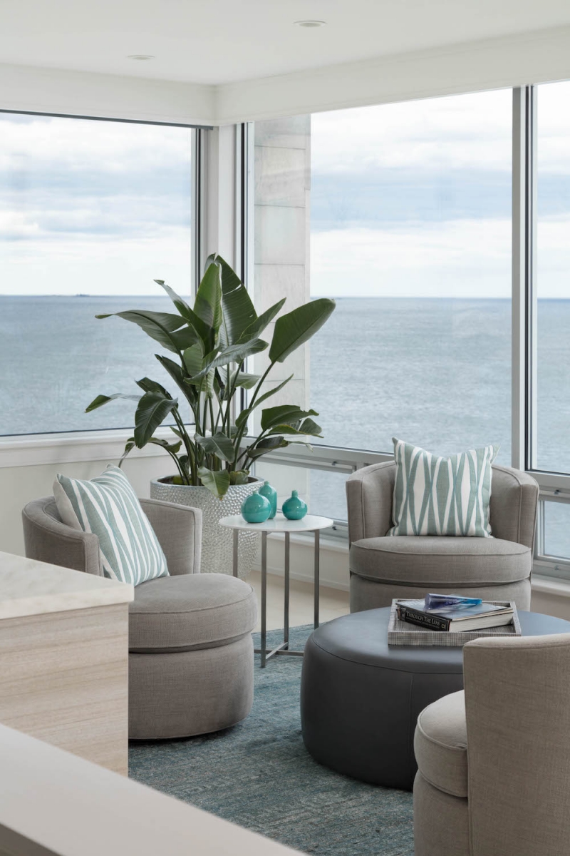
And everything, except for the butler’s pantry, would be positioned to capitalize on the home’s dramatic wall of windows, stretching the entire width of the house and delivering those breathtaking water vistas.
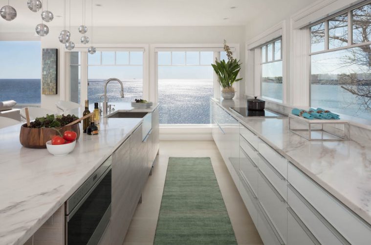
For the new kitchen, Clark aimed to use as much floor space as possible. “The kitchen and butler’s pantry were designed to emphasize function over aesthetics,” she says. “No matter how great a space looks, if it does not function efficiently, the client cannot benefit from using it in its entirety.”
The abundance of windows presented Clark with both an asset and a challenge. “There was limited room for upper cabinetry that you typically find in most kitchens,” she recalls.
“So we designed the kitchen to function with minimal cabinetry and storage, and created the butler’s pantry to accommodate additional storage and function as a small catering area for when the family entertains larger groups,” she adds.
The separate pantry would also create an ideal space for her clients’ passion for coffee and roasting their own personal blends.
After assessing several leading kitchen brands, Clark and her clients opted for a Poggenpohl design for the perimeter galley, the central island, and the sole wall of full-height cabinets.
“We liked Poggenpohl’s clean lines,” Clark says, “and the white high-gloss lacquer cabinets lend the kitchen a sleek, contemporary feel.”
The island countertop is an Imperial Danby white marble that typically comes from Vermont.
“As the kitchen has an extensive window line, we had to fit pretty much everything into the lower base cabinets of the perimeter wall and in the island,” Clark adds. “We only had one full-height wall for the built-in refrigerator, pantry, and coffee cabinet.” The clients opted for a Wolf induction cooktop on the perimeter galley and a Wolf steam and wall ovens, all sourced from Clarke in Boston.
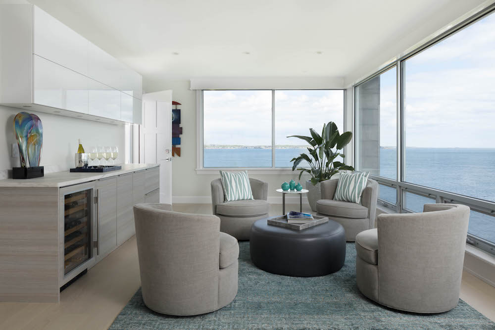
The butler’s pantry, located behind the oven wall and accessed via sliding doors around the corner, has the same Poggenpohl cabinets as the kitchen.
Clark’s clients were closely involved in the overall design. “They had their own ideas and were very much part of the selection process of the finishes, appliances, and fixtures,” says Clark.
“We purchased most everything from New York, including furniture, rugs, lighting, and artwork,” Clark says, pointing to a stylish leather sofa in the living area.
“My clients travel frequently and spent a great deal of time looking at furnishings and floor coverings based on our recommendations, review, and approval,” she adds.
Clark wisely kept the color scheme muted and steered clear of window treatments to keep the ocean vistas center stage.
The nine-month renovation has resulted in a cohesive, contemporary living space. “It’s perfect for entertaining, from an intimate dinner for two to a family gathering of 20,” says Clark. “The space has a great flow and is designed for the way people live today.”
And the serendipitous commission has resulted in yet more windows of opportunity for the talented designer. “I’m on my fourth project with the family,” she says. “It’s a very nice relationship.”

