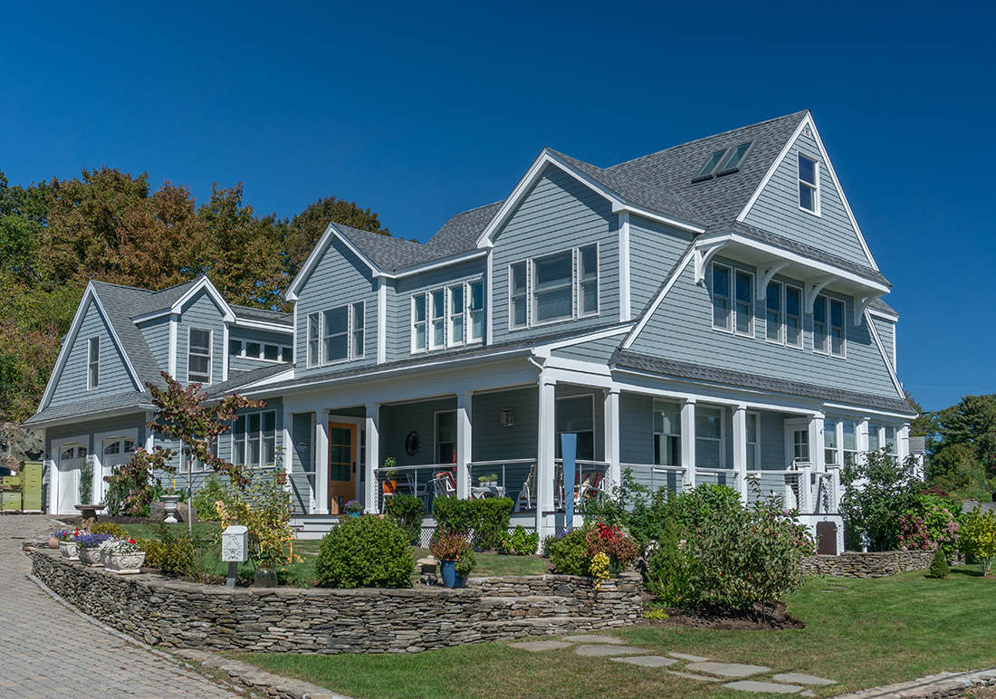
The artist Laura Petrovich-Cheney’s work creating quilt-inspired wall sculptures out of wood reclaimed from natural disasters revolves around the premise that “material has memory.” So, it’s fitting that she and her husband, Peter Cheney, have also “reclaimed” their Marblehead home by shoring it up structurally and revamping it to fit its oceanside locale while retaining its charm and soul.
“I feel an energy there. This house had a lot of love,” Petrovich-Cheney says. “There’s a spirit of creativity in the house, and a sense of love and peace in this house that’s real special.”
That’s not to say that the home didn’t need some TLC. It was first built in the mid-1800s as a summer cottage, and over the years, subsequent owners tacked on a hodgepodge of additions that left the house feeling disjointed and thrown together.
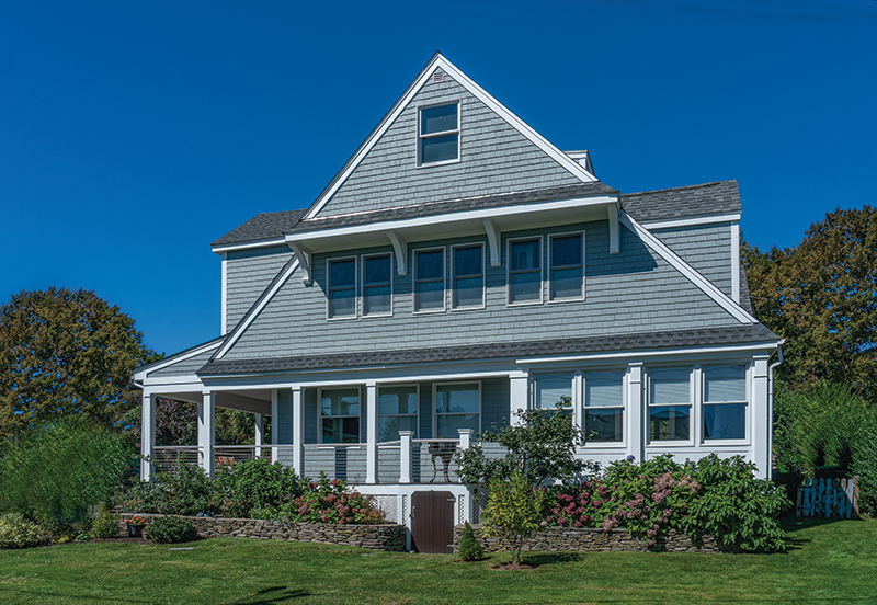
Outside, there were two competing front doors and a clutter of gables. Inside, previous owners had removed—and not replaced—a support wall, leaving only “two bay windows holding up the entire second and third floor,” says Petrovich-Cheney. The floors buckled and sloped unevenly.
“Half the house was sinking and falling,” says contractor Branden Scimone, owner of S&S Construction and Facilities in Marblehead. There were also lots of “points and curves that didn’t suit the house” as a result of it being haphazardly added onto again and again.
“How did this house not fall down?” Petrovich-Cheney wondered, admitting that she and her husband “probably lied to ourselves about the quantity of the structural issues.”
Yet it was hard for them not to fall in love with the place, with its rocky, picturesque perch overlooking the ocean and friendly neighborhood that beckoned them away from their previous home in New Jersey.
“We wanted a vibrant year-round community,” Petrovich-Cheney says. “We loved the sense of belonging that Marblehead offers.”
Once the team shored up the home structurally, they could turn their attention to the home’s layout, flow, and aesthetics. They also enclosed the porch and achieved a cleaner roofline by replacing a gable and two dog shed dormers with a single Nantucket dormer, which made a difference inside, too. “We gained so much more space inside by doing so,” Aileen Graf, principal of Graf Architects in Newburyport.
Another thing that was apparent immediately was that the home didn’t capitalize on its seaside location. “When you walked into the house it didn’t feel coastal, it didn’t feel like it appreciated the environment that it’s in,” says Graf.
Not only did the house fail to maximize on the stunning ocean view, it also didn’t stylistically feel like a house on the ocean, with its French Provencal-style kitchen dominated by a heavy center island, a formal living room and dining room, and rooms that didn’t flow easily into one another.
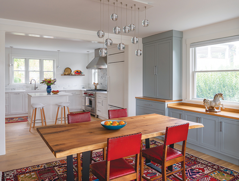
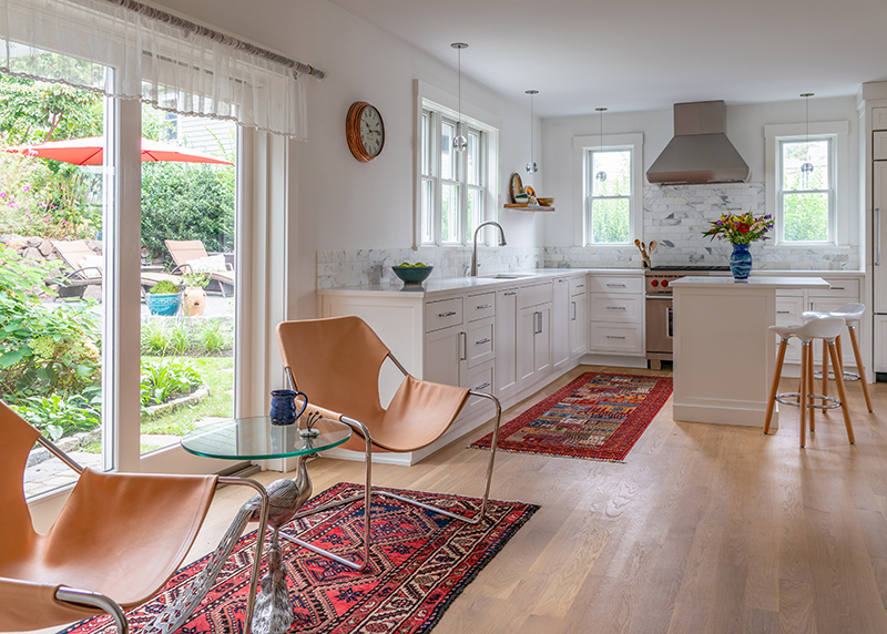
That contrasted with the “easy, beachy, open-concept” feel that the couple wanted in their new home. The solution was to reorient the kitchen, open walls, and add windows to open up the space and allow for lots of bright light and a breezy aesthetic.
“One of the best ways to have that easy flow is to keep all the rooms somewhat connected,” Petrovich-Cheney says.
For instance, they opened up the space between the kitchen, dining room, and sunroom to create a long, continuous view throughout the home. “By breaking down walls, by adding new windows we were able to maximize those views,” Graf says.
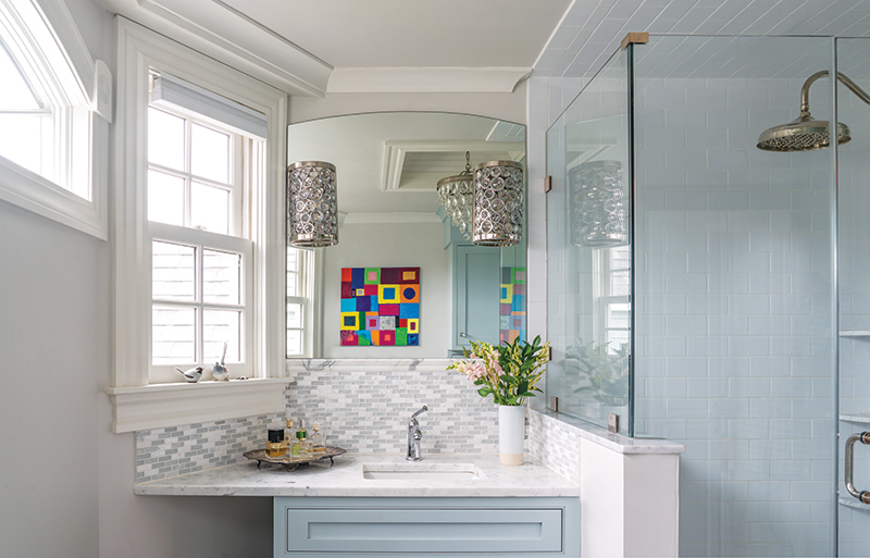
A white color palette throughout the house adds to that light, bright feeling. “It made a big difference,” says Scimone. “There’s so much light with the ocean being right there, it made a huge impact on the home.”
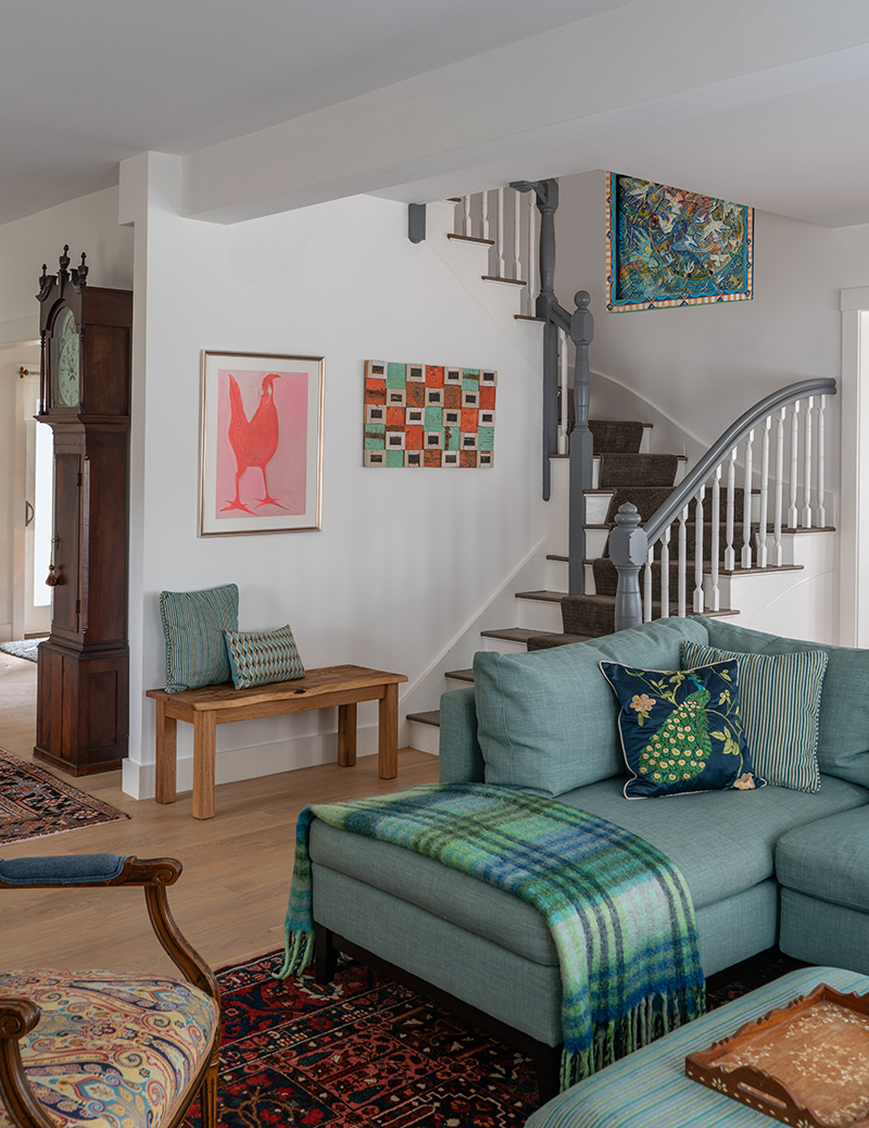
Other elements, like the watercolor blue stained-glass tile in the powder room; a bookcase-walled library; original pieces of art from artists like Wolf Kahn and Diane Burko; and a rectangular, contemporary fireplace, add pops of personality and color to the space.
“In addition to being an artist, I also collect art from other artists,” Petrovich-Cheney says. “I believe that supporting artists and buying real art (instead of posters or mass-produced images) adds to the sophistication and charm of a house.”
Another way that they “lightened” the home was by eschewing upper kitchen cabinets, instead opting for custom built-ins in the dining room to look more like furniture than upper cabinets, as well as lots of closets and a kitchen pantry.
“Eliminating the upper cabinets made the whole kitchen area really open and part of the house, not a designated ‘kitchen area,’” Petrovich-Cheney says.
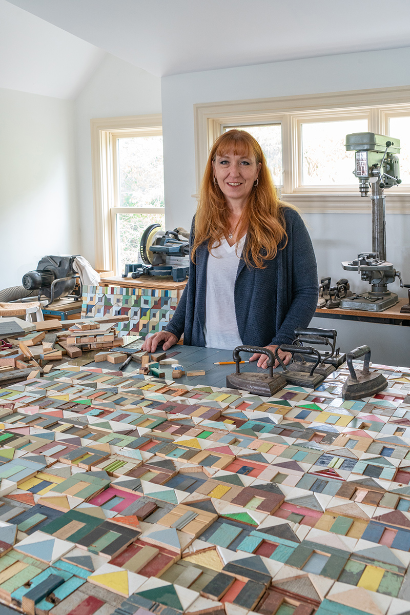
Although the home needed a lot of work, there’s a sense that the house became more of itself along the way, reflecting the personalities and unique needs of the owners, right down to the large woodshop studio space for Petrovich-Cheney above the garage that was once a gymnastics practice area for the previous owner’s daughter.
“There’s a playfulness and a quirkiness to the house that’s actually very representative of Laura and Peter,” Graf says. “You could describe the house and these owners as a perfect match.”

