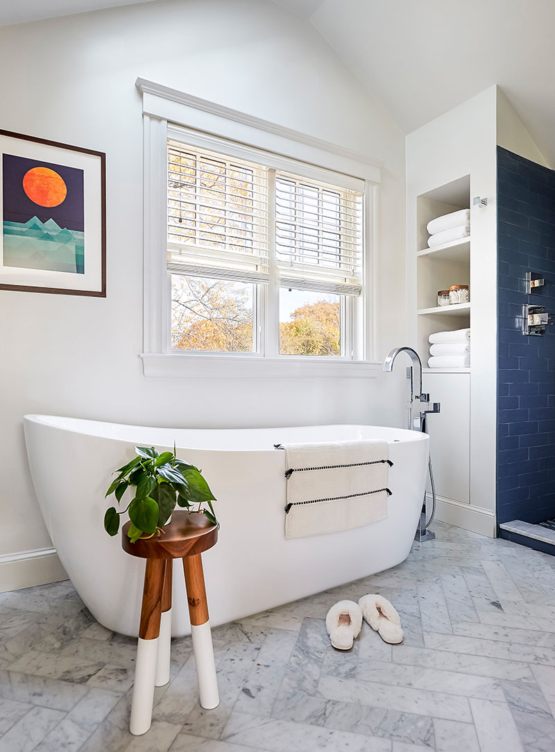
Despite two windows that look to the sea, this primary bath felt dark, tight, and altogether dreary. “There was a lot of builder beige,” Carly Blackmore of Habitat Design says. “It was pleading for a gut renovation.” In addition to fulfilling the owners’ wish list, which included a soaking tub, double sinks, and a walk-in shower, Blackmore wanted the approximately 100-square-foot space to reflect their love of boating and being by the water. “The location is quintessential Marblehead with a dock at the end of the street,” she says.
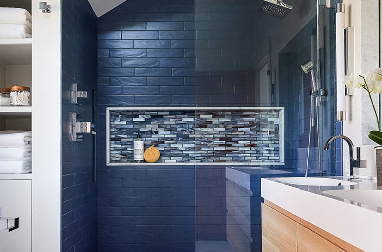
The first move was to deconstruct the box-like shower. Playing off the vaulted ceilings in the rest of the space, the team dismantled the shower’s half walls, removed the header, and opened the ceiling to follow the roofline. Blackmore covered the walls in elongated, matte blue ceramic subway tiles with an undulating texture that bounces light around the room. As for the color, Blackmore says, “The navy tile is an homage to the location.”
Blackmore briefly considered going dark on the floor, but is glad she went bold in the five-by-three-and-a-half-foot shower. “I wanted drama instead of white, bright, and obvious,” the designer says. That the tiles follow the angle of the roofline makes the expanse feel dynamic. The arrangement also leads the eye upward, emphasizing the newly sky-high space.
A large storage niche with a backdrop of matte glass mosaic tiles in a medley of blues that Blackmore matched to the shower floor, adds even more interest. The mix of colors includes warm browns that tie to the vanity. “The tiles have a lot of dimension,” the designer says, also noting its site appropriateness. “It looks like a moody ocean,” she says.

Eager to keep the sightline to the tile as clear as possible, Blackmore convinced the clients to forgo a shower door in favor of a single, fixed panel of transparent glass. “It really makes the room feel open and lets the tilework be the star,” Blackmore says.
A soaking tub was a must-have for the clients, who weren’t sure if the space could accommodate it. “People often can’t see beyond how they’re living, but I knew I could fit everything they wanted,” Blackmore says. Indeed, there was ample room for an almost six-foot-long freestanding tub under the windows. Although the thought of increasing the size of the windows seemed tempting, they ultimately opted to let them be. “The bath faces a main road that leads down to a dock, so they wanted the privacy, and they had just repainted the exterior,” Blackmore explains. Still, the window affords a view of the sky.
The sinuous shape of the slipper tub juxtaposed with the rectangular tiles and squared-off plumbing fixtures in the shower, while the tall, gooseneck tub filler accentuates the tub’s sensuous allure. The team positioned the filler at the end of the tub instead of under the window so as not to impede the vanity. “It’s not a focal point, but it still adds some drama,” Blackmore says. She slotted in towel niches on that same side, and hung towel bars opposite.
Packing in a double vanity also seemed unlikely to the owners given that the prior vanity, a brown antique chest that had seen better days, dominated the wall. In reality, the vanity was both undersized and bulky. Blackmore used the entire wall, all the way to the trim of the bedroom door, installing a 60-inch white oak vanity with a chunky, resin countertop boasting a pair of integrated sinks. Not only does the wall-hung piece make the space feel airier than the prior chest that almost reached the floor, but it also offers more storage.
To supplement the somewhat scant surface area, Blackmore carved a niche into the wall for a recessed mirror and marble jambs, creating a little shelf. “We squeezed storage out of the walls anywhere we could,” she says. Linear sconces provide long bands of light on either side.
On the fourth wall, Blackmore pushed the toilet, now a bidet model by Toto with all the bells and whistles, to one side in order to make room for built-ins complete with hampers. “We replaced their temporary storage units with this much sleeker solution,” Blackmore says.
The homeowners are thrilled with the results. “They were using the tub before the grout was dry,” the designer says with a laugh.
Interior Design: Habitat Design, habitat.design
Contractor: Mark Gibbons

