When it comes to modernizing an almost 50-year-old home, sunlight and color can make a difference. Fresh fixtures, materials, and furnishings can too. But when an architect fully reimagines the entire property—from the landscape to the living spaces—so that each element elevates the other, a truly profound transformation occurs.
This is exactly what Mat Cummings of Cummings Architects was able to accomplish for new clients looking to update their Middleton, Massachusetts, residence. The 1970s colonial suffered from the typical limitations of a structure built in that era: shallow rooms, low ceilings, dated materials, poor lighting, and very little connection to the outdoors. The couple wanted to remodel the kitchen and create a master suite but were open to Cummings’s ideas about more comprehensive improvements.
“It had a wonderful yard with an existing pool,” explains the architect of his first impression. “The clients have two children and a big, extended family that spends a lot of time together. They throw big pool parties in the summer. But the interior was disconnected from this great setting,” he continues. “The kitchen only had one window and one door overlooking the yard. The interior was generic and a little dreary.”
With the owners onboard, Cummings embarked on a property-wide overhaul with firm interior designer Chloe Rideout working alongside to finesse the paint colors, lighting, and furnishings. “They wanted their spaces to feel modern but still reflect the elegance of more traditional design,” Rideout explains of the style goals. “This resulted in a lot of contemporary-leaning, transitional details.”
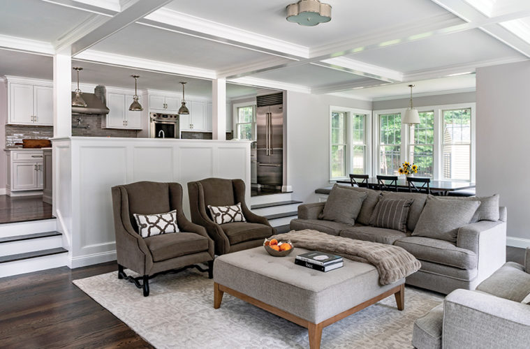
Right away, Cummings envisioned an addition bursting off the back of the house, with a tall, light-filled family room below and master suite above. “We lowered the family room down a few steps to get it closer to the grade of the patio, which allowed for a higher ceiling,” says the architect. Ceiling coffers and built-in benches infuse the family room with period charm. Stained wood floors set off the addition’s bright white millwork.
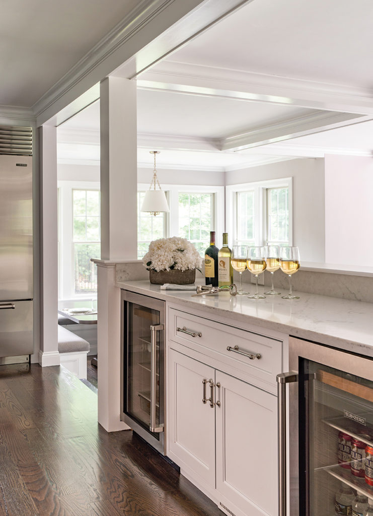
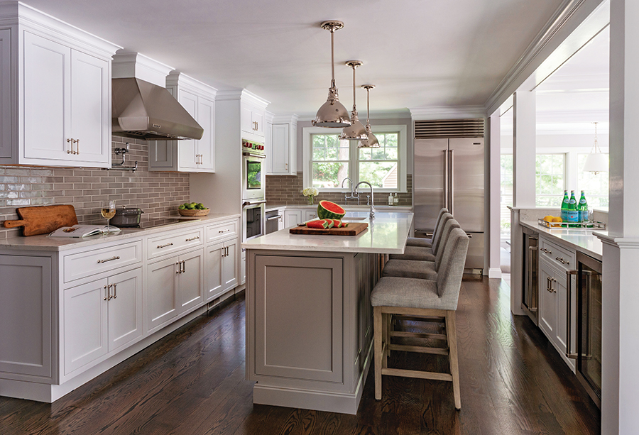
“When these homes were built, the kitchen was placed on an outside wall, with a sink centered on a window so parents could watch their kids playing in the yard,” explains Cummings. To modernize this arrangement, the architect reversed the layout, nesting the cabinets and workspaces against an inside wall. The sink was relocated under a set of windows on the home’s side, and a columned half wall with cabinets, beverage fridge, and wine fridge prefaces the step-down.
Gray—the wife’s favorite color—is woven throughout the newly open-concept main living space, starting with a pale “Silver Bells” by Benjamin Moore on the walls. Polished nickel Hudson Valley light pendants, painted island cabinets, a porcelain tile backsplash, and cushy bar stools and living room furniture from Restoration Hardware all contribute unique yet complementary shades of gray via differing textures and finishes.
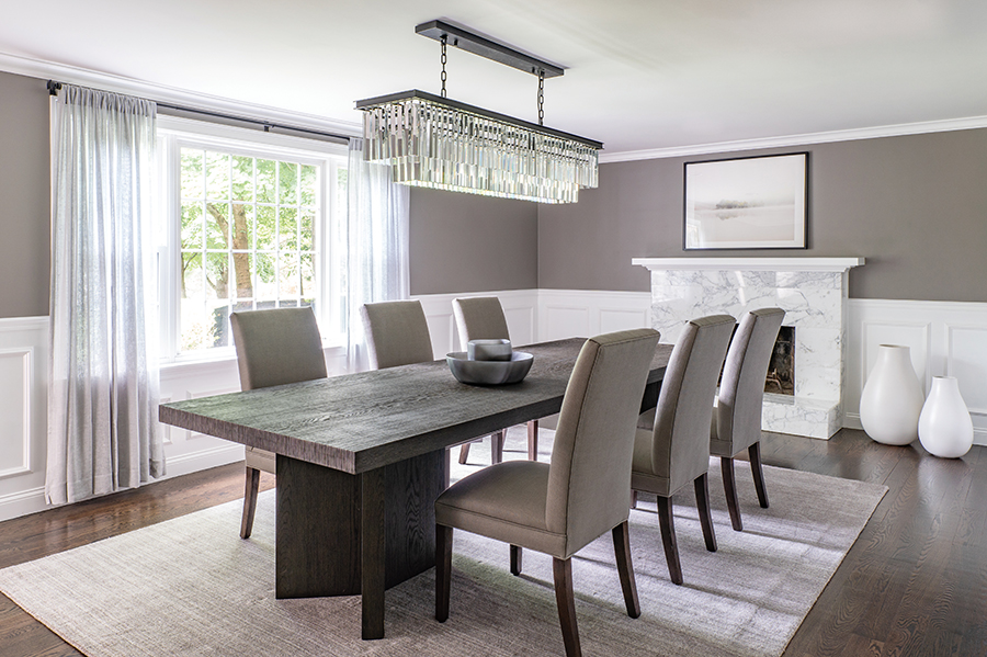
The rear addition includes a sun-filled breakfast nook off the kitchen. Its custom-crafted oak table partners perfectly with a built-in banquette and seats up to 15. Behind the kitchen, on the home’s street side, Cummings transitioned a lackluster living room into a formal dining room, where a rich gray (“Graystone” by Benjamin Moore) tops paneled wainscoting. A fringe chandelier from Restoration Hardware contributes 1920s-inspired glam.
In their new master suite, the owners gained a variety of wish-list improvements, including a large walk-in closet, custom steam shower, built-in makeup vanity for the wife, and a vanity mirror TV for the husband. “She wanted to have some fun in the master bath, so we went with laser-cut marble tile featuring a hippodrome pattern for the shower,” says Rideout. The rest of the room is serene and spa-like: a freestanding tub and vessel sinks by MTI and fixtures from Kohler’s “Purist” line are all clean-lined and contemporary.
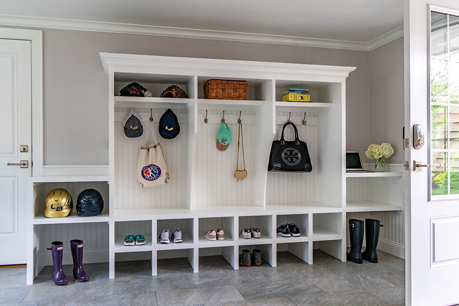
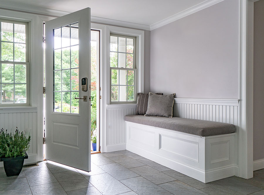
Cummings left the home’s façade largely untouched except for a mudroom addition, which took the place of an underutilized breezeway in between the home and garage. “I suggested turning the breezeway into a more utilitarian space with cubbies for the kids’ stuff, a dedicated laundry room, and a study,” says Cummings. The mudroom’s beadboard paneling, porcelain floor tile, and built-in seat are all welcoming yet practical touches.
The home’s remaining rooms were polished with new finishes and wall colors in varying shades of gray. Cummings and Rideout even improved a basement media room with updated flooring and a fresh coat of paint. Cove lighting nestled inside its new crown molding lends theater-inspired drama to the family-friendly space.
Outside, Cummings, in collaboration with Environmental Pools, transformed the property’s existing fenced-in vinyl pool into a vibrant backyard oasis and party destination. Now, an expansive stone patio expands outward from the central pool and spa, creating an eye-catching courtyard between the house and a new pool cabana.
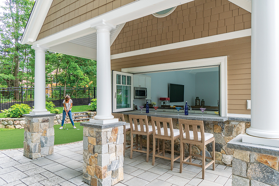
The cabana’s folding window opens up to a covered outdoor bar; folding doors along its pool-facing side fully connect it to the outdoors in fair weather. “Our clients wanted easy entertaining, and now there are plenty of spots for gathering,” says Rideout of the open-air improvements, which include a grill area with pizza oven and a putting green.
“Some architects conceive of a house in a bubble, but we believe that a house should be fully integrated into its setting,” relates Cummings. “Now, the kitchen is open to the family room, and all of the family room’s glass overlooks the pool and then the cabana. There’s a much more modern, much more inviting connection between indoors and out.”

