Royal Barry Wills was one of the country’s most popular architectural firms. Wills, a Massachusetts native and MIT graduate, designed houses with livability and common-sense charm in mind. His plans—available for “stock” purchase and regularly advertised—resulted in well-proportioned residences with a custom feel but attainable cost. Houses bearing his stamp are still highly valued today.
For Jenn Sanborn, principal of Sacris Design, a full-service interior architecture and design firm, it was a thrill to reimagine such a classic example of the architect’s work. Her clients spotted the Royal Barry Wills design—a symmetrical Cape with large central chimney and dormers—in Newburyport during a real estate hunt.
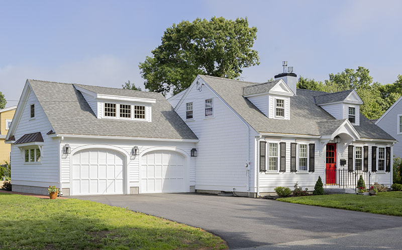
“They were searching for a home with some land in a walkable neighborhood, one where they could age in place with a first-floor primary suite,” says Sanborn. Eyeing the Cape on a corner lot, they were hopeful about its potential. Sanborn agreed that, with some thoughtful construction, the house could deliver all the features on their wish list.
Straight out of the pages of Houses for Good Living, Wills’s 1947 catalog of house styles, the home was well cared for by the previous owners and largely unchanged. Downstairs was a simple configuration of living room, dining room, kitchen, and half bath. Upstairs, it had three small bedrooms and a bathroom. An enclosed breezeway prefaced the one-car garage, and a screened porch ran along the back.
The book’s caption says it all: “[The plan] is so simple and livable that it needs little explanation. It is included in this volume because it is an old friend and we like it.”
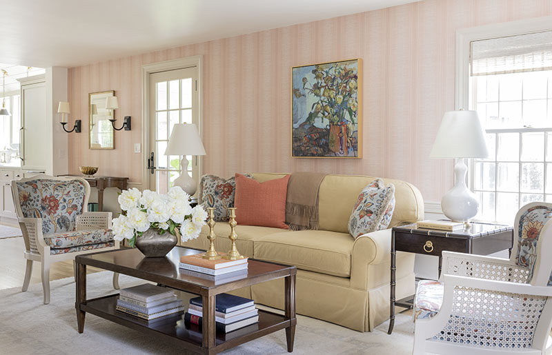
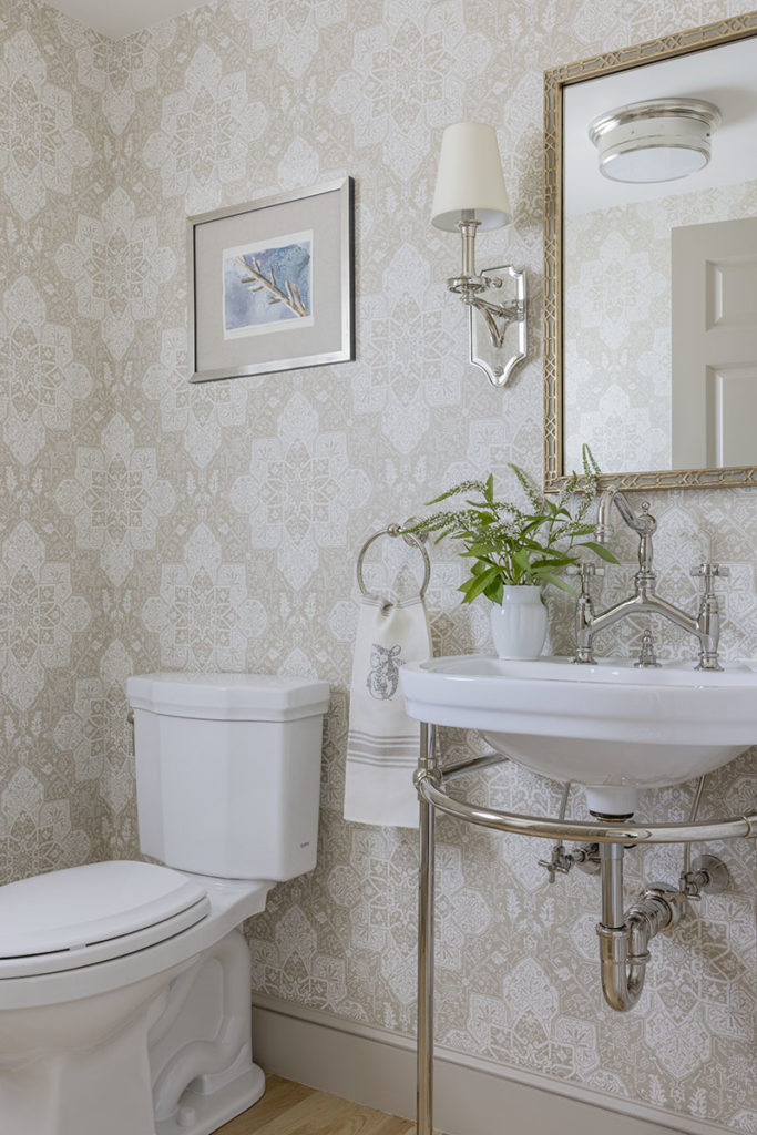
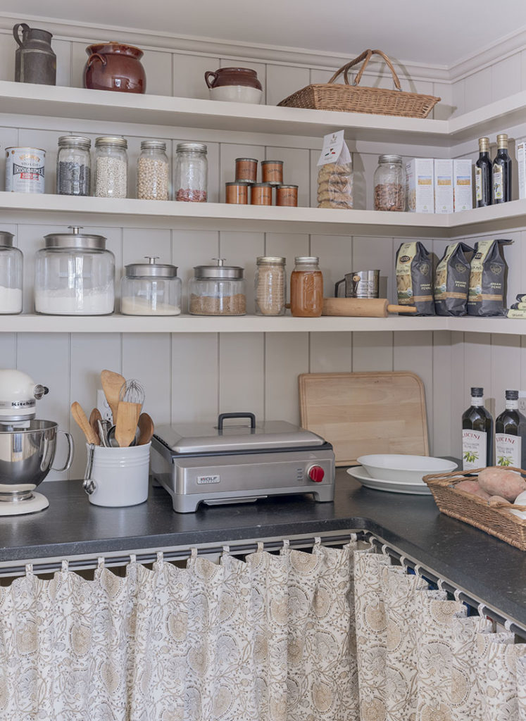
Transforming this “old friend” into a home with contemporary amenities required the rearrangement of rooms as well as a small addition reaching into the rear yard. Sanborn removed the back porch and added a new entrance corridor from the garage lined with a mudroom, half bath, and pantry. This corridor leads to a new light-filled kitchen and dining area connected directly to the living room.
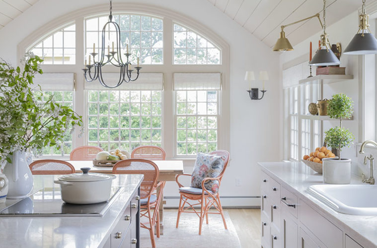
Construction allowed Sanborn to curate a modern, open-concept, high-functioning kitchen with vaulted ceiling and luxe appliances for a client who loves to cook. She placed a Wolf induction cooktop in the central island and wall ovens (including Wolf’s convection steam model) and paneled Sub-Zero refrigerator and freezer drawers in the perimeter cabinetry. “This kitchen is somewhat unique in that it’s a double galley arrangement,” says Sanborn of its linear shape.
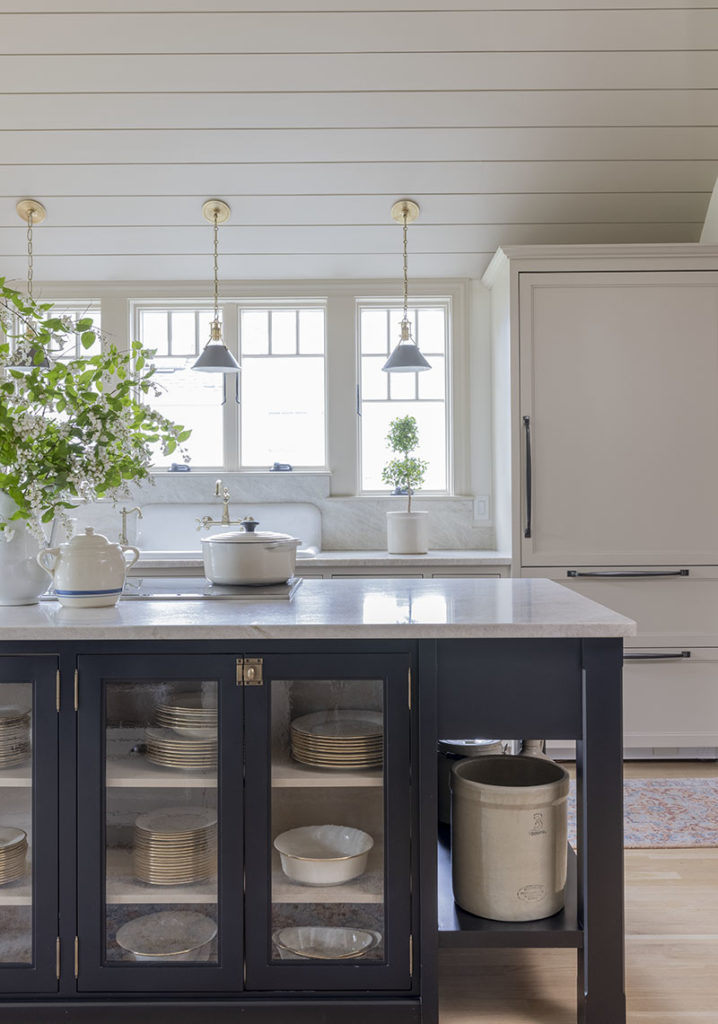
The perimeter cabinetry, millwork, and ceiling paneling are all finished in Benjamin-Moore’s “Brick House Tan,” a warm historic hue that was popular in Williamsburg during the late 18th century. In contrast, the island is painted black; its seeded glass, exposed hinges, and chamfered legs give it a period, furniture-like feel. Opposite the island’s cooktop side, glass-fronted cabinets showcase the client’s china and dishware in lieu of a more traditional hutch. Open shelving at either end displays vintage pieces.
“This is the first island I’ve designed in a long time without seating, but we didn’t require any with the dining table so close by,” explains the designer. Instead of lights over the island, which would have obstructed views, she centered three small Hudson Valley pendants over the sink.
“Our client loves traditional cottage elements, so I mixed and matched design features to achieve a historical cottage feel,” notes Sanborn of the overall style. A reproduction farmhouse sink and wall-mounted faucet nod to vintage cottage. Differing hardware finishes keep the kitchen from feeling too precious or too new. The perimeter cabinetry hardware is dark bronze while the island’s is antique brass; light fixtures similarly bounce between black and brass.
A showpiece iron chandelier by Visual Comfort punctuates the dining area. Sanborn had the woven rattan chairs from Sika Design finished in her client’s favorite persimmon orange. The arched top of the showpiece window arrangement honors the home’s former breezeway, which Sanborn transitioned into a second garage bay for practicality’s sake. Flattening the vaulted ceiling’s middle section “related better to the geometry of the window than a peak,” she notes.
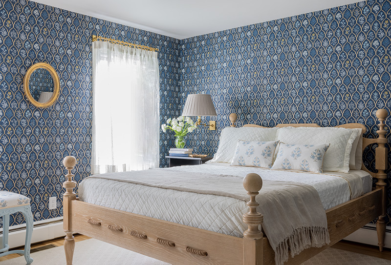
Assembling a first-floor bedroom suite was one of Sanborn’s top priorities. She repurposed the original dining room at the front of the home and used plumbing from the old kitchen for a primary bath. “We took out a window to make room for a headboard and finished the room in a really fun Rifle Paper Co. wall covering,” says the designer. The “Saltwater” Woodbridge bed with rope detail harks back to the 1800s when mattresses were supported by rope lattice underneath (hence the phrase “sleep tight”).
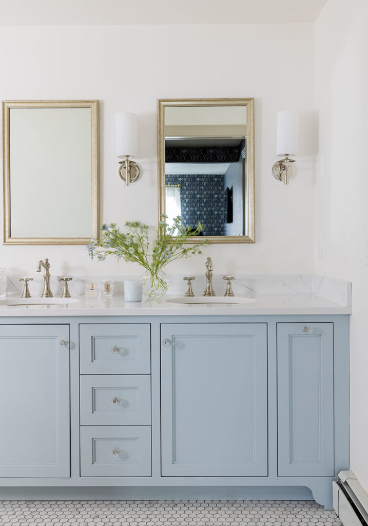
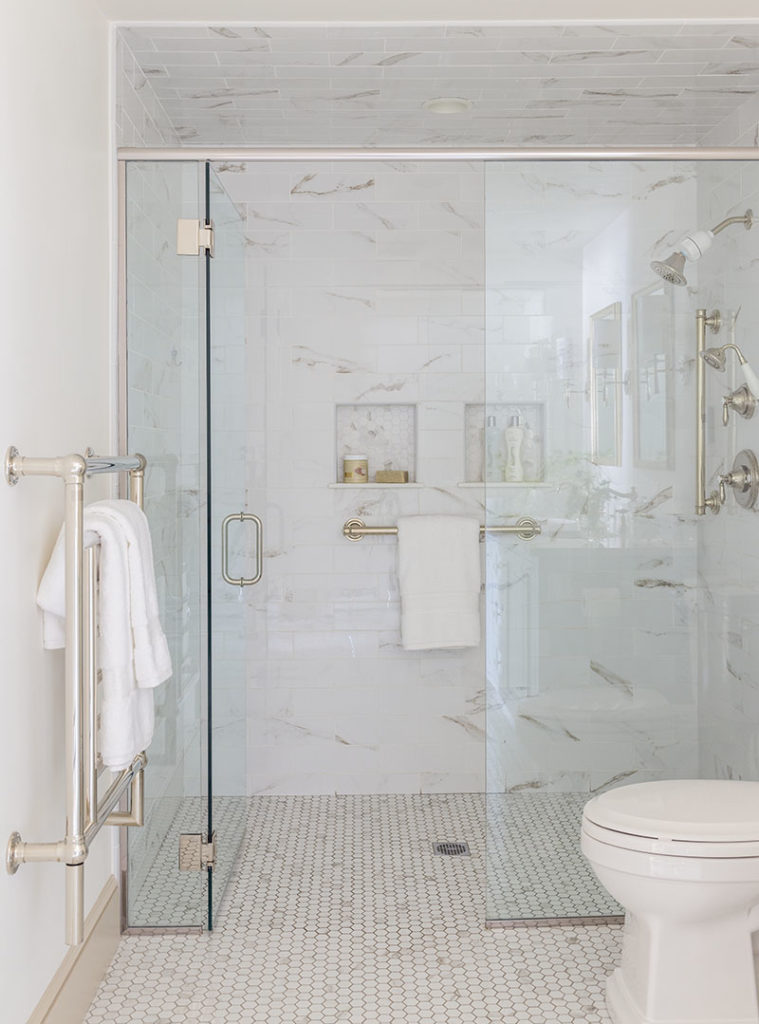
A curbless glassed shower with extra grab bars (plus blocking for more bars if needed) in the primary bath ensures ease of use well into the future. The vanity, designed by Sanborn and executed by Advanced Custom Cabinets of New Hampshire, has pullouts on both ends for optimum storage. Heated floors and an Amba towel warmer round out the room’s quiet luxury.
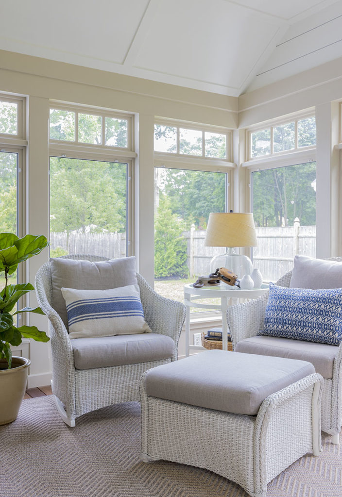
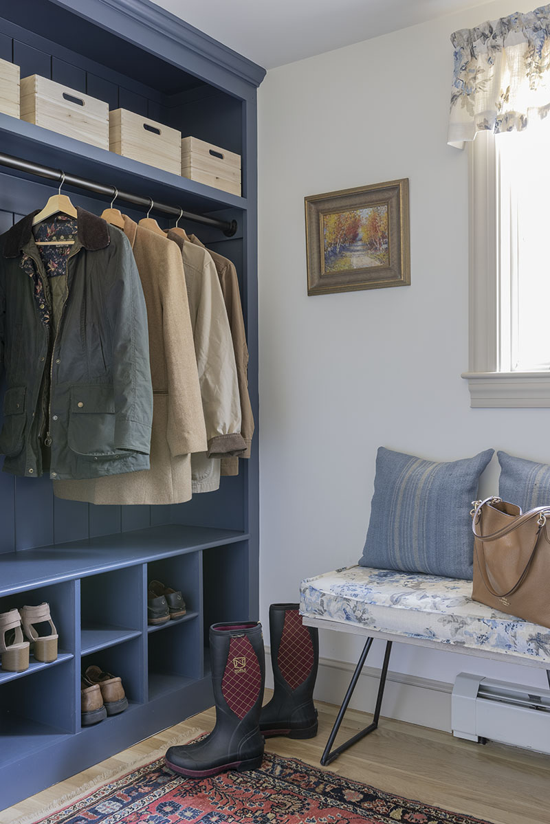
Other post-renovation perks include a new walk-in closet for the primary suite, laundry closet, three-season porch, and front entrance portico. Upstairs, three small bedrooms were consolidated into two full-size rooms. Considering the husband’s preference for blue and the project’s locale, the designer couldn’t help but apply Benjamin-Moore’s “Newburyport Blue” to the mudroom built-ins.
Without adding square footage disproportionately—the house increased from around 1,900 square feet to just 2,500—Sanborn achieved an impressive list of modern conveniences. With a fresh coat of white paint, this chapter of Royal Barry Wills’ design philosophy is still relevant but even more livable.

