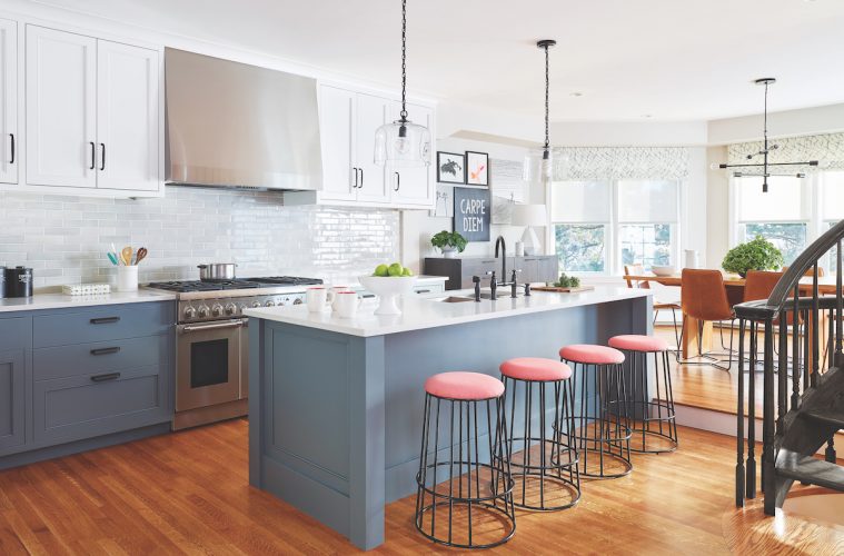
When Kristina Crestin saw the post, she knew she needed to call in reinforcements, both literally and figuratively. Standing smack in the middle of the kitchen space, exactly where Crestin, founder of an eponymous Manchester-by-the-Sea design firm, could picture a large welcoming island for this Swampscott homeowner’s family of four to gather around, the post cut the whole space off, making it feel claustrophobic. So before Crestin even presented her first sketch, she suggested bringing in Premier Builders, a Georgetown contractor that also has a custom cabinetry division, to collaborate on the project.
The grand old home, built in 1882 by well-known Boston architect Arthur Little, was full of charm. The client loved the bones of the house, but hated the dated 1990s-style kitchen, closed in by the pole, and suffering from the imprint of many previous owners and their sometimes odd renovation choices through the years.
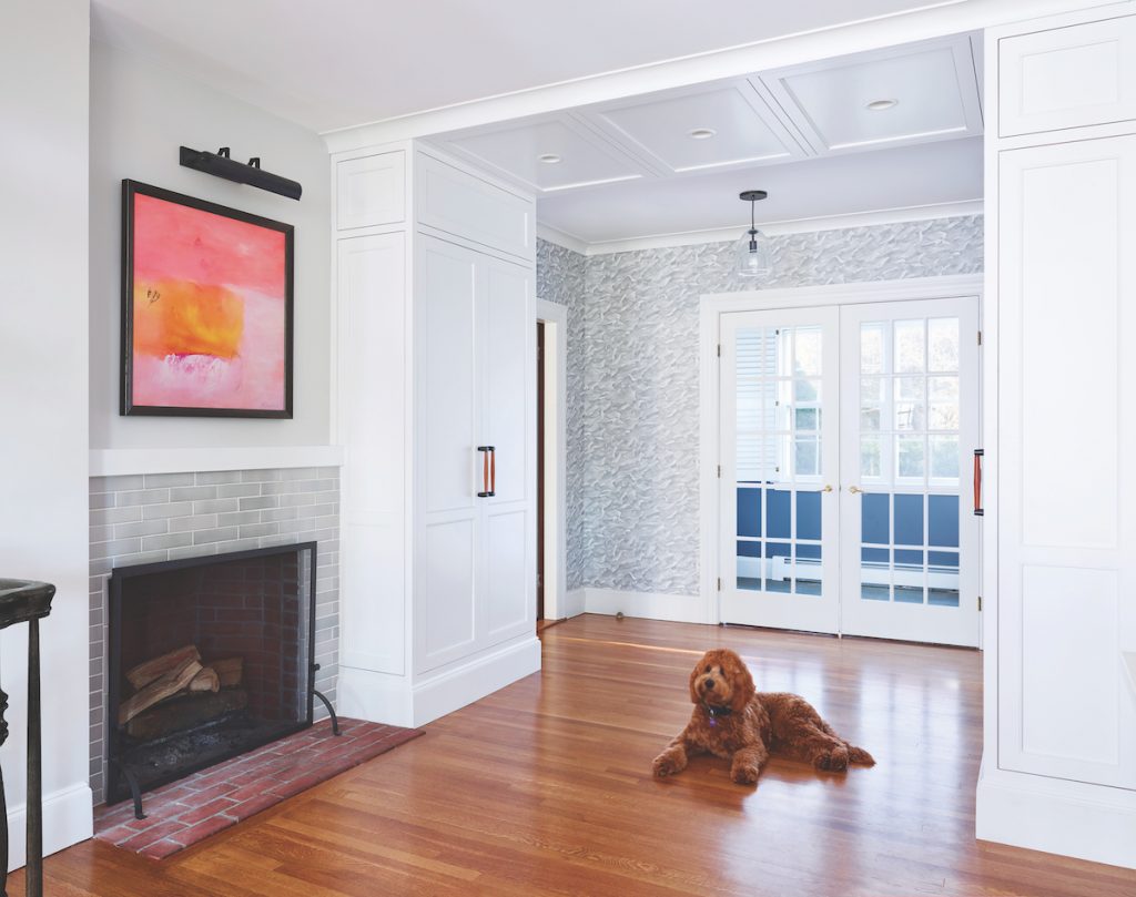
For example there was a single step up into the dining nook—put in place by a former owner to give more ceiling height to a dining room below—as well as a spiral staircase leading down to that dining room and a fireplace jammed into the corner. Not to mention the soffit running above the wall of cabinets.
“I call it design gymnastics,” Crestin says with a laugh, noting that these challenges often turn up in older homes—though this one had them in spades.
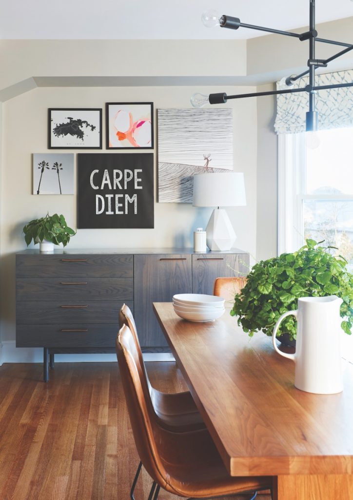
While the owner herself is not drawn to traditional designs, Crestin says she expressed a desire to honor the house. “She didn’t want to walk into the kitchen and feel like you were in a totally different home, but at the same time she didn’t want it to be completely classic because that didn’t give her any of the freshness of modern design for her young family.”
To help with the balancing act, Ken Kumph, president of Premier, arrived with a team during measure-up to poke some holes in the post and explore what that soffit was hiding, hoping to clean up the design. Kumph said that that the pole could go, and be replaced by a steel beam in the ceiling, but moving the ductwork would jack up costs considerably.
“Ken was able to give us some data, so that when I started sketching layouts, it was an informed decision to show [the client] some ideas that involved moving the HVAC, knowing that would be a much bigger ticket,” Crestin says.
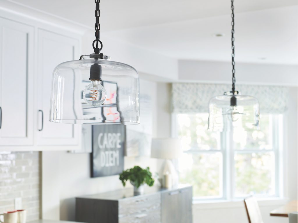
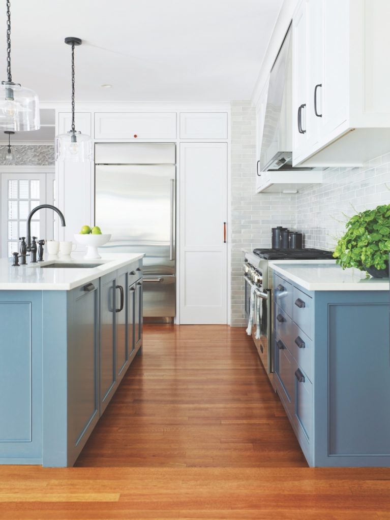
Ultimately, they decided to leave the ductwork as it was, but integrating it involved a bit of magic. The new upper cabinets only have shelving part way up—at the top, hidden inside each one, is a box with the ducts, which involved a lot of custom millwork. A specially crafted stainless steel panel in the middle of the cabinets above the stove covers both the range hood and the AC ducts above it.
“I brought Premier in because on a project like this, you need talented carpenters,” Crestin says. “You need the A Team.” Crestin has a long history of working with Premier—Kumph was running one of the first projects she worked on as a design intern, and she met her husband, Kirby Crestin, on a project where she was lead designer and he was project manager. The couple has been married for 11 years now, and they work together a few times a year—including on this project.
“He can get inside my brain and see where I’m taking things,” Crestin says. “It’s nice to have that kind of shorthand.” That said, the pair has some rules around talking shop at the dinner table. “We both have to understand when it’s okay to be off,” she says.
For his part, Kumph says his long-term working relationship with Crestin is a real benefit. “We can relate easily on her design ideas,” he says. “Kristina has a great eye for fine details, well in advance. Together, we are able to work out special concerns.”
On this project, that level of communication was critical—when demo started, workers uncovered an unwelcome surprise that slowed the project down.
“Initially, upon demolition we discovered serious structural problems,” Kumph recalls. “Previous renovations had been re-structured inadequately.” Because of this, a structural engineer was brought in—and the result was a massive steel beam, along with brackets and supports that needed to be crafted and installed before work could move forward.
Custom millwork was also critical for hiding mechanicals and creating storage space, playing to another of Crestin’s strengths. “I have a good background in custom cabinetry and millwork and a lot of technical knowledge,” she says, explaining that while the homeowner wanted to solve the aesthetic problems of blending old and new, there were a lot of interior architectural details that also needed to be addressed. “I was a good fit for her without really needing an architect, except for the beam sizing,” Crestin says.
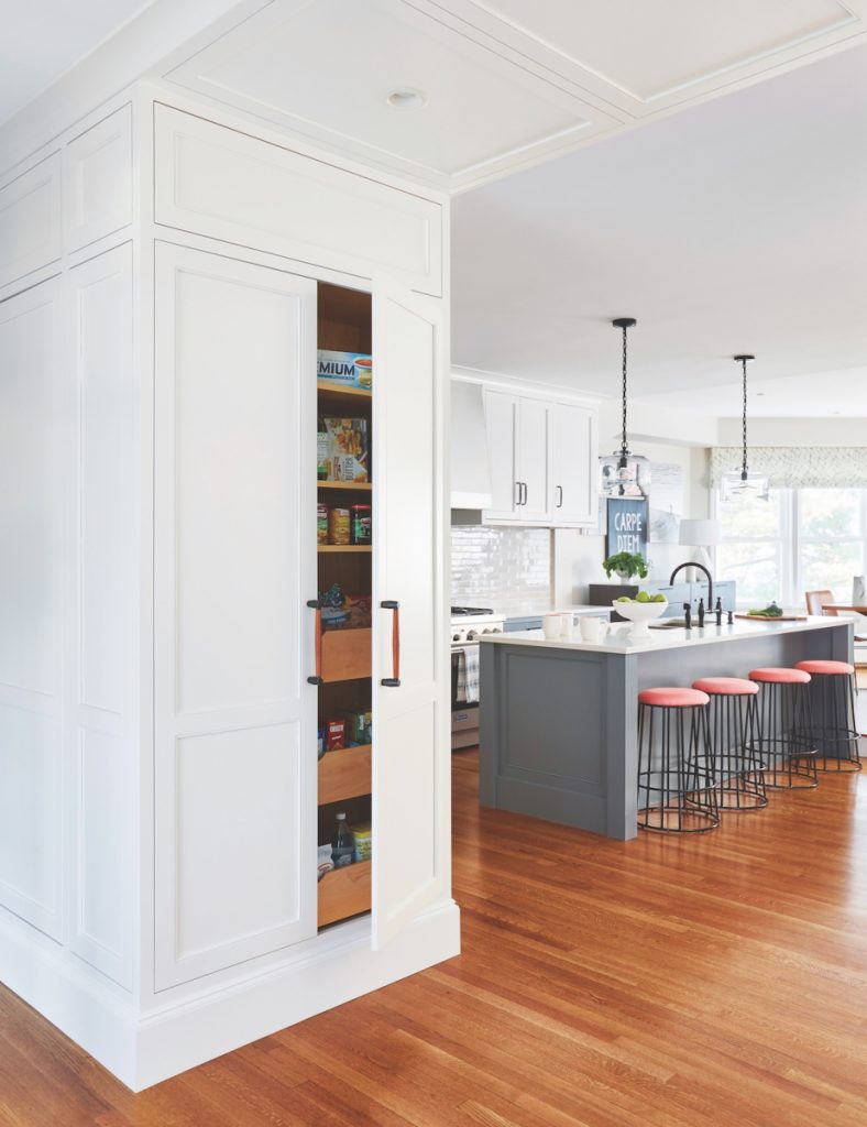
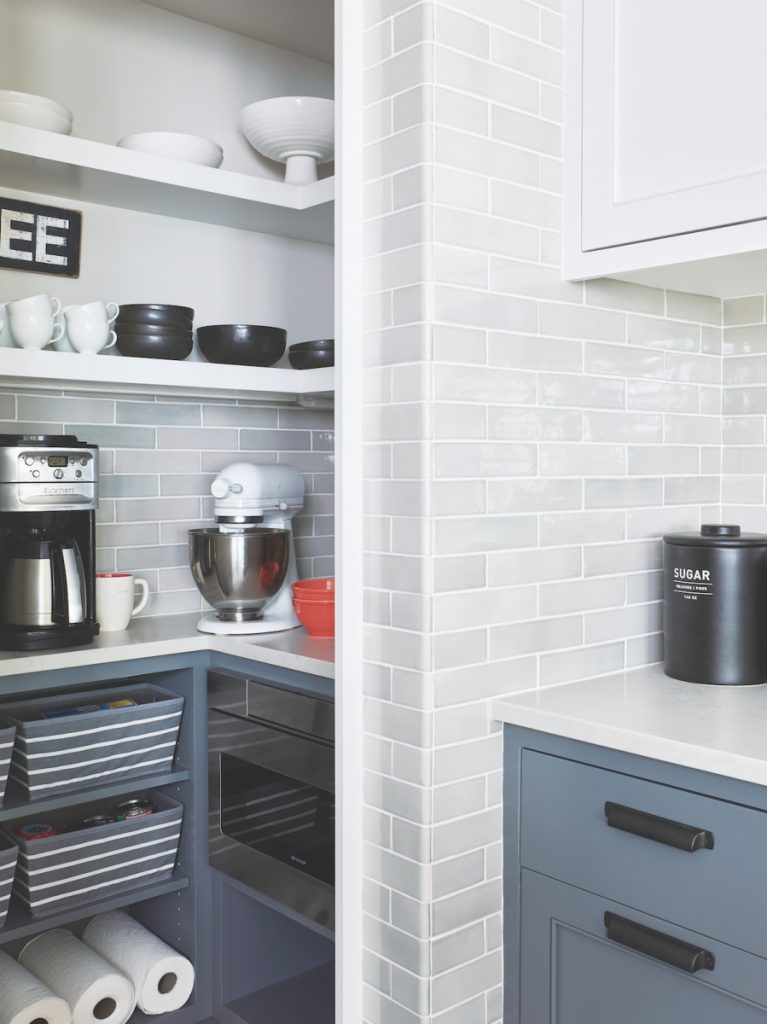
As one example, clever custom cabinetry hides a pantry, keeping the coffee maker and microwave tucked away. “The design of the pantry ‘walk-in cabinet’ was a unique challenge,” Kumph says. “Due to space constraints, true walls would have really limited the storage.” Instead, Crestin’s design called for custom panels and an entry door using cabinet construction.
For pieces like this, and for decisions right down to the cabinet colors, having a design/build project with a custom cabinetry arm made all the difference.
“It was a really nice team effort to bring some of these older home nuances together with a fresh, modern look,” Crestin says. “There was a lot of collaboration on design details and how it was all going to come together.”

