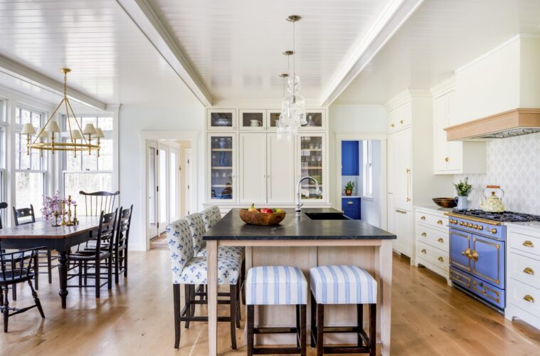
Suzanne never cared for stainless-steel appliances. Nevertheless, when she and her husband, John, renovated the kitchen in the North Reading home where they raised their three children, they felt that installing them was expected. “I never liked the industrial look of stainless steel,” she admits. “We like things that look older and more traditional.”
This time around, however, Suzanne and John designed from the heart. Working with architect Scott Brown and Star Island Builders, the couple built a 1930s-style Dutch Colonial in Rye, a town they had always loved. Paula Accioly, the head of design at Jewett Farms + Co., collaborated with the pair on the kitchen. The process included going through everything in their current kitchen that they didn’t love.
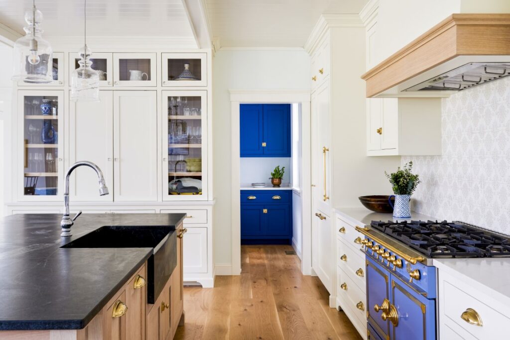
The centerpiece of the new kitchen, which combines a coastal sensibility with New England craftsmanship, is a La Cornue range in periwinkle blue enamel with polished brass accents. Yes, it was pricey, but Suzanne cooks often and John enjoys baking bread. Plus, the piece would set the tone for the entire space, which includes a dining alcove and an adjacent sitting area. As their daughter helpfully (cheekily) observed, since they were building a barn for John’s antique car collection, surely they could splurge on the stove Suzanne adored.
The range anchors the main wall, punctuating the creamy white cabinetry with charming coastal color. “I always wanted a blue and white kitchen, but not overly so,” Suzanne shares. The patterned backsplash tile she chose at Portico Tile in Rye adds a subtle layer of interest. The neutral hues play off the room’s beachy wood accents and there’s a hint of blue brushed in too.
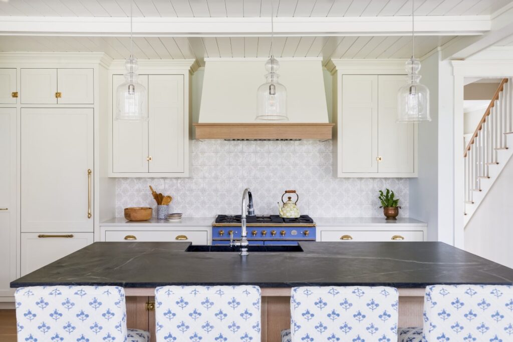
Preliminary plans showed the range on the wall at the end of the island, between the pantry and the cased opening to the mudroom. The visual impact would have been significant from the sitting area, but Accioly relocated it for better functionality. “You need countertops on either side, especially for someone who loves to cook, so we placed the range on the longest wall,” she says. The new location also made it easier to vent the hood outdoors.
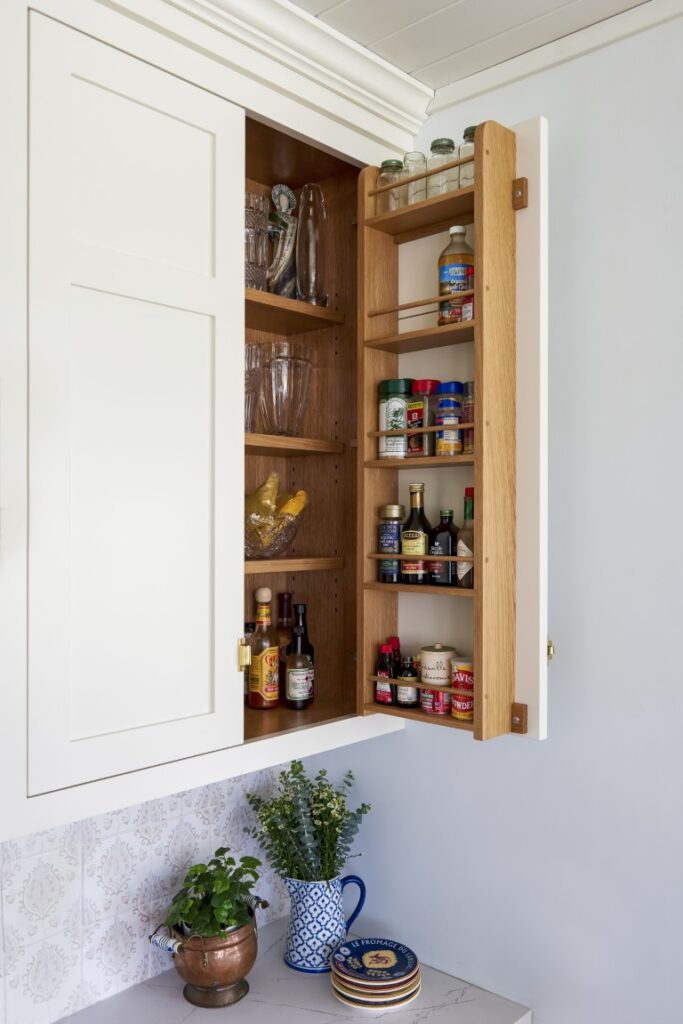
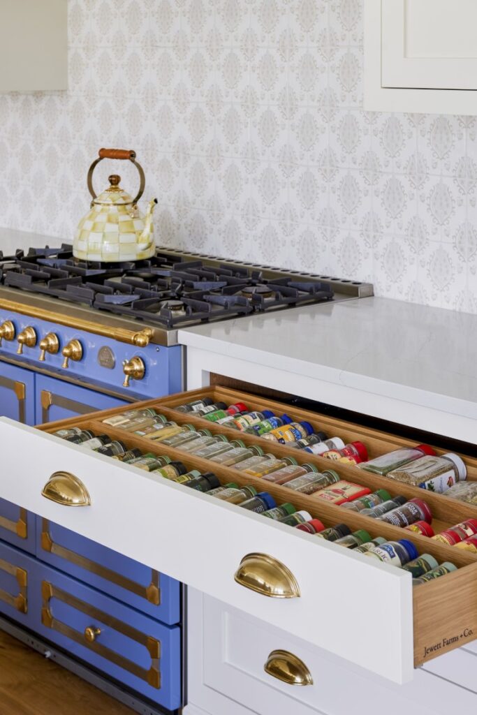
Accioly packed that wall with function. “One of the first things Suzanne told me was that she had a lot of spices,” the designer says. “We built a wide drawer to the right of the range that lays them all out.” There’s also a rack on the inside of the upper cabinet door for larger containers, bottles of oil, and the like. Suzanne is glad to be rid of her ineffective lazy Susan spice system and doesn’t miss the clatter of the lids that constantly fell out of the cabinets. “Everything fits so nicely in the big drawers,” she says. “We keep the plates in them too.”
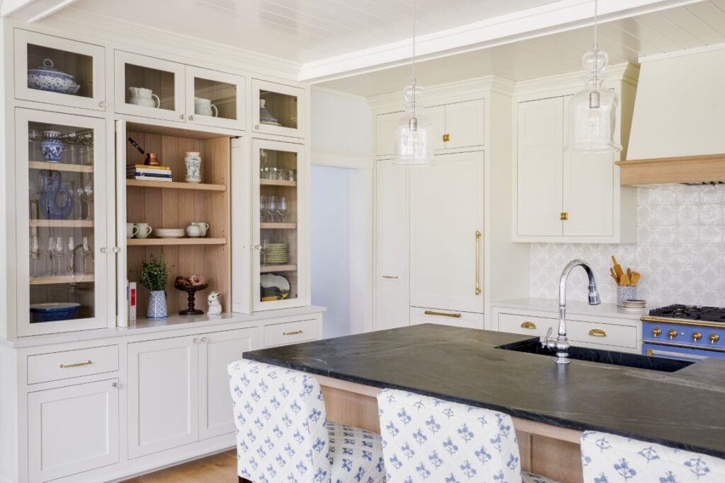
The paneled fridge and a pull-out pantry cabinet are barely discernible by the walk-in pantry. “You want the tallest, bulkiest cabinet in the most discreet area so it doesn’t overwhelm the space,” Accioly explains. “We put the fridge and the pantry side by side to make it easier to put away groceries.”
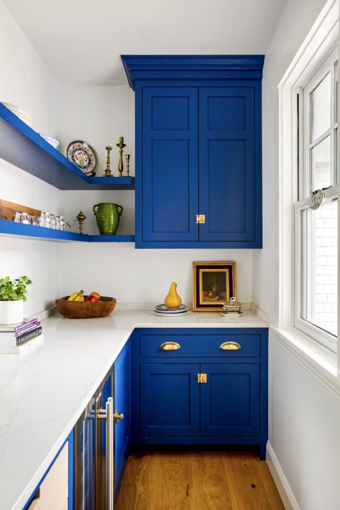
The pantry has been a game-changer in terms of banishing clutter from the kitchen, Suzanne says. The microwave, toaster, bread basket, vitamins, and other accoutrements of daily life are tucked away in there. It also presented the opportunity for a shot of color: The cabinets are painted an intensely saturated blue. “The blue in the pantry is a surprise when you stick your head in,” Suzanne says delightedly.
For the shorter wall at the end of the island, Accioly designed a hutch. The center section boasts retractable pocket doors that reveal an oak-paneled back and a countertop for serving or mixing drinks, while the glass-front doors that flank it show off glassware and china. “Our old kitchen lacked accessible storage for the Austrian crystal my husband collected when he lived there,” Suzanne says.
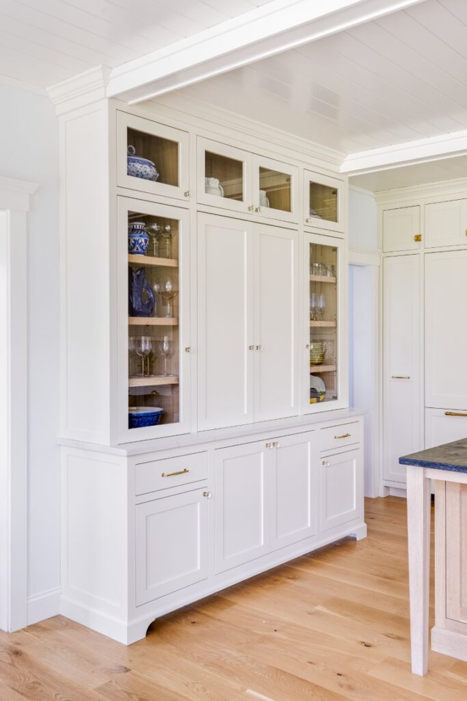
The elegant vignette is also an effective focal point. “We consider every sightline when we design so every vantage point offers something beautiful to look,” at Accioly says. She points to the glossy, slatted ceiling, noting the seamless integration of the beams with the millwork. “We often start making the cabinets before there’s a house, or even a foundation, in place, which means the contractor has to build according to our plans,” the designer says. “The builders worked hard to make sure everything lined up.”
A rift-sawn white oak island with a white-tinged oil finish and a dark, soapstone top grounds the center of the room. The countertop ties to the traditional black dining table and chairs that the couple brought with them from their prior home. While the table’s rustic wood top withstood the family’s wear and tear over the years, Suzanne looks forward to the soapstone’s eventual patina. “Soapstone tells a story,” she says. “You’ll see marks showing exactly where you put your coffee cup every morning.” It’s warm and comforting, just as they hoped.
Learn more about the project team
Architect: ART ARchitects
Contractor: Hunter Whitmore, Whitmore Brothers Construction Co.
Landscape architect: Nina Brown, Brown, Richardson + Rowe
Architect: Scott Brown
Contractor: Star Island Builders
Kitchen Design & Cabinetry: Jewett Farms + Co.

