“There can be no toile here,” one of the homeowners told interior designer Tiffany LeBlanc, and she understood what he and his family were looking for immediately. “These clients are sophisticated but also playful — they wanted their home to be chic, comfortable and livable,” she says. Instead of traditional toile, she found wallcoverings with tactile textures and tone-on-tone prints, sourced hand-blocked textiles and brought in surprises like animal prints, lots of purple and pops of orange. Unexpected light fixtures and artwork were the finishing touches that matched the decor to the family’s joie de vivre.
Photos by Eric Roth
Houzz at a Glance
Who lives here: An active family of five
Location: Wellesley, Massachusetts
Size: Five bedrooms, five full bathrooms, two half bathrooms
Designer: Tiffany LeBlanc of LeBlanc Design
The family purchased a Colonial-style home that had recently undergone an extensive remodel, but it still didn’t represent their style. “It had great bones but was only about 80 percent them,” LeBlanc says. “I told them that having to change about 20 percent was totally manageable.”
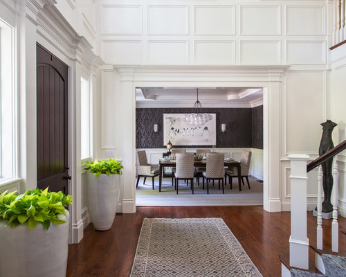
This is the formal front entry. “We needed to soften the extensive millwork in here,” LeBlanc says. A luxe wool and silk stair runner brings in pattern and color, while a bronze sculpture stands up to the two-story height. LeBlanc also added a dark stain to the staircase railing and the front door. “It’s important to pay attention to the finishes on tactile things like railings and doorknobs, because you’ll be touching them a lot,” she says. “Paying attention to these kinds of architectural finishes prevents things from looking ‘cookie-cutter.’ ”
Below, a rug provides a landing zone for guests. Two new ceramic planters break up the millwork and add some life and energy to the space.
Tip: “If you want the look of greenery but don’t want to have to maintain it, use moss,” LeBlanc says.
Sophisticated 1: Eric Roth, original photo on Houzz
“I knew my clients did not want the usual big traditional oil painting over the dining room buffet,” LeBlanc says. The piece she helped them find, visible from the entry, is a British illustration of penguins. “The frame probably cost more than the artwork,” she says with a laugh. “Moves like this helped bring their personalities into the house.”
“The family didn’t want the dining room to feel so serious and formal,” LeBlanc says. “We brought in some drama via the purple ikat wallpaper and some whimsy with the light fixture and the penguin illustration — it’s a playful juxtaposition between sophisticated and fun in here.”

Sophisticated 2: Eric Roth, original photo on Houzz
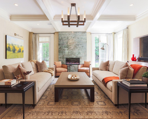
“Cozy doesn’t have to mean unrefined,” the designer says. In the living room, she created a polished look that’s also very livable. The most dramatic change was replacing a ho-hum traditional fireplace surround with a striking quartzite slab that looks like art. On the floor she layered a handmade rug atop a sisal one. The chenille sofas are soft and inviting, while throws invite people to cozy up.
This room serves as the family’s main TV-watching room, so LeBlanc designed a recessed area for the TV and installed a media cabinet beneath to house the components and wires. “By installing it this way it just felt lighter in the room,” she says.
Before the redesign, the only access to the backyard was via these French doors. “It was not ideal to have to carry the chicken out to the grill through the living room,” LeBlanc says.
A subtle seamless grasscloth adds warm color and texture to the walls. “A lot of people are reluctant to add grasscloth because of the visible seams, but Phillip Jeffries has come out with wallcoverings that are seamless,” LeBlanc says. Animal-print pillows with bright orange piping are an unexpected touch.
Mix and Match Colorful and Patterned Throw Pillows
Sophisticated 3: Eric Roth, original photo on Houzz
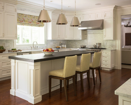
Because the kitchen had undergone a recent renovation, all LeBlanc did here was replace the lights, add a Roman shade in a cheerful pattern and bring in new bar stools.
Blinds vs. Shades: What’s the Best Treatment for Your Windows?
Sophisticated 4: Eric Roth, original photo on Houzz
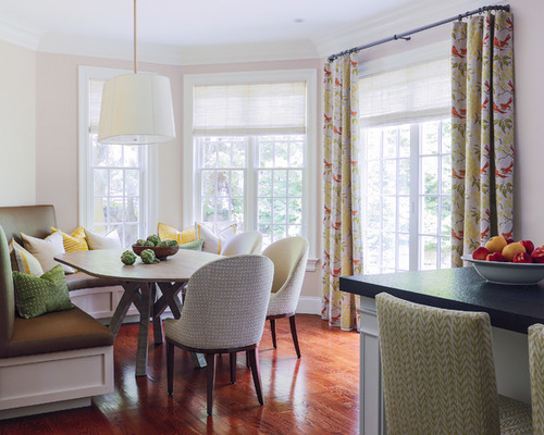
The biggest intervention was in the breakfast nook, where the family loves to gather for most of its meals. The banquette is curved and the bleached-walnut-topped table was custom made. “It’s great to have comfortable chairs for the adults on one side, while the kids like the banquette,” LeBlanc says. She brought in the same bright fabric to the French doors that she used over the sink. Oh, and she also added the doors. No more trekking through the living room with chicken.
Sophisticated 5: Eric Roth, original photo on Houzz
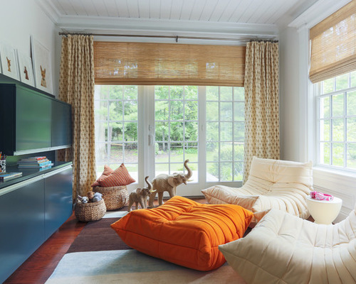
This playroom is another TV-watching spot, one where the kids rule. There’s plenty of room to get messy with toys and games on the soft rug in here, while the cushy Roche Bobois chairs and ottoman are super snuggly. Lacquered cabinets provide storage and a stark contrast to all the white millwork in the house. The window treatments feature a hand-blocked pattern.
Sophisticated 6: Eric Roth, original photo on Houzz
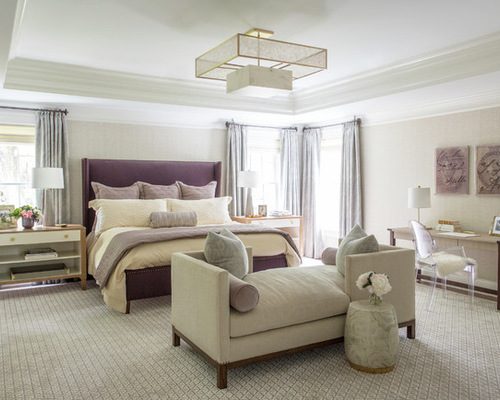
“Lately people get carried away with master bedroom proportions and they are simply too big,” LeBlanc says. In order to make this space feel more intimate, she designed a tall velvet headboard with a tailored feel, flanked by nightstands and lamps that are to scale. She also softened the windows with woven wool panels.
“The idea behind the tete-a-tete was that they could sit and talk without having to be on their bed,” LeBlanc says. “But it’s always fun to see how things really get used — they tell me that when one of the kids isn’t feeling well they snuggle down and sleep on it.”
A rug adds softness to the floor, while a sophisticated light fixture draws the eye overhead. The bottom of the light is alabaster that glows.
The wallcovering in here is another tone-on-tone pattern. “It’s geometric but it almost looks like limestone; it has a very lovely subtlety to it,” the designer says.
“These are such wonderful, vibrant people,” LeBlanc says. “I’m so glad their home now matches their personalities.”

