Any good designer knows that opposites can attract—classic and contemporary, tradition and technology, form and function, beauty and practicality—but it takes a great design team to make them work together successfully.
Enter Sally Wilson and John Kelsey, principals of Salem-based Wilson Kelsey Design, who accepted a kitchen renovation project at a family home in Newbury and turned it into a thoroughly stylish and perfectly balanced living space.
Their clients, who were expecting their first child, had upsized from an apartment on Boston’s Commonwealth Avenue to a much larger Colonial Revival-style residence near Newbury Commons.

“The setting is gorgeous,” says Wilson. “The house is on about three acres with a corral at the back; it’s a lovely leafy aspect.”
Newbury architect John Minton and custom builder Henry Becker began the design process with an elegant extension to one side of the house, allowing for a new kitchen while maintaining the home’s architectural symmetry and integrity.
But once the new construction shell was complete, Wilson and Kelsey realized there was space for more than a kitchen alone, and drew on the knowledge that the clients wanted to add a screened porch at a future date.
“We completely changed the kitchen layout to allow them to get directly to the enclosed porch and outside,” says Kelsey.
The design duo’s solution was a long galley kitchen with staggered workspaces along one wall, an island with pull-up seating, a built-in banquette for family dining, and French doors that would open to the porch.
Wilson and Kelsey’s clever space utilization also left room for a separate walk-in pantry adjacent to the kitchen, a powder room, a mud room with direct access to the garden, and a new hallway connecting the kitchen to the main dining room.

With Becker custom-making the kitchen cabinets at his nearby workshop, the designers turned their attention to the galley, island, and dining banquette.
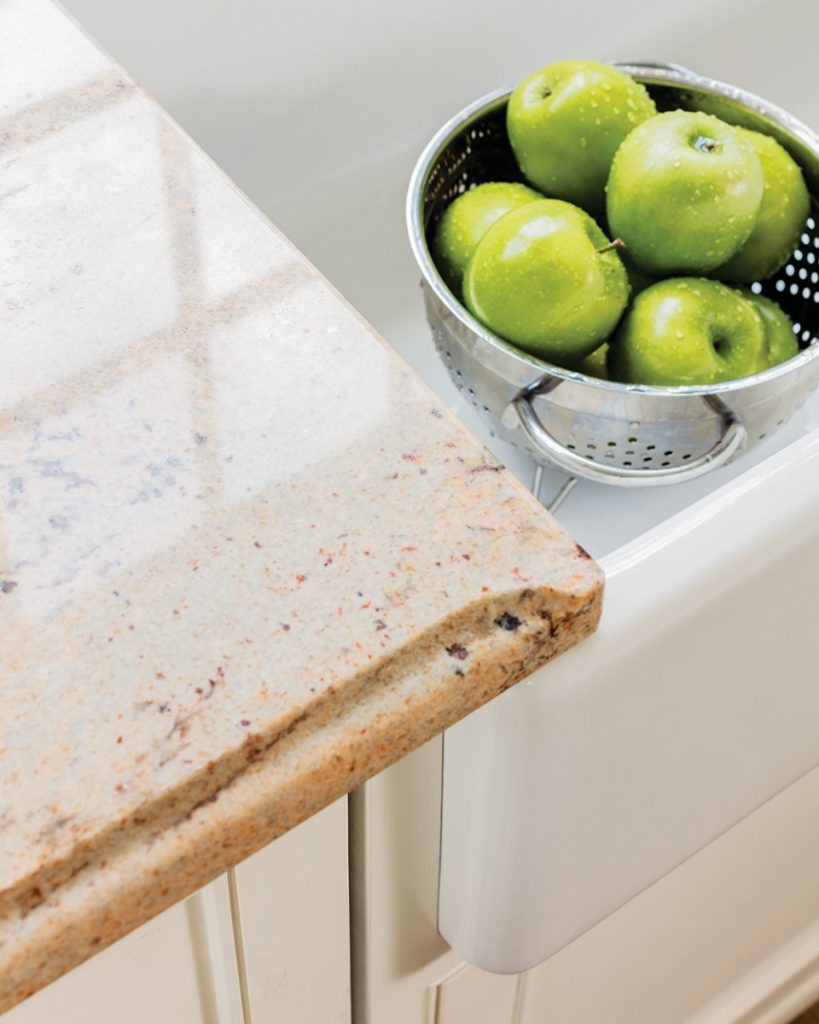
Keeping the color scheme light and airy in whites, off-whites, browns, and greens, Wilson and Kelsey opted for matching polished granite countertops for the galley and island.
Sourced from Stone Technologies, based in Woburn, the slabs feature subtle streaks of beige, gray, maroon, and orange, adding a warm textural quality.
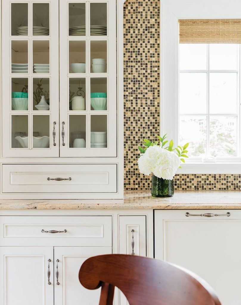
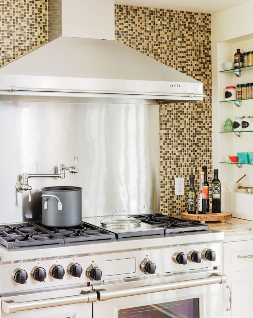
The galley comprises a Sub-Zero refrigerator, under-counter drawers, an above-counter pantry cabinet for everyday china and glassware, a dishwasher, a large sink, and counter space next to a Wolf stainless steel stove and chimney hood.

Additional counter space and a second sink on the island more than fulfill the clients’ wish for ample room to cook together.
All stainless steel appliances lend the kitchen a sleek look, including thoughtful Grohe faucets with only one lever to operate water temperature and volume. “A mother with a child in her arms doesn’t often have two hands to work with,” says Wilson.
The designers opted for durable and easy-to-clean 18- x 18-inch American Olean floor tiles in a natural buckskin tone.
White galley cabinets, featuring a simple recessed panel and traditional silver 5-inch handles, contrast beautifully with the island cabinets stained a dark walnut color.
The kitchen’s most striking visual element is the backsplash, extending from countertop to crown molding, framing a window in the center of the galley, and designed with American Olean mosaic glass tiles.
Arranged in a horizontal pattern with beige, dark brown marble, and green tiles, the backsplash pops against the muted kitchen walls in Benjamin Moore Winter Wheat.

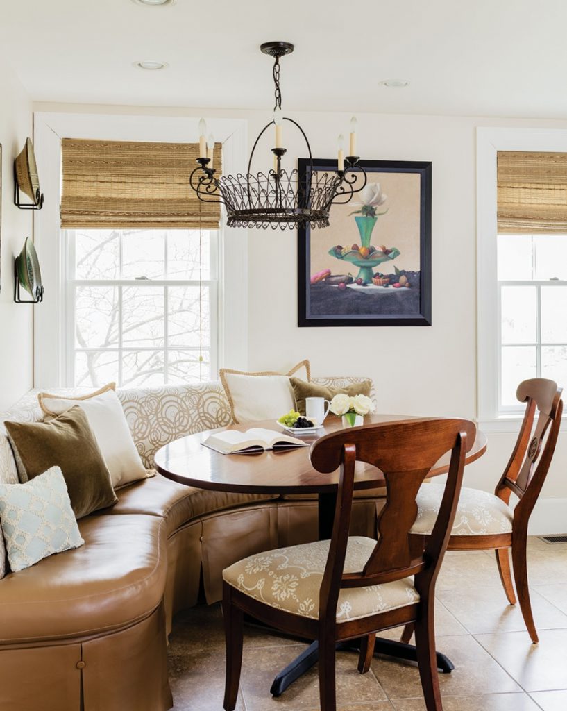
The curved dining banquette next to a corner window was Wilson and Kelsey’s idea, allowing them to add an architectural element to the kitchen—in place of a standard table and chairs—and another pop of pattern, texture, and color.
“We used a Sunbrella fabric for the back and faux leather for the seat, so it’s easy to glide across to get in and out, and easy to wipe clean,” says Wilson.
A rustic but stylish chandelier over the island by Dana Creath Designs in California and a more antique-style chandelier over the table by Texas-based Lamplight Designs add ambient lighting to the more powerful downlights over the galley.

Both designers are pleased with the outcome. “The flow and circulation is free and easy, yet there are clearly defined cooking, dining, and entertaining spaces,” says Kelsey.
“There’s also an easy indoor-outdoor connection via the kitchen and the porch which the family can really take advantage of in the summer months,” he adds.
Neither designer can give the aesthetic a definable name or style. “It’s traditional but modern, practical yet beautiful, which is typical of how we work,” says Wilson. “It’s just the right balance of elements, and it just comes together.”
