The interior of the 1910 Colonial-style clapboard house in the Reading Library District had been extensively renovated to update it for a 21st-century lifestyle, but the grounds remained largely untouched and uninviting.
When a couple with two young daughters bought the property, they commissioned Andover Landscape Design and Construction to create outdoor rooms in the backyard for family fun and entertaining.
With its undulating lawn, wooden deck, and large driveway, the small corner-lot yard was pretty much a blank slate.
The new landscape design was driven by the architecture of the residence.

“We used classic New England materials—red brick and bluestone—in a clean, contemporary arrangement to reflect the owners’ personalities and preferences,” says Russell Stott, Andover Landscape firm partner and in-house architect. “The layout is deliberately architectural: It pulls from the lines of the house.”
To open up the space and maximize the lot’s small footage, Stott and his team moved the driveway to the house’s front door, making enough room for a plunge pool, the key design element.
“We talked about a swimming pool, but it’s an urban-scale lot—it’s 60 feet by 70 feet—so a traditional pool would have eaten up too much space,” he says, adding that it’s heated so the family can use it in the spring and fall.
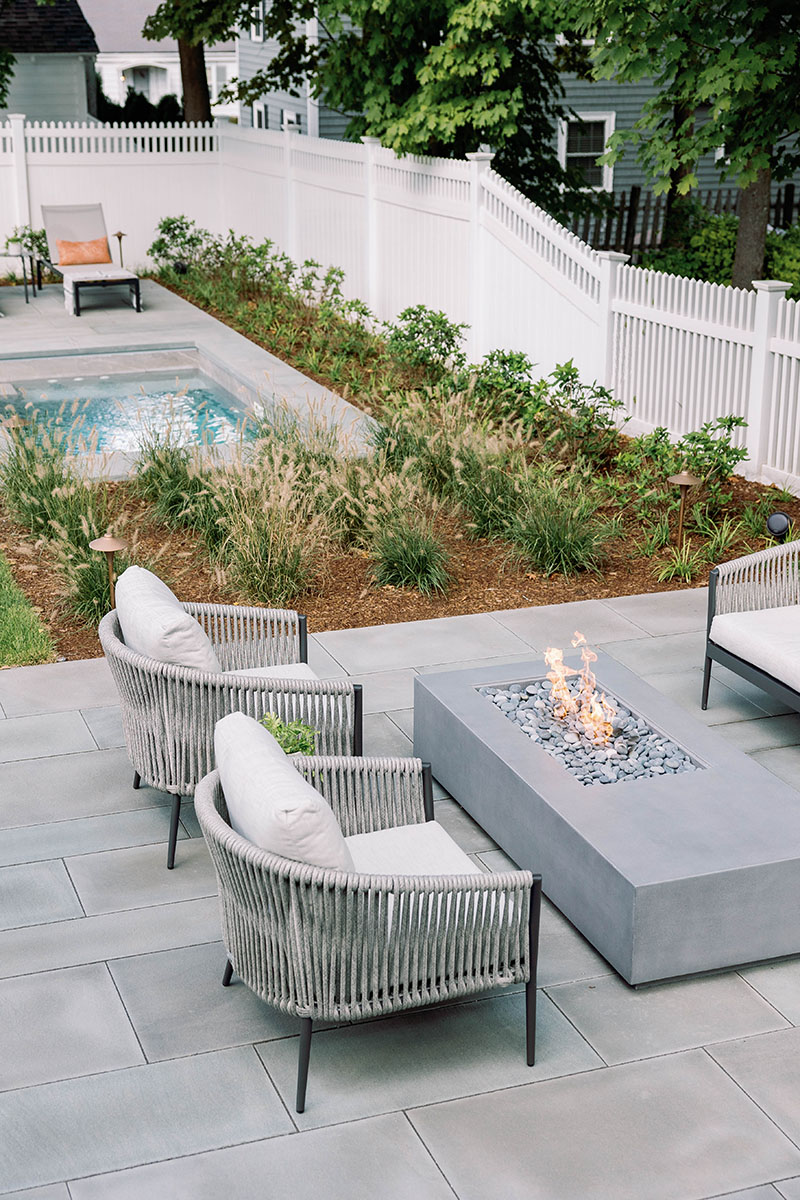
Its tile, which is in a deep-gray colorway, was chosen to complement the bluestone coping and paving material of the two terraced patios. The red brick on the landings and walkways references the house’s foundation.
The casual, comfortable, contemporary furnishings, chosen by Andover Landscape in partnership with Andover-based MAK & CO., reinforce the color scheme and theme of the grounds.

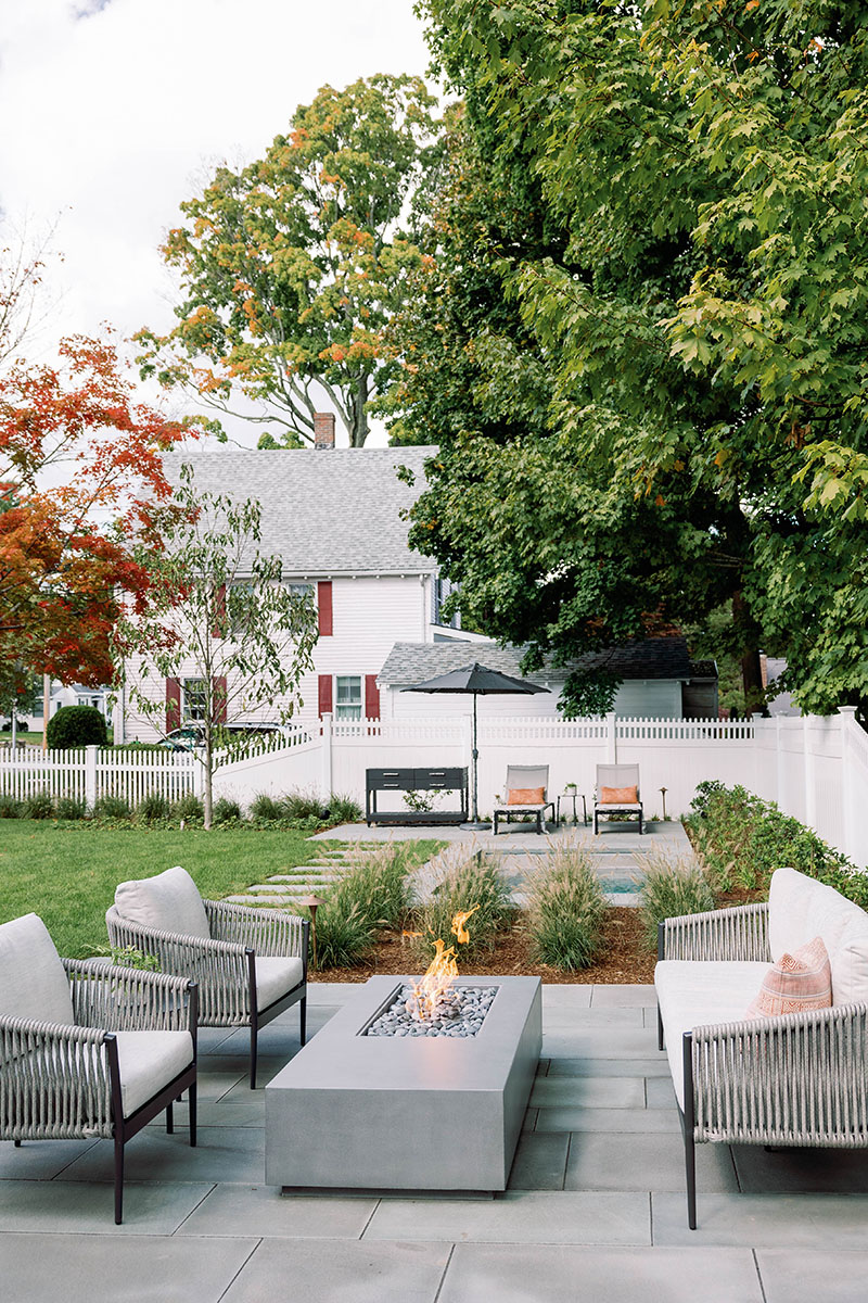
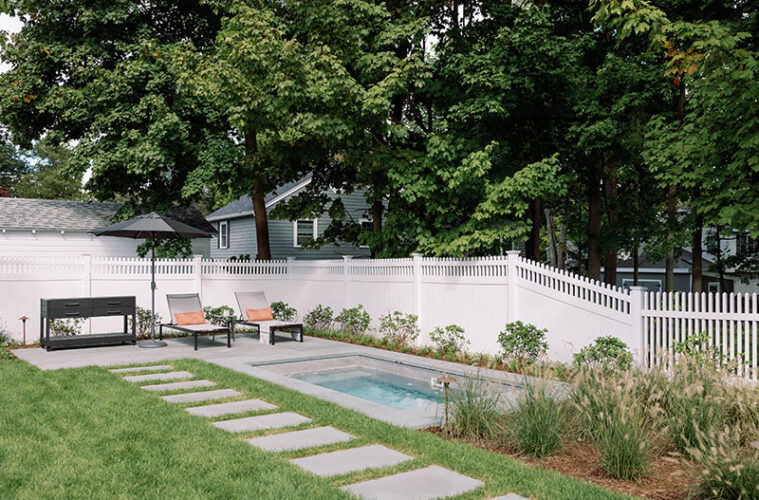
The pool paved the way for the two terraces that bookend it. The one closest to the house is appointed with a contemporary couch and two armchairs that face a gas-powered fire pit that’s activated by the push of a button and that doubles as a coffee table. It connects to the wooden deck. The other, at the back side of the pool, is where the chaise lounges repose and bask in the sun.
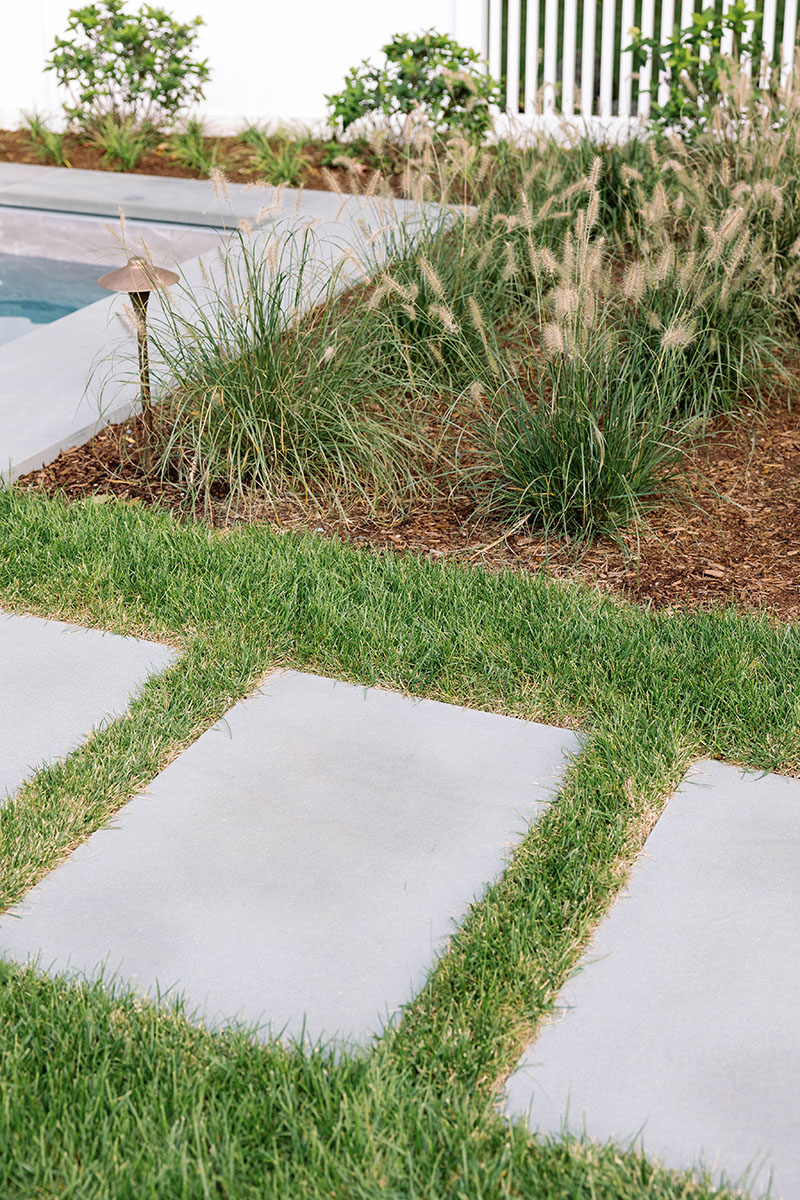
Rectangular bluestone stepping stones, with lawn joints that add softness, march in line between the spaces, creating a crisp, clear path.
The plantings on much of the perimeter of the yard were chosen and placed to provide privacy while still being “neighborly,” Stott says, adding that this was challenging because the yard is surrounded by streets on two sides and abuts three neighboring houses.
A square plot of dwarf fountain grass planted in straight lines bridges the space between the main terrace and the pool, creating what Stott calls “a tailored look that reinforces the architectural lines of the house.”

The existing white picket fence is softened by layering rows of liriope, white Little Lime hydrangeas, pink-flowering magnolia trees, and evergreen yews.
“When in the small pool or sitting on the far patio, it makes you feel like you’re in different parts of the yard, and you have a different perspective looking back at the house,” Stott says, adding that the design was constrained by zoning rules that mandated the placement of the pool and fire pit. “So, the adults can sit around the fire pit sipping wine while the kids are playing in the pool.”
The backyard is now the family’s favorite place to hang out. “In what I consider the ultimate compliment, they have shared videos of the girls jumping into the pool and sitting around the fire pit with their friends,” he says.
The couple is so pleased with the new open-air rooms that Andover Landscape is implementing phase 2 of the master plan it designed: the front yard.
“The backyard is now an awesome place to be,” Stott says. “And it’s designed for the enjoyment of the family for many years to come.”
Learn more about the project team
Architect: ART ARchitects
Contractor: Hunter Whitmore, Whitmore Brothers Construction Co.
Landscape architect: Nina Brown, Brown, Richardson + Rowe
Landscape design: Andover Landscape
Furniture: MAK & Co.
Pool: Soake Pools

