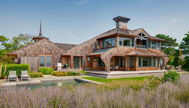
When a recently retired couple decided to build a home on Gloucester’s Back Shore, they asked architect John DaSilva to use local materials that tell a story. DaSilva, the design principal of Polhemus Savery DaSilva Architects Builders (PSD), was delighted. After all, Gloucester’s profile as a bucolic summer community on Cape Ann is only part of its storied history.
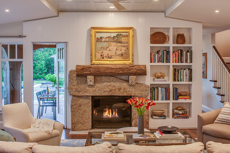
PSD, an integrated architecture and construction firm on Cape Cod, relished finding special pieces that reflect this North Shore town’s deep history to add to the shingle-wrapped house overlooking Brace Rock. A fireplace surround was crafted from granite mined in Johnson’s Quarry in Rockport. Serving as a mantel is a hewn log that had been stored for use on the USS Constitution—“Old Ironsides”—and eventually buried in mud and reclaimed from the Charleston Naval Yard. Paintings by North Shore artists hang throughout the house.
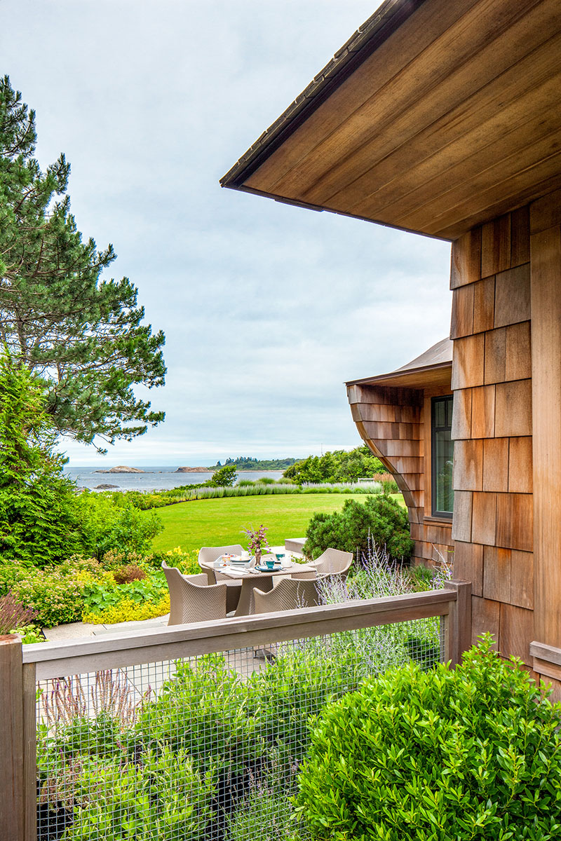
“The homeowners love the character of Gloucester,” DaSilva says, “and so do I. It’s a very dynamic waterfront. There’s the working port and a shoreline of rocks and ledge with fishing boats, freighters, and sailboats visible on the horizon. The architectural history is incredibly rich, as well.”
For the couple, longtime Boston residents, the treasure trove of materials was perfect. “We wanted a home with architectural personality, but that didn’t feel out of place,” the homeowner says.
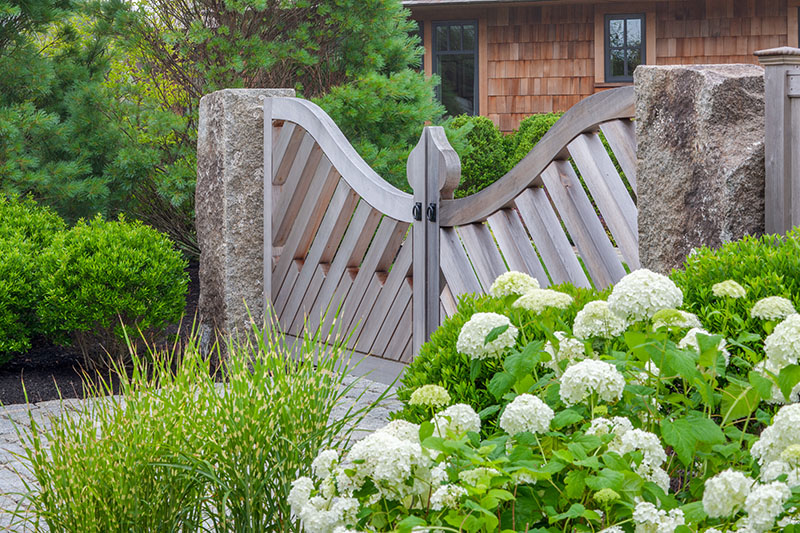
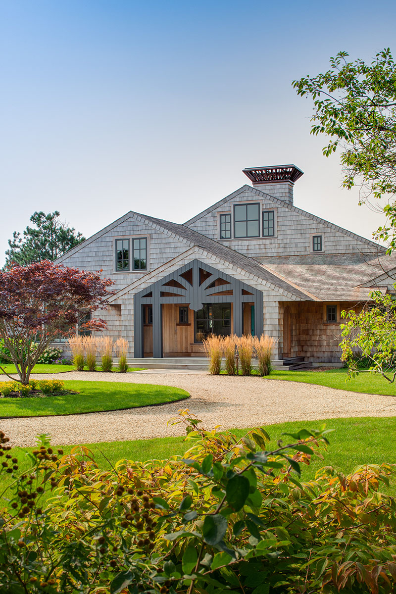
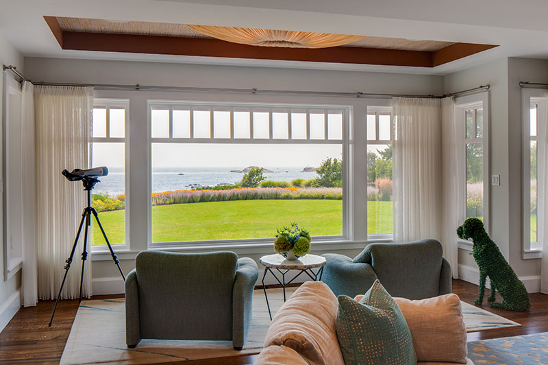
The details are not the only thing that drives the dynamism here. DaSilva’s deft touch gives the entire form and space a spirit of movement, beckoning visitors to new discoveries throughout. A touch of anticipation starts at the front gate. The landward-facing front porch is defined by a “spider’s web” screen wall, as DaSilva describes it. The ocean side is largely left free for large swaths of glass, rendering pleasing ocean views.
It was crucial to all involved that the home mirror the culture and architecture of the area. “The overall style and philosophy here is contemporary Shingle Style,” DaSilva says. Eclectic detailing dots the exterior: subtle curves in the home’s shape, pristinely crafted shingled brackets, and a knife-edge roof with no fascia board all add distinction and charm. The flat large-scale screen wall creates interest. “It’s very emphatic,” DaSilva says. “The big acorn in the center is placed low, so the opening feels compressed. There’s some tension, if you will, anticipation.” An off-center front door gives a casual note. “It’s a little more unexpected and mysterious.” Plus, it worked better for the floor plan, he adds.
Plantings by PSD’s senior landscape architect, Rob Calderaro, also draw the eye toward the entrance. Feather reed grass lends the front side movement and grace. Large massings of plantings, such as black-eyed Susans, Russian sage, and fountain grass give privacy and interest. A berm and masses of flowers add privacy on the ocean side. “Because we’re an integrated architecture, landscape architecture, and construction firm, the process was seamless,” says Calderaro.
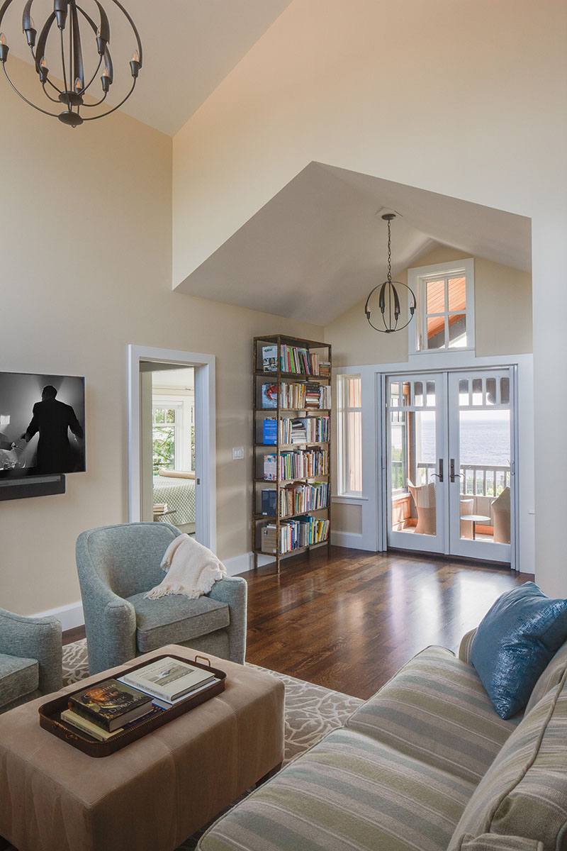
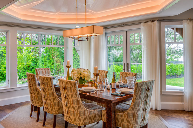
The entryway offers a direct ocean view through to the home’s back side. On the wall is a striking painting by the marine painter Frederick Judd Waugh. On arrival, visitors pass a stairway to the second floor and a butler’s pantry, then reach the centrally located great room. The living, dining, and kitchen spaces are arranged in an open plan, each space defined by individual ceiling treatments: at the high point of the living room’s ceiling is board-and-batten paneling in a checkerboard pattern. The dining space has an octagonal dome highlighted by a cove light. Nearby is geometric built-in shelving. The first floor is also home to the primary suite, with a private terrace and a stupendous view of the water. On the second floor is a guest suite, an office, a music room, and a sitting area with French doors that open to a porch above the living room.
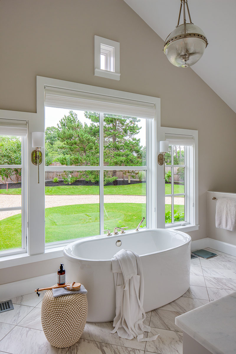
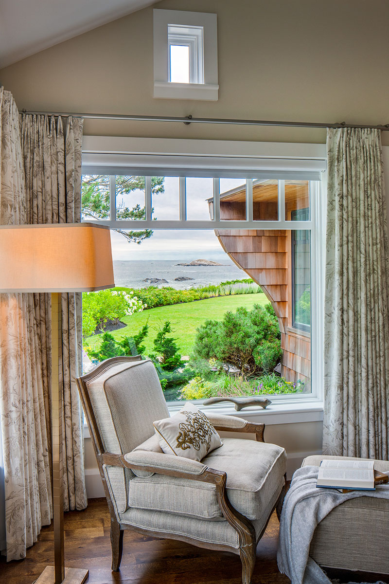
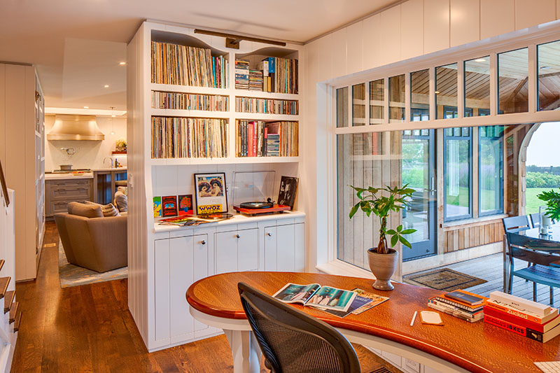
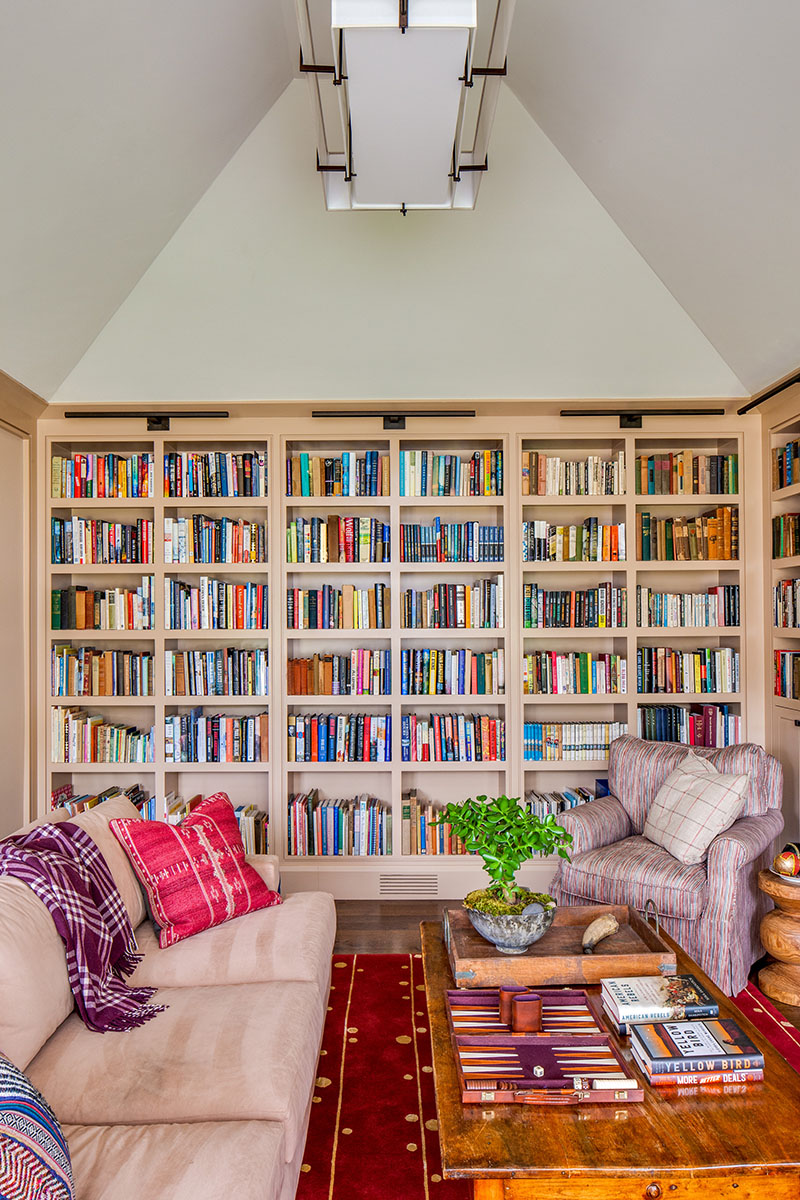
The interiors, by Dennis Duffy of Duffy Design Group in Boston and Tampa, Florida, are filled with muted colors and natural textures. Duffy has worked with the homeowners for years on other projects. “Any time we do a house with a strong architectural framework, we try to complement the structure and relate it to the surrounding environment,” Duffy says. It also was important to keep the tone somewhat informal. Wilson Kelsey Design also assisted with the interiors.
A muted interior palette continues through the entire house, with shades of taupe, gray, and creamy whites, sometimes tinged with a deeper color. Flooring is character-grade random-width oak, stained a honey color.
Even the most inconspicuous rooms have character. In the mudroom is a porcelain tile floor, a hint of Gothic spirit, and—yes—another view of the ever-present Atlantic Ocean, the best feature of all. The owners realize their good fortune. Says the homeowner with a smile, “We love sitting in the living room, in our comfortable chairs, having coffee and watching the ocean. We’re lucky to be here.”

