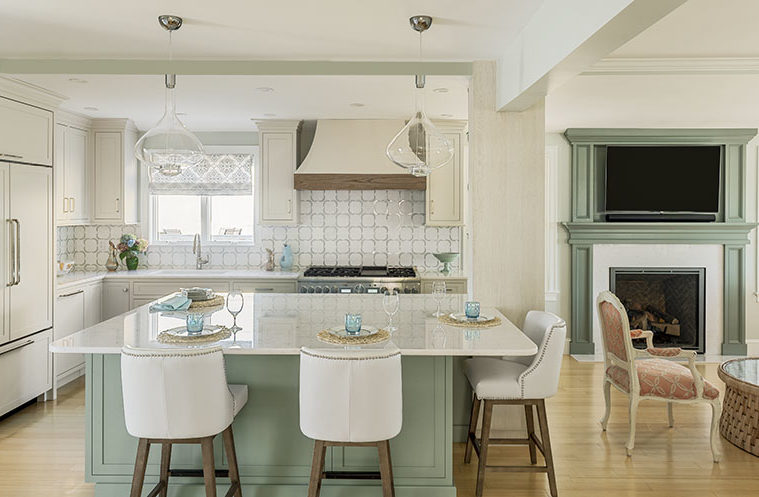
Given that her home is across the street from the beach in Salisbury, it’s no surprise that Kathleen Carrigan hosts friends and family more often than not. As such, she wanted her kitchen to be more functional and reflect her personal style. Janice Page of PK Surroundings made it happen by reworking the layout and imbuing it with seaside hues and shimmer. “Soft ocean colors and shiny details provided the blueprint for the design,” Page says.

Keen to increase hang-out space near the kitchen, Carrigan requested that the team swap the living and dining locations and replace a pair of windows with a gas fireplace. The space was already wide open to the kitchen, but Page strengthened the connection by painting the mantel the same sea-inspired shade as the new kitchen island: Benjamin Moore Greyhound Green.
In the kitchen, the sink remained under the window to avoid fussing with plumbing in the finished basement. However, Page insisted that they relocate the range to the sink wall. “It was our only disagreement,” says Carrigan, who wanted to install the new range next to the fridge in order to preserve a long stretch of countertop next to the sink. “With the size of the new island, I didn’t need it,” the homeowner admits. She also notes that separating the range from the fridge and pantry keeps traffic away from the cook.


The range is now a focal point. The swooped hood’s driftwood-style oak-trim is a beachy counterpoint to the polished dolomite and glass mosaic tile backsplash. “The inlay has the look of blue-green sea glass,” Page says.
Page rejiggered the adjacent wall, too. The fridge slid to the right, where it gained countertop beside it now that the range isn’t there. The shift also opened up 12 inches of dead space that was behind the fridge, which Page captured to create a generous pantry. It too is a focal point with doors boasting rose gold mesh inserts and rose gold pulls. They open to a glam surprise: An interior lined with rippled glass tiles reminiscent of iridescent abalone shells.
Around the bend, by the door to the deck, is the bar. “Guests have expectations,” Page jokes. The function-packed beauty includes stacked fridge drawers, an icemaker, and a sink. Rose gold and acrylic hardware punctuate the cabinetry, offering subtle but sexy pops.

The upper cabinets have wavy glass fronts with circular and semicircular muntins that play off the trellis-patterned backsplash. “Kathleen didn’t initially realize that the glass doors had that pattern,” says Becky Dillman, a design associate at the firm. “She first thought the circles in the drawings were dishes!” Luckily, Carrigan loved them.
A large island topped with a crisp expanse of sparkly marble is the room’s centerpiece. The long side runs parallel to the range wall, providing the cook with ample counter space. The short side opposite the pantry is outfitted with a custom feeding station for Carrigan’s golden retriever, Molly.
Page enlarged the island and switched its orientation in order to address the post supporting the opening between the kitchen and living room. Rather than leaving it standing solo, she designed the island to embrace it, then dressed it up. A polished nickel etagere with glass shelves sits against the post, which the team wrapped in a surface material resembling pale wood. “We wanted to create elegant architectural interest that didn’t feel contrived,” Page says. Dillman points out that using open shelves on the chunky post also keeps it from weighing down the room.
As for Carrigan, she loves every last touch. “I didn’t want a boring kitchen with a bunch of plain doors,” she says. “Janice said she’d come up with a design I would like, and she did.”
Learn more about the project team
Architect: ART ARchitects
Contractor: Hunter Whitmore, Whitmore Brothers Construction Co.
Landscape architect: Nina Brown, Brown, Richardson + Rowe
Kitchen Designer: PK Surroundings
Contractor: Ken Shute, 978-270-3511

