These homeowners have big plans for the future at their house on Cape Cod, Massachusetts, and they are fully prepared to welcome the next generation and extended family. The changes in the house mark a big change in their home life: the emptying of the nest. When the youngest of their three children left for college, they sold their large home in the suburbs of Boston, moved into an apartment in the city and began to ready their weekend house on Cape Cod as their official home base.
The newly renovated home includes dedicated bedrooms for visiting family members. They couple almost doubled the original space with additions and renovated existing areas to suit themselves and their extended family year-round. “It’s a very large house, but it’s amazing; every room feels cozy and comfortable,” says interior designer Caroline Kamp Warner, who partnered with interior designer Robin Violandi to tackle the project. Putting their design skills together, the two carefully considered gathering areas and private spaces; created comfortable nooks to curl up in; brought in lots of texture, layered lighting and built-ins; and looked at how the space would function for the whole family for generations.
Partner Up With a Local Interior Designer
Houzz at a Glance
Who lives here: A couple of empty nesters with 3 adult children
Location: West Falmouth, Massachusetts
Size: 7 bedrooms, 7 bathrooms
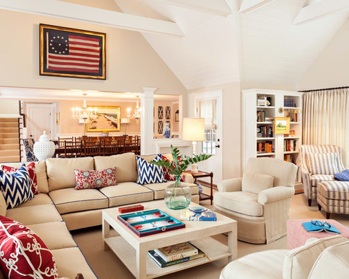
The center of the main floor contains the gathering spaces, including this comfortable great room, a more formal dining space and the kitchen, which is off to the right of the dining space. “This homeowner was very involved and had a real vision for what she wanted,” Warner says. For example, she wanted an antique flag for the space and tracked this one down herself. She also loves navy blue and wanted to use the color throughout the house. In here it shows up in the piping on the sofa, on the wool rug’s leather border and on the throw pillows. “The navy ties the whole house together,” the designer says.
The flag also inspired some Americana style, which Violandi incorporated via fabric choices. “Robin’s the fabric guru, while I tend to focus on furniture,” Warner says.
“It all starts with one fabric,” Violandi says. In this case it was the very traditional Ralph Lauren floral fabric seen on a throw pillow on the sofa, which wound up tying everything together. The other throw pillow fabrics that enliven the sofa include one with a more modern chevron pattern, from China Seas, and one with a subtly coastal knot pattern, from Robert Allen. All of the fabrics are either indoor-outdoor or were treated for durability.

Dan Cutrona, original photo on Houzz
“Their house was much more casual before,” Warner says. While it’s still very comfortable and inviting, pulling everything together gave it a more formal look and made it suitable for year-round use rather than mostly during summertime. “There are lots of nooks and built-ins now,” she says. The reading space to the right is new; the designers added light via a sconce so as not to need a floor lamp.
“The V-groove paneling on the ceiling really helps the room feel cozier,” Violandi says. “With a high vaulted ceiling like this, it creates an important contrast between the walls and the ceiling.”
Another factor that makes the space so comfortable is customization. The sofa, pillows and coffee table were all designed to fit the space to a T. Subtle patterns and textures add richness, like the burlap wrapping the coffee table and the tone-on-tone houndstooth fabric on the swivel armchairs. The rug is wool, bordered with navy leather tape.
Dan Cutrona, original photo on Houzz
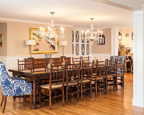
A custom table with extenders on the ends and barley turned legs can seat up to 14 people. Two chandeliers provide soft light overhead and stand up to the table’s length, while their clear glass doesn’t add any visual clutter. The host and hostess chairs are covered in a fabric with a stunning botanical pattern. The seascape is from a local artist. The kitchen is just off to the right.
Unfortunately, the tan, brown and blue striped dining room rug had not arrived by photo shoot day. It currently adds more coziness and helps define the dining room area.
Dan Cutrona, original photo on Houzz
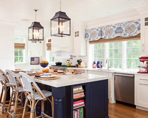
The kitchen was originally slated to occupy the space where the dining room is, but Warner knew the room needed more natural light, while the dining room was fine without it. Here it enjoys lots of windows and sunlight. Two large lanterns draw the eye over the island; a long valance adds pattern and more sand and navy hues. Each window has a woven shade; the owners like to completely close up the house when they are not here.
“The kitchen is traditional but not too formal,” Warner says. “It’s easy to live with.” For example, the countertops are Lyra Silestone. “Our client loves the look of Carrara marble but knew she needed something more durable that she wouldn’t have to worry about ruining,” Warner says. Special features include cookbook shelves in the island and a baking area near the framed antique flag.
Dan Cutrona, original photo on Houzz
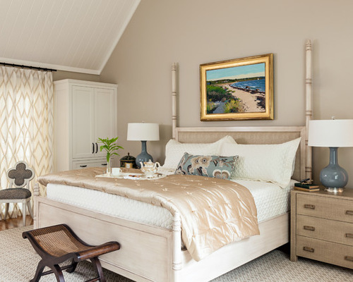
In the master suite, sandy hues and dashes of gray-blue win out over the crisp navy seen elsewhere in the house. “Everything is more tonal and calm in here,” Warner says. “It’s the mix of textures that adds depth.”
The nightstand is wrapped in burlap, while the rug adds a geometric pattern in a subtle tone-on-tone palette. Soft curtains add a larger-scale geometric pattern. A quatrefoil-backed chair upholstered in a raised-velvet animal-print fabric adds a touch of whimsy. “An animal print works almost like a neutral; it goes with just about everything,” Warner says.
The homeowners didn’t want the bottom posts of a traditional four-poster bed to block the TV, so the designers created a custom bed with low posts on the footboard.
Dan Cutrona, original photo on Houzz
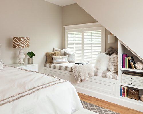
The homeowners created mini suites for their adult children complete with a bathroom for each, so that they and their significant others can have privacy. Their daughter didn’t want any bright colors in her room, so the designers brought in lots of rich textures, patterns and metallics, including fur pillows, a woven rug from Dash & Albert and a zebra-print lampshade.
The designers added cozy reading nooks and built-ins wherever possible, including this long window seat. Each of their children’s bedrooms has a window seat like this one, complete with an indoor-outdoor cushion that is easy to maintain and won’t fade.
15 Cozy Book Nooks and What They Want You to Read
Dan Cutrona, original photo on Houzz
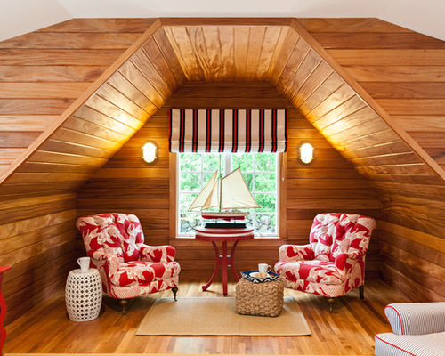
Over the garage there are two separate bunk rooms for future grandchildren, one for boys and the other for girls. Here in the boys’ room, African mahogany tongue and groove walls resemble the rich wood ones you would see on a ship.
Porthole mirrors and marine sconces emphasize the symmetry and add playful nautical touches. The ship model and table were the homeowners’; the table used to be pink. The designers re-covered the homeowners’ existing chairs in a whimsical red koi print fabric; again, it’s indoor-outdoor fabric that will stand up to abuse. When the children arrive, the house will be ready for them.

