Every home has the potential for an awkward space, that one area that never looks quite right no matter the artwork placement or furniture arrangement. For a couple who upsized from a condo in downtown Boston to a larger residence in the suburbs in 2011, their awkward space was unfortunately the place where they ended up spending most of their time.
The design nemesis in question was their expansive great room, stretching the entire length of the house, front to back, it’s also open to the kitchen, a staircase, and the back porch.
“We really didn’t know how to make it work,” admits the wife. “After trying a few approaches over the years, I decided it was time to bring in professional help.” As she was already familiar with the Boston Design Center, she discovered Barbara Elza Hirsch of Concord-based Elza B. Design, Inc., through the center’s elite designer-on-call program.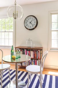
The couple enlisted Hirsch’s help, not just with the tricky great room but in morphing the entire first floor into a more cohesive, sophisticated whole. One caveat was that, in case they decided to sell down the road—they didn’t want to invest in ultra-expensive furniture pieces custom-made specifically for the house. And with no plans for any structural changes, Hirsch’s objective was clear: Reimagine the interior using space planning, paint, and art, and by blending new and existing furnishings.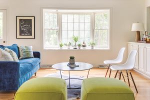
“One issue was that, because of their lifestyle in Boston, their furniture was really small in scale for the big rooms in this suburban home,” explains Hirsch, a French native whose background in art and fashion, as well as her travels, influences her design eye. Delving into the couple’s tastes and interests, she discovered two major sources of inspiration for the interior redo: the couple’s preference for blues and greens and the wife’s Scandinavian heritage and resulting fondness for mid-century modern design.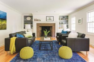
“They are both hardworking professionals who wanted ‘city living,’ but out in the country,” describes Hirsch. On the wife’s tastes: “She is very dynamic—not drawn to too many prints and patterns, but instead to various textures, which led us to things like faux fur and mohair. And anything with wood had to feel contemporary and mid-century.”
Hirsch ended up dividing the great room into three distinct “living” concepts. “When you have a big room like that, you have to define the function of each area and what you will end up doing there,” she explains. Painting any dark wood white—the trim, door and window frames, and a wall of built-in cabinets—resulted in a clean and bright blank slate.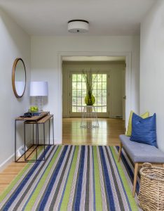
For the first functional area of the room, the TV stayed put and Hirsch devised a chic yet comfortable media area around it. Opting for mid-century-inspired forms, she paired a Robert Allen sofa, finished in soft gray velvet, with an upholstered Crate & Barrel ottoman, lacquered log table from Jayson Home, and articulated lamp from Lumens. The bold blue shag rug with a Moroccan by Stark crisscross pattern defines the space.
On the hunt for art that would pop against the media area’s furnishings, Hirsch discovered a set of lemon and lime watercolor prints at Icon Group at the Boston Design Center. “They add some whimsy and repeat the colors you see throughout the room,” says the designer. The fruits are also a wink to the twist in a martini, the owners’ cocktail of choice.
Centered on a bay window, the great room’s entertaining area was designed as a welcoming circle for hosting guests. Anchored by a custom Robert Allen sofa—“Its rich blue velvet has a little shine for some glamour,” describes Hirsch—the circle is completed by two apple-green Robert Allen poufs and a pair of vintage Eames bucket chairs by Herman Miller. The playful cowhide rug contrasts the glam.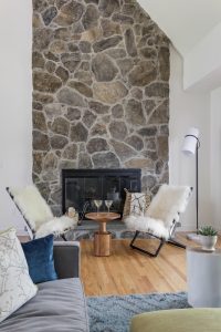
A standout feature in the great room is the stone fireplace but taking advantage of its rustic appeal was problematic, as the real estate in front doubles as a pass-through to the back porch. Hirsch’s solution was to create a cozy sitting area. It doesn’t take up much space, but its chairs, the result of a serendipitous walk past Edelman Leather at the Boston Design Center, demand attention. “I saw those Ward Bennett scissor chairs covered in a Mongolian lamb’s wool and sent my client pictures right away,” says Hirsch. After a quick test sit, the chairs were green-lighted. “They bring coziness to the area and yet are architecturally interesting.”
Hirsch continued working her design magic in the formal living room, where she presented the owners’ leather furniture and coffee table in a fresh, new way. A variety of coordinating accessories—accent pillows, end tables, lamps, poufs—plus rearranged art and a new paint scheme worked wonders, giving the space a refined, pulled-together vibe. She also styled the shelves by painting the backs with a gray color and arranging new accessories blended with some belonging to client.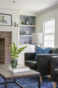
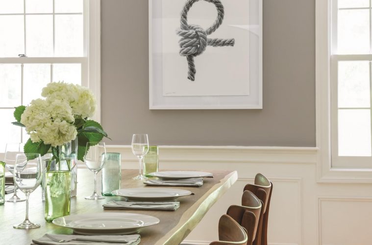
Similarly, Hirsch revitalized the foyer with two striped outdoor rugs by Dash & Albert, attached end-to-end to mimic the effect of a long custom rug. Then she created two vignettes to stop the eye: a midcentury bench with pretty pillows and a round white table from CB2 topped by a vibrant green glass jug vase from Darby Home. There is another vignette in the foyer to the left of the striped rug with nesting console tables, a glass lamp from Arteriors and a round walnut-wood finish mirror. The vignette with the white table is further back, in the sight line of the foyer but belonging to the living room. In the dining room, Hirsch worked with what was there, a drum light pendant and gray wall color, but brought measured drama to the space with a live-edge dining table, a framed photograph from The Icon Group, and a green-and-white geometric wool rug.
From the Parisian café-inspired dining area in the kitchen to all corners of the expansive great room, the first floor is now a visually interesting feast unified by color, texture, and creative design. Once lackluster, the refreshed interior expresses a little edge, a little attitude, and a whole lot of charm.
There’s a definite worldliness to the Barbara Elza Hirsch for Dowel furniture collection, which is not surprising considering the designer’s résumé. A native of France with a background in art and fashion, the interiors maven knows the transformative potential of great furniture.
“This collection has an ‘Old World-meets-New-World’ style,” describes Hirsch. “I wanted to honor Dowel’s craftsmanship and intricate wood capabilities while designing fun, colorful, and versatile pieces with interesting fabrics and details.” The results speak to Hirsch’s cultural experiences, including her time in Paris and family experiences in the Aquitaine and Burgundy regions, but in a fresh, crisp, and modern way.
Choices include two dining chairs and their corresponding armchairs, a statement-making living room armchair with an accompanying ottoman, three end tables that can also serve as nightstands, and two counter stools. Each piece is customizable, with five Sherwin-Williams colors and two natural white oak finishes for wood frames and myriad fabric choices hailing from notable showrooms including Schumacher, Kravet, and Robert Allen.
The collection is available for purchase online and can be viewed by the trade only via appointment at the studio of Barbara Elza Hirsch in Concord or Dowel’s studio in midtown Manhattan.
Elza B. Design, Inc., 781-859-7817

