Nestled on 1.25 acres of land in Gloucester, the house consists of five bedrooms, including the master bedroom and bunk room on the main level, and four bathrooms. The homeowners hired Siemasko + Verbridge (SV) to design the renovation with one primary goal in mind: maintain the earthy wood and stone feel while making it more modern. It was to be a delicate balance of contrasts. Utilizing the home’s unique, solid structure, SV elected to improve its functionality while increasing its appeal.
Acting on a theme of “leather and lace,” conjured up by the homeowners as a nod to the Stevie Nicks/Don Henley tune, the architectural team delivered a bright and slightly more contemporary space incorporating contrasting earthy wood notes to equalize the design.
“It was the perfect blend of old and new and the more modern aesthetic with the existing. We pride ourselves on a collaborative approach with our clients and [the] homeowners were really excited and interested to take part in the decision making and selection process,” says Tobin Shulman, a principal with SV.
The transformation was drastic. Interior renovations included designing a new layout of primary living zones; designing a new kitchen, bathroom, office, and closet for the master suite; three redesigned bathrooms; and a refreshed family room, including the construction of a window seat next to the doorway, which leads out to the side patio.
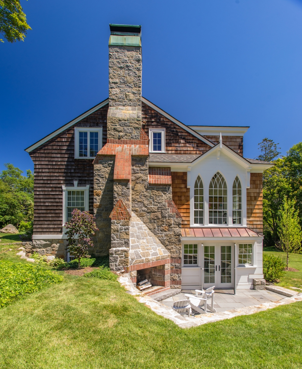
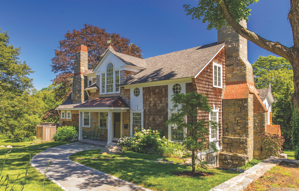
Exterior modifications rendering significant impact incorporated the redesign of the roofline and side patio door in order to balance existing Gothic-style windows and the exterior fireplace more harmoniously. The main entry was also reorganized to fall below the home’s striking Palladian window to not only generate a better interior entry sequence but also make it more centered externally. Additionally, this entailed the creation of a new covered porch at the front door.
The home underwent an overall lightening of color to brighten the interior and give a more modern, fresh feel. Using an elegantly refreshed color scheme throughout, the team closely collaborated with the homeowners in selecting new modern lighting and plumbing fixtures, juxtaposing refreshed modern accents against a traditional (and quite charming) background.
KITCHEN AND DINING ROOM
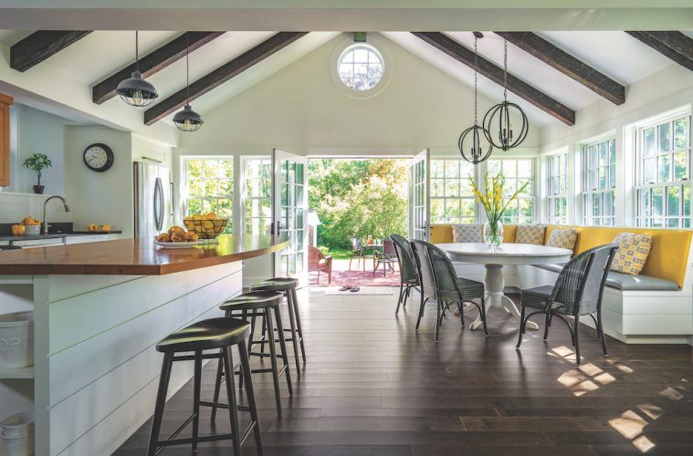
A significant portion of the renovation focused on a complete redesign of the kitchen and dining room. “Now the space extends from the dining room, through the spacious and light-filled kitchen with eat-in nook, right out to a peaceful and secluded patio,” says Shulman. Using a carefully thought-out, focused demolition plan, the architectural team reorganized the space to create a renewed kitchen/dining area within the boundaries of its original footprint.
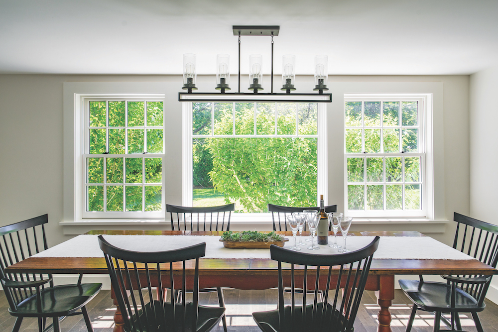
The dining room was a matter of paring down; the wainscot paneling and rough-hewn ceiling beams were removed in order to create a more spacious and modern-day vibe. Remaining beams in the dining room were removed during expansion to make the ceiling
feel taller.
The kitchen island countertop and upper cabinets consist of antique chestnut, while the rest of the counters are absolute black in a leather finish and paired with a bright, crisp white backsplash and cabinets. Taking advantage of the kitchen’s cathedral ceiling with ample height and substantial natural light from the numerous windows, the team reincorporated wood elements back in to blend with the existing. The new kitchen/dining layout allows for better flow, an island, and an eat-in nook for additional seating—a vast difference from the previously small closed-off space.
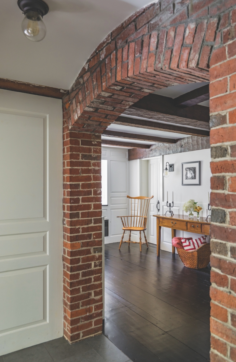
Brick, which can be seen throughout the first floor, was a preexisting element and was kept exposed, along with the wood beams in the main hall.
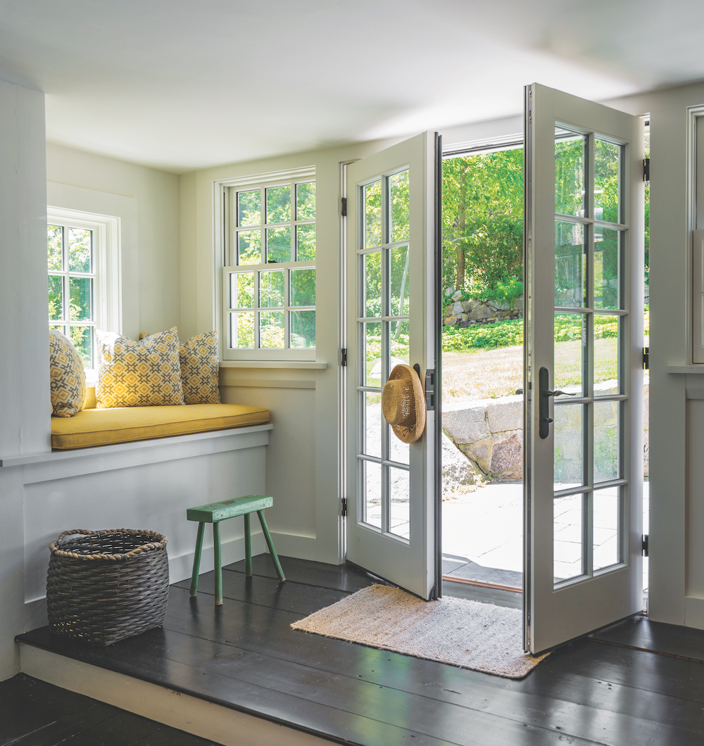
Many of the home’s various window styles were preserved—for myriad reasons, but mostly to carry on its unique charm and character. “Some windows were replaced in kind, the new windows in the kitchen area maximized the two kitchen walls for expanded views and light. The Palladian window was existing, and it became much more of a feature when we centered the front porch underneath. Likewise, at the side patio, the Gothic-style windows now feel like part of the composition with a larger spanning roofline underneath the double French doors,” Shulman explains.
BUNK ROOM
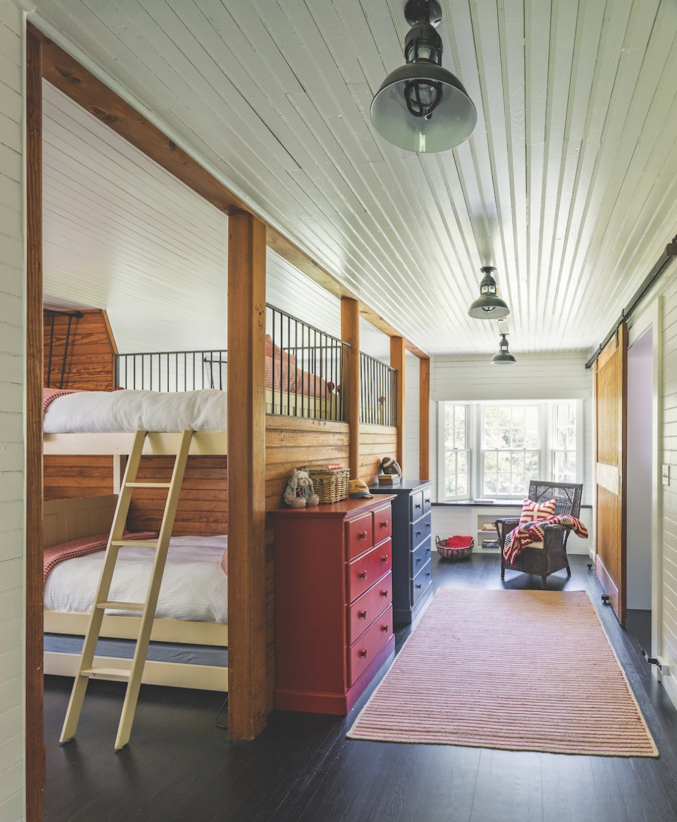
Once a drab and campy space is now transformed into a bright and airy bunk room, a safe haven for kids to build memories. “The bunk room is a good example of the contrasting elements in the home. The existing horse stalls divide the bunk areas. The warm rustic wood and iron elements have been balanced by painting the wood walls white to make the space brighter and seemingly more modern,” says Shulman.
The home now offers a better flow and increased functionality, thanks to the team at SV. Leather and lace, black and white, old meets new, it all comes together in this beautifully unique, cohesive space.
Resources:
Architect: Siemasko + Verbridge, 978-927-3745, svdesign.com
Interior Designer: Siemasko + Verbridge, 978-927-3745, svdesign.com

