When Jen Dulac, cofounder of Swampscott’s Trim Design Co., was tasked with redesigning the kitchen in a 1940s Colonial in Marblehead, she knew it would be a challenge to create a light, airy interior in the long, narrow galley space.
The room remained slim despite being recently expanded after a previous renovation moved the dining room to the front of the house. The original kitchen was thin and dark, while the new kitchen would just be thin.
But not dark.
The homeowners, Danielle and Steve Hallisey, were determined for it to be light. Danielle preferred it to be totally white, in fact.
“The old kitchen was incredibly dark—so dark and so cramped; it was like a cave,” says Dulac. “She wanted an all-white kitchen because she was so done with the dark kitchen.”
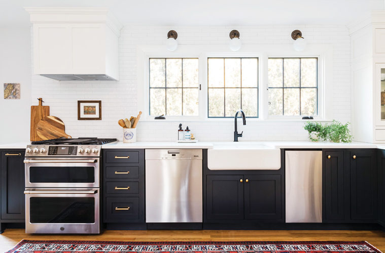
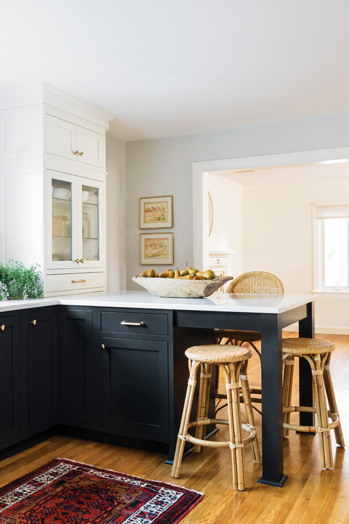
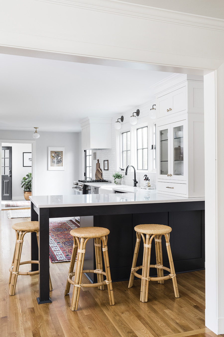
Dulac and her team pushed hard to include dark lower cabinets for “a little touch of glamour—a Parisian bistro look so it didn’t just look like sterile white kitchen.” The cabinets, from Crown Point Cabinetry in Claremont, New Hampshire, are painted Sherwin Williams Black of Night on the bottom and Sherwin Williams White Flour on top, creating what Dulac refers to as a “tuxedo” aesthetic.
“She was so glad that we pushed her to do the dark lowers,” says Dulac of Danielle. “I had to really sell that, and in the end she loves it… I like pushing the client a little bit beyond where they think they want to go, and then that end reaction of them realizing that was actually what they did always want or that’s what did suit them. I love that.”
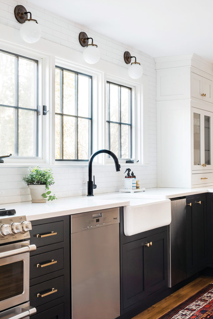
As part of the effort to make the room brighter, the homeowners’ priority was to include a lot of natural light. Removing the wall between the old kitchen and the dining room allowed the new design to incorporate three big windows over the central counter, with the sink underneath the middle one.
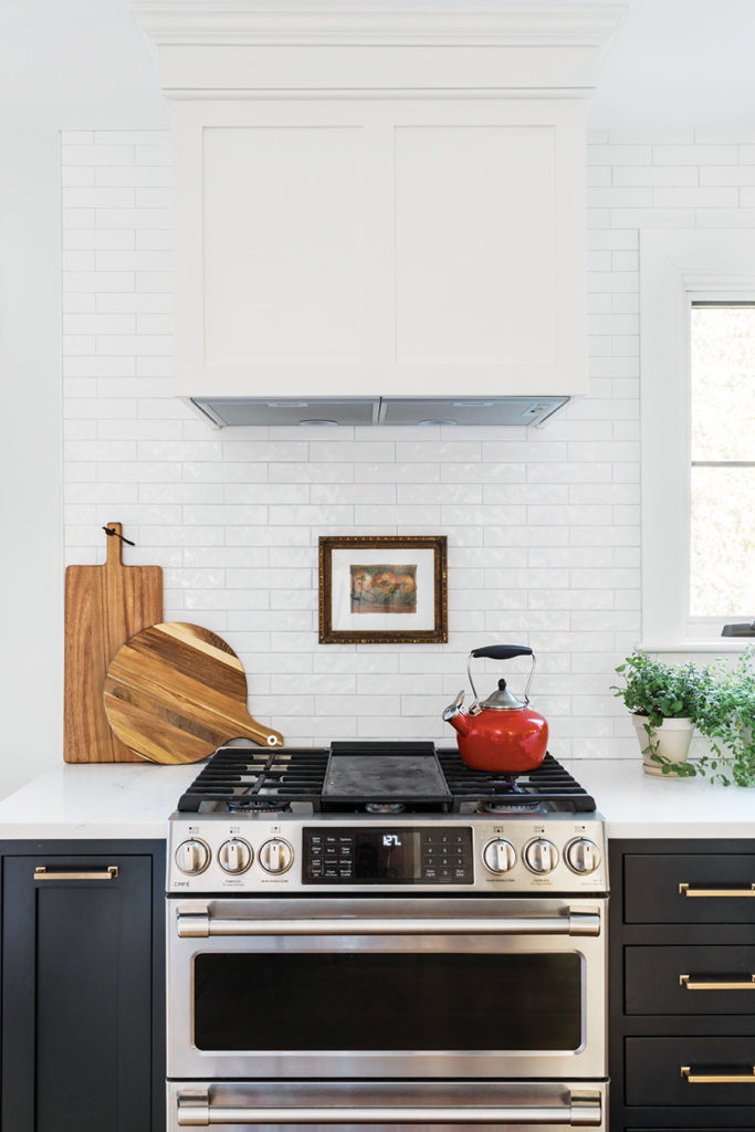
Installing the windows had the desired effect of lightening the room, but presented a new challenge: the need to create symmetry on either side of the bank of windows. The stove hood on the left, which Dulac decided to enclose in cabinetry so as not to detract from the windows, had to be balanced out somehow. She solved this problem with the addition of a glass-front butler pantry on the right.
“The biggest challenge in working with a long galley space was making it not feel like a runway, making it feel like a room,” says Dulac. “We couldn’t have perfect symmetry, so we had to have some sense of balance without having that symmetry.”
Each window is topped with a handblown white-glass sconce fitted with antique brass from Olde Brick Lighting of Lititz, Pennsylvania. That old-world metal contrasts with more modern touches, such as a black faucet and contemporary drawer pulls from Top Knobs. Dulac focused on bringing in a range of contrasting materials, such as natural woods and wovens to contrast with the white tile wall and white quartz countertops.
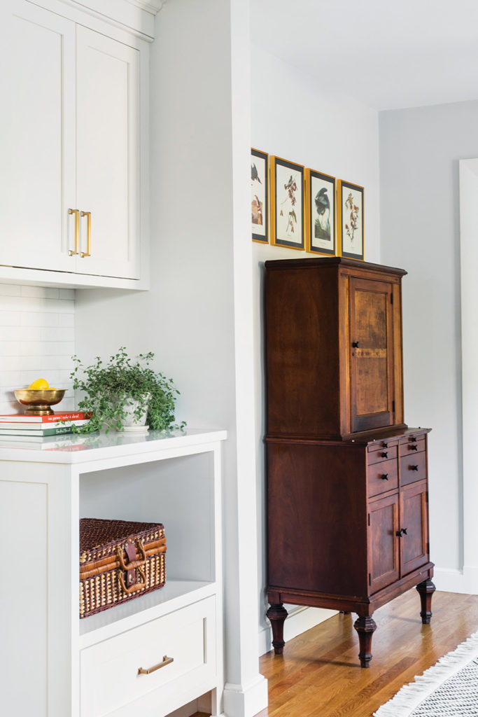
A vintage wood dental cabinet repurposed into a home bar is surrounded by old Audubon prints sourced from an estate sale, providing a sense of warm historical charm. A deep-red vintage runner provides a dramatic splash of color.
“I love that even though it’s a black-and-white kitchen, it still has a sense of airiness and lightness, but there’s so much dimension and character because of the dark lowers, and the vibrant vintage rug, and the warm fixtures, and the wood and woven elements that we brought in,” says Dulac. “It has a little bit of an old-world feel.”
However, the family of five—plus two dogs—is contemporary, so it was important that the renovation fit their busy and casual modern lifestyle. A center island was on the wish list, but the long, thin shape of the kitchen prevented it. Instead, Dulac designed a table-like “peninsula” jutting from the wall under the butler’s pantry, perpendicular from the main counter.
The peninsula fits five stools so the family can eat there as a group. Their kitchen may wear a tuxedo, but in this beautiful, light-yet-cozy room, they can come as they are.
trimdesignco.com

