Basements are one of a home’s most utilitarian spaces, where aesthetics take a back seat to function and natural light is at a premium. Even when finished—with a game room, wine cellar, exercise area, or whatever is desired—they still tend to differ, in look and feel, from the main-level interiors, creating a discernible “Upstairs Downstairs” design effect.
When a couple living in an 1880s Victorian northwest of Boston considered their basement’s potential, they knew immediately that it represented a valuable extra level of living space. With grown children and a large extended family, they needed to maximize every square inch of the inside. The basement—a walkout with French doors leading to a water-view backyard—was rife with potential, particularly when interior designer Phoebe Russell signed on to helm its transformation.
After purchasing the property eight years ago, the owners spearheaded a variety of renovations, addressing structural issues along the way. Not surprisingly for an aging Victorian on the water, the basement was prone to flooding and suffered from water damage. Its redress required a full gut and the installation of a French drain. One silver lining to the costly corrective procedure, however, was opportunity: a watertight, fully heated blank slate.
“I wanted an in-law apartment,” describes the wife, “but I wanted it to fit in with the rest of the house. Depending on the situation, it could be used by my daughters as a hangout space or study, by guests, or even for entertaining, since it’s closer to the backyard than the main kitchen. It saves running food up and down the stairs,” she relates.
Russell, principal of Lovejoy Designs, founded in 2008 and based in Allston, had worked with the owners once already, overseeing substantial overhauls of their living room and entryway. When the basement project was greenlighted, she knew what was in store: collaborating with the contractor, finalizing the floor plan, optimizing natural light, merging new and existing furniture pieces, and keeping the look cohesive with the floors above.
“We were attempting a new take on a modern farmhouse look,” describes Russell, an Annisquam native and graduate of New York School of Interior Design. Working with a fluid color palette of ivory, browns, blues, grays, and yellows, her goal was for the apartment to feel “unpretentious, spare, neutral, and sunlit.” One hurdle was navigating the existing brick walls, which the owners wanted to remain intact. “There was so much brick; I had to counteract it with enough white so that it didn’t feel like this heavy space,” says the designer.
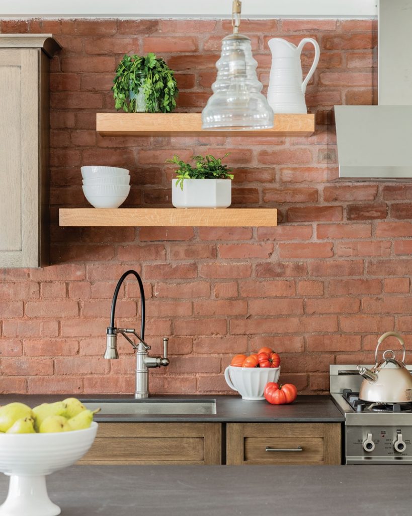
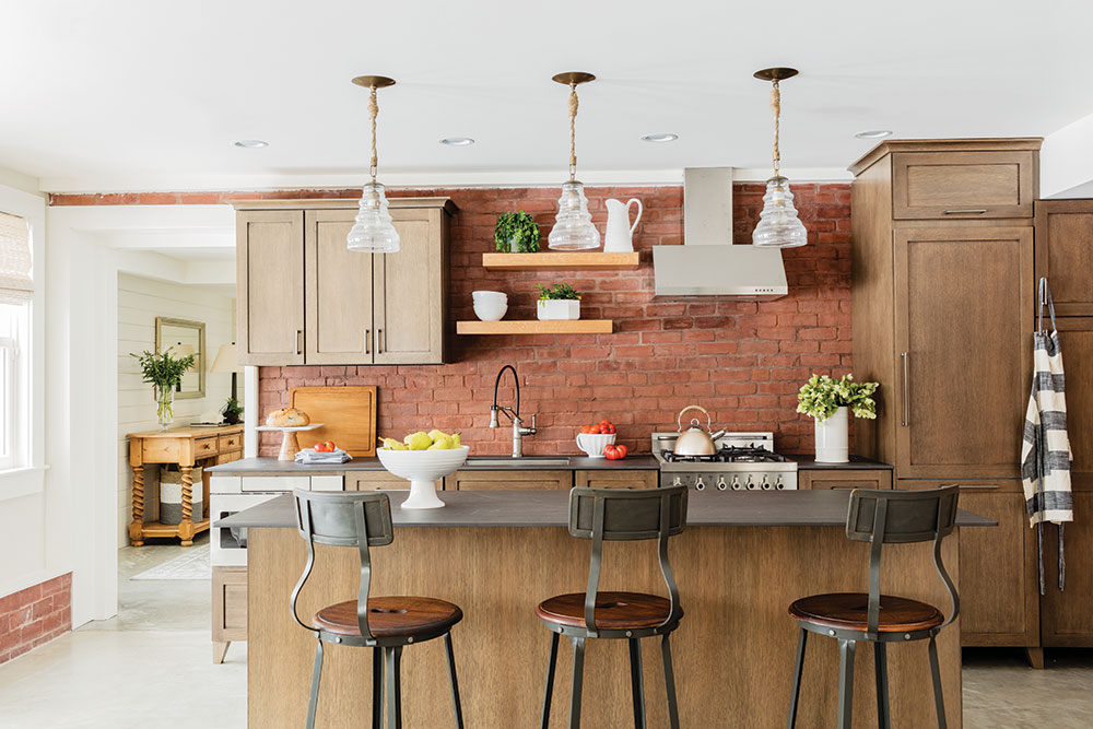
The kitchen and living room are open to one another. “It’s open-concept living, very loft-like,” says Russell. A classic white kitchen would have looked out of place in the old home, notes the wife, so she and Russell collaborated with RiverBend & Company on a wine cellar–inspired look. Durable yet thin Neolith countertops mimic the look of slate, while brown-glazed quarter-sawn oak cabinets appear appropriately aged and slightly distressed.
Other new-old details include hanging pendants with blown glass by Arteriors and a commercial-grade pull-down faucet by Grohe. The 7-foot-long island seats three on barstools by Go Home. “It’s rustic, but with modern elements,” explains Russell, whose personal design preference is to employ modern shapes inside a traditional envelope.
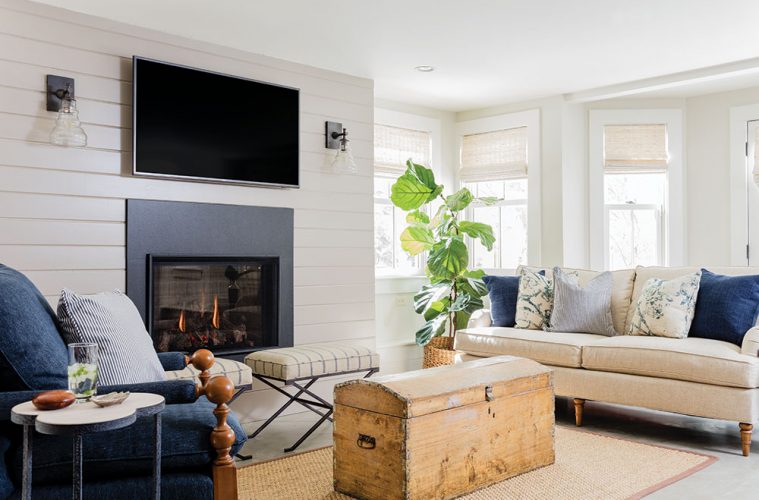
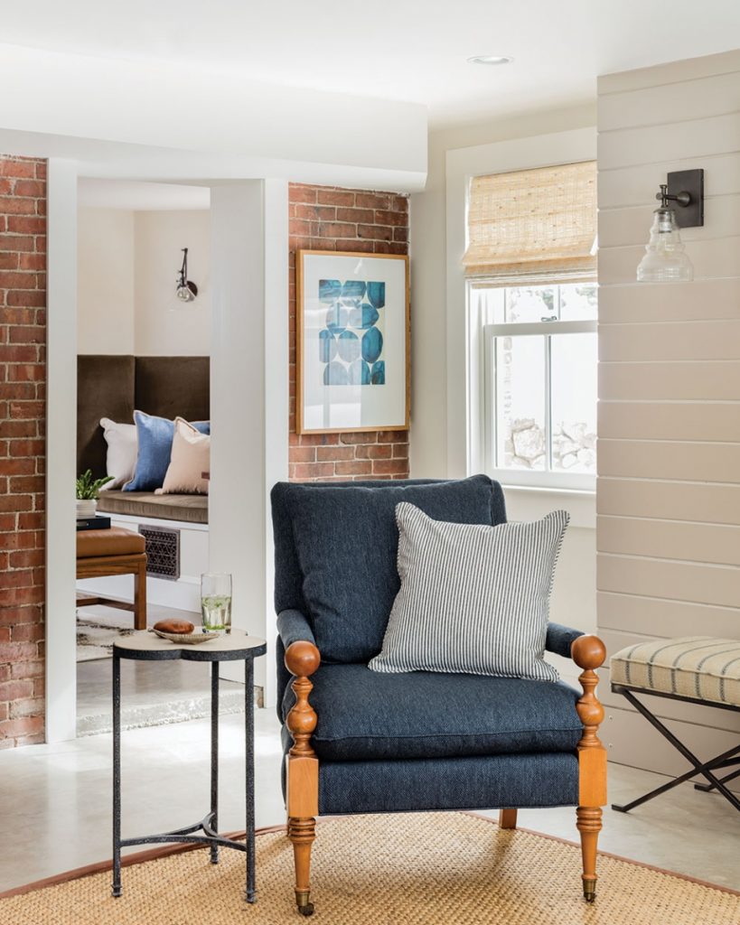
The living room’s centerpiece is a gas fireplace. Instead of elaborate millwork, its setting is more serene: a sleek surround of slate and then crisp shiplap, finished in Sherwin-Williams Key Stone Gray, which contrasts with the Sherwin-Williams Natural Choice applied everywhere else. Textured neutrals include the Donghia linen twill on the sofa and a sisal rug, while a navy blue Pindler & Pindler fabric on the club chair and custom throw pillows in an overscale Rose Cumming damask draw the eye.
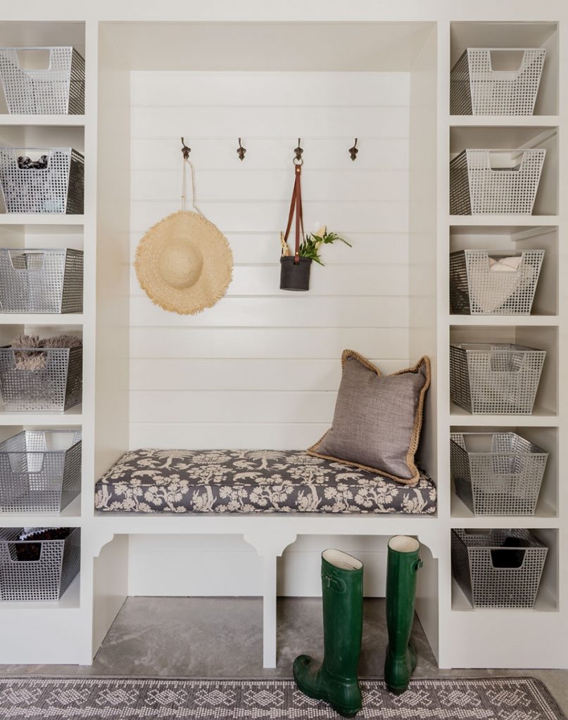
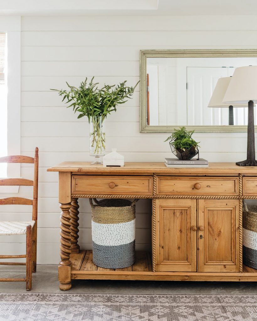
For the apartment’s private entrance, Russell assembled a charming entryway, whose built-in features include a bench and galvanized steel bins for organizing odds and ends. On the opposite wall, a country sideboard offers yet more storage. “They are a super active family—I wanted them to have plenty of room for hats, gloves, gardening tools, and other cast-off items,” describes Russell, whose talent is blending beauty with practicality, resulting in elegant yet grounded room compositions.
One surprise for the owners was the study. On the floor plan, it was merely an awkward pass-through between the living room and bedroom, but in Russell’s mind, it was an opportunity to create a functional, inviting space. She nestled a banquette—upholstered in a Robert Allen linen-wool blend and stocked with cushy pillows—into a window well and tucked a built-in desk into one corner.
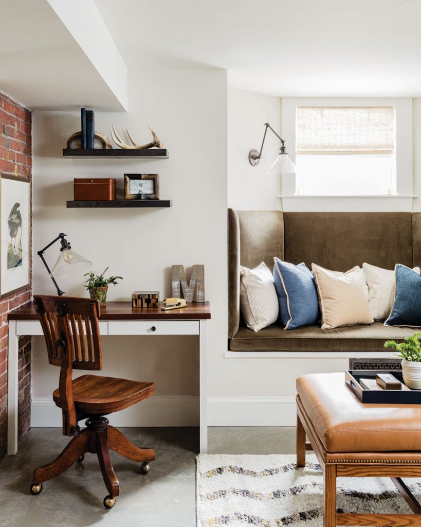
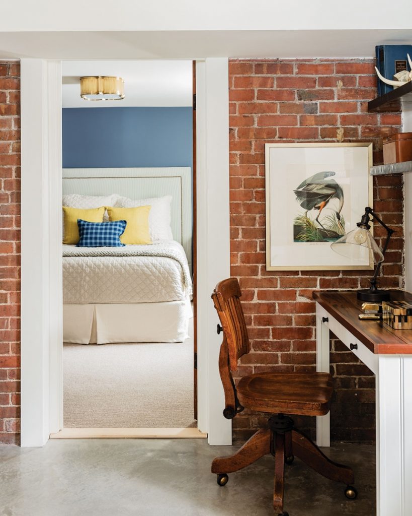
“The banquette is really creative and something we would have never thought of doing,” points out the owner. “It’s a sweet little nook for curling up with a book.”
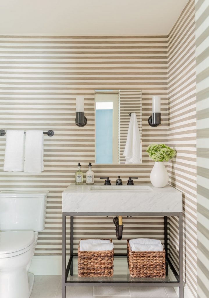
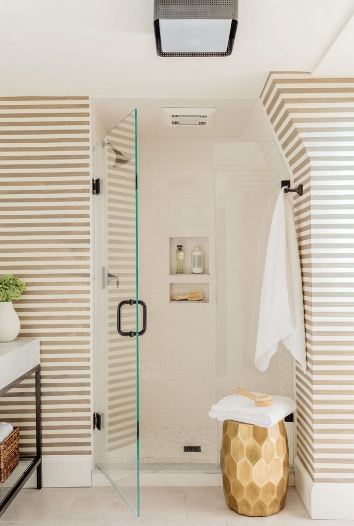
In the end, Russell achieved more features than anyone thought possible, maintaining a high level of creativity, originality, and sophistication along the way. She pushed the owners toward some bold design decisions—the bedroom’s saturated gray-blue walls, the bathroom’s custom-painted ticking striped walls—while maximizing every square inch and accommodating the family’s day-to-day lifestyle.
“Phoebe was very collaborative and brought a lot of fun energy to the project,” summarizes the owner. “She took it from just finishing the basement to making it a really livable space, one that feels like it’s part of a whole.”
Resources:
Interior Designer: Lovejoy Designs, 617-987-0097, lovejoydesigns.net
Cabinetry: RiverBend & Company, 978-392-8555, riverbendandcompany.com
Pendants: Arteriors, arteriorshome.com
Barstools: GO Home Ltd., 718-445-4022, gohomeltd.com
Faucet: Grohe, grohe.us
Paint: Sherwin-Williams Key Stone Gray and Natural Choice, sherwin-williams.com
SaveSaveSaveSave

