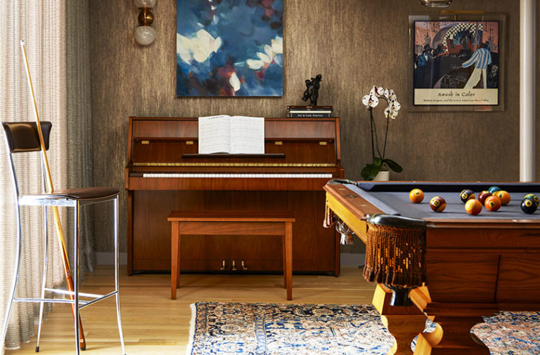
It started with the drapes. Cristina and Zoltan Csimma, who have lived for 35 years in their midcentury modern home designed by architect Henry Hoover, were looking to infuse a bit of warmth to the room on the lower level where they kept the pool table and stored their wine. “They asked for window treatments, and one thing led to another,” says designer Polly Corn Sullivan, who had worked with the couple on other projects over the years.
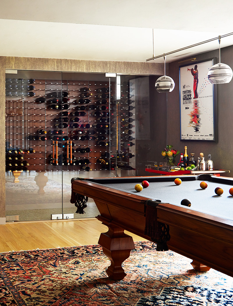
Since the Lincoln, Massachusetts homeowners were waiting out COVID in Carmel, California, Sullivan reasoned that it was a good time to do more with the space. “It was pretty bare,” the Boston-based designer says. “There was no color on the walls, just some simply framed jazz posters.” Said posters became Sullivan’s inspiration, along with the piano, the pool table, and Zoltan’s wine collection. The bottles had been relegated to a closet, with makeshift shelving, that sorely needed an upgrade. “I suggested creating an entertainment room with a jazz theme,” Sullivan says.
The more they talked, the more the couple liked the idea. “Polly said we should consider painting the room, which we never quite finished, and we realized we needed to replace the DIY wine cellar,” Cristina says. “The discussion evolved and the room became so much more.”
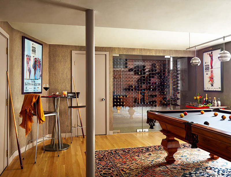
Playing off the neutral base color of the couple’s Persian rug, Sullivan covered the room in a warm, printed paper that catches the light. “It’s a mauve strié atop a gold metallic ground,” the designer says of the paper, which looks textural but is actually smooth. The homeowners cite the wallpaper as an example of an element that veers edgier than their usual taste. “I wouldn’t have picked it on my own, but, wow, it’s perfect,” Zoltan says.
Sullivan treated the window wall similarly, choosing pewter fabric with an open weave and metallic threads for the drapery. The panels, which Sullivan lined in a soft gray fabric after the mauve lining she initially chose was discontinued, are mounted as close to the ceiling as possible and stretch the whole length of the wall. “The fabric needed the weight of a lining for more drape and warmth, but it lets the light through so you can see the texture,” she says. “It wraps the room with ambiance and acts almost like a stage curtain.”
A new, walk-in wine cellar anchors one side of the room. The couple’s longtime contractor, Scott Williams, took the lead on it, opening up one of the room’s two closets to create space for it. He also identified the racks—wooden panels with anodized aluminum slats that each hold nine bottles—online at Wine Racks America. About 350 bottles rest behind the glass doors punctuated by double-sided mahogany and stainless-steel handles. “The wine cellar is fantastic,” Cristina says. “It wouldn’t have had nearly the impact if we hadn’t redesigned the room.” Her husband adds, “It draws me downstairs daily.”

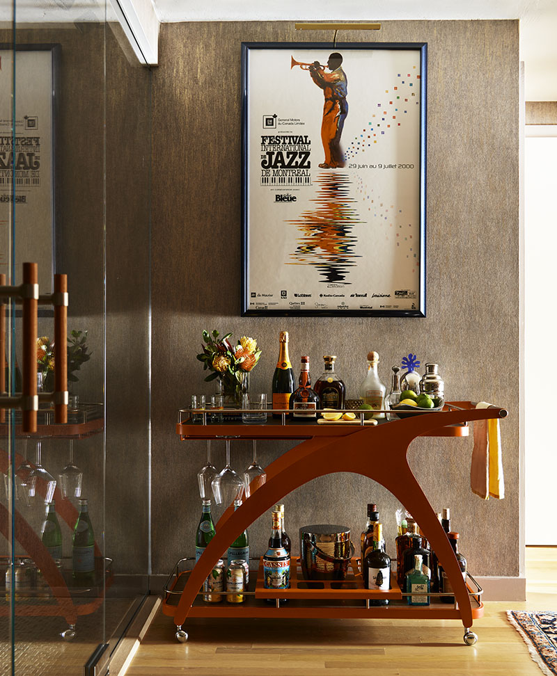
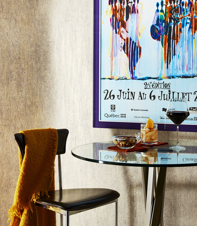
Where there’s wine, there should be cocktails. In that vein, Sullivan set up a midcentury modern–style metal bar cart on one side of the cellar, and a bar-height table on the other. “I had to convince the company to make me the bar cart in orange because it was being discontinued,” Sullivan says. Inspiration for the pub table came from bar stools that the couple already owned. “Polly is excellent at repurposing things from other rooms to reinvent a space,” Cristina says. “These really pop in the new spot.”
Posters from the Montreal International Jazz Festival enhance both tableaus, injecting personal flavor. “We’ve been going to that festival for about 25 years,” Zoltan says. He also points out that they’re in frames more expensive than the (now vintage) posters originally cost. Indeed, Sullivan had South End Frames reframe them, along with another vintage poster they owned. The fun colors she used elevated these meaningful pieces. “They were not inexpensive, but once I showed them they couldn’t un-see it,” Sullivan laughs.
The Csimmas are glad they indulged. “We want to be surrounded by things we love,” Zoltan says. “Especially those that bring back fantastic memories.”
Learn more about the project team
Architect: ART ARchitects
Contractor: Hunter Whitmore, Whitmore Brothers Construction Co.
Landscape architect: Nina Brown, Brown, Richardson + Rowe
Interior Designer: Polly Corn Design
Contractor: Scott Williams Construction
Paint and Wallcovering: Larkin Painting Company
Drapery: Thread Drapery Workroom
Art Installation: Christopher Valle Installations
Glass Enclosure: Commonwealth Glass & Mirror Corp.

